Tutorial: a to-do app
4. Ticking off and deleting
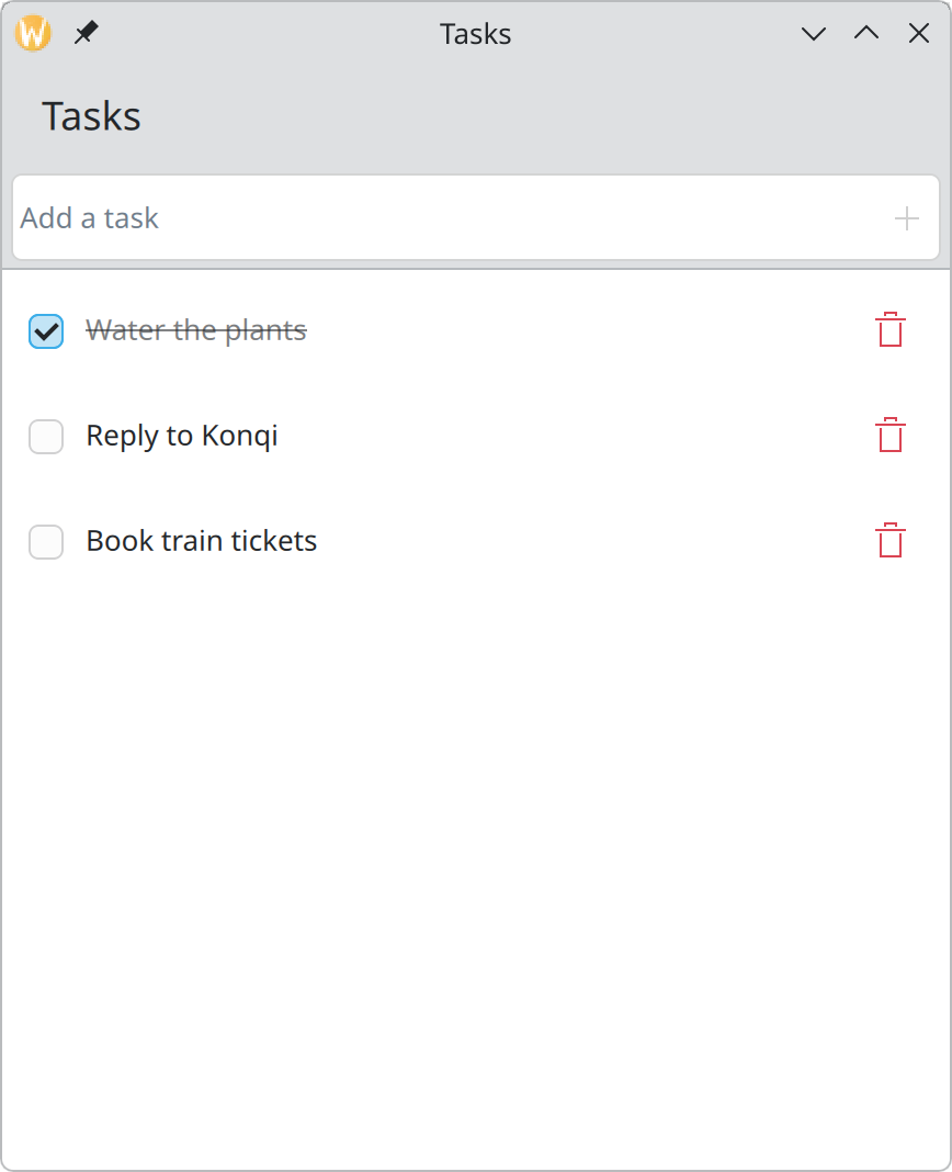
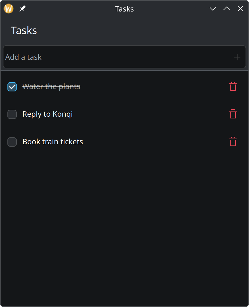
Make the checkbox change the data, show finished tasks as finished, and add a delete button that can be undone.
QQC2.ItemDelegateshowPassiveNotification
Show the complete main.qml for this step
import QtQuick
import QtQuick.Controls as QQC2
import QtQuick.Layouts
import org.kde.kirigami as Kirigami

Kirigami.ApplicationWindow {
    id: root

    title: "Tasks"
    width: Kirigami.Units.gridUnit * 24
    height: Kirigami.Units.gridUnit * 28

    ListModel {
        id: tasksModel

        ListElement { title: "Water the plants"; done: true }
        ListElement { title: "Reply to Konqi"; done: false }
        ListElement { title: "Book train tickets"; done: false }
    }

    function addTask(title: string): void {
        const trimmed = title.trim()
        if (trimmed.length > 0) {
            tasksModel.append({ title: trimmed, done: false })
        }
    }

    function deleteTask(row: int): void {
        // Keep a copy so the deletion can be undone.
        const task = { title: tasksModel.get(row).title, done: tasksModel.get(row).done }
        tasksModel.remove(row)
        showPassiveNotification("“" + task.title + "” deleted", "long", "Undo",
            () => tasksModel.insert(row, task))
    }

    pageStack.initialPage: Kirigami.ScrollablePage {
        title: "Tasks"

        header: QQC2.ToolBar {
            contentItem: Kirigami.ActionTextField {
                id: newTaskField

                placeholderText: "Add a task"
                onAccepted: {
                    root.addTask(text)
                    clear()
                }

                rightActions: Kirigami.Action {
                    text: "Add Task"
                    icon.name: "list-add"
                    enabled: newTaskField.text.trim().length > 0
                    onTriggered: newTaskField.accepted()
                }
            }
        }

        ListView {
            model: tasksModel
            // Rows are ticked, not selected, so none is marked as current.
            currentIndex: -1

            delegate: QQC2.ItemDelegate {
                id: row

                required property string title
                required property bool done
                required property int index

                width: ListView.view.width

                // Clicking anywhere on the row ticks or unticks the task.
                onClicked: tasksModel.setProperty(index, "done", !done)

                contentItem: RowLayout {
                    spacing: Kirigami.Units.smallSpacing

                    QQC2.CheckBox {
                        checked: row.done
                        onToggled: tasksModel.setProperty(row.index, "done", checked)
                    }

                    QQC2.Label {
                        Layout.fillWidth: true
                        text: row.title
                        elide: Text.ElideRight

                        // Finished tasks step back: struck through and faded.
                        font.strikeout: row.done
                        opacity: row.done ? 0.6 : 1
                    }

                    QQC2.ToolButton {
                        text: "Delete"
                        icon.name: "edit-delete"
                        display: QQC2.AbstractButton.IconOnly
                        onClicked: root.deleteTask(row.index)

                        QQC2.ToolTip.text: text
                        QQC2.ToolTip.visible: hovered
                        QQC2.ToolTip.delay: Kirigami.Units.toolTipDelay
                    }
                }
            }
        }
    }
}
The ready-made check delegate cannot hold a delete button, so this step builds the row from parts. It needs one
more import at the top of the file, for RowLayout:
import QtQuick.LayoutsA custom row
Replace the delegate with this:
delegate: QQC2.ItemDelegate {
    id: row

    required property string title
    required property bool done
    required property int index

    width: ListView.view.width

    onClicked: tasksModel.setProperty(index, "done", !done)

    contentItem: RowLayout {
        spacing: Kirigami.Units.smallSpacing

        QQC2.CheckBox {
            checked: row.done
            onToggled: tasksModel.setProperty(row.index, "done", checked)
        }

        QQC2.Label {
            Layout.fillWidth: true
            text: row.title
            elide: Text.ElideRight

            font.strikeout: row.done
            opacity: row.done ? 0.6 : 1
        }

        QQC2.ToolButton {
            text: "Delete"
            icon.name: "edit-delete"
            display: QQC2.AbstractButton.IconOnly
            onClicked: root.deleteTask(row.index)

            QQC2.ToolTip.text: text
            QQC2.ToolTip.visible: hovered
            QQC2.ToolTip.delay: Kirigami.Units.toolTipDelay
        }
    }
}
We keep a standard QQC2.ItemDelegate and replace only its inside, the contentItem. That way the row
keeps the standard height, padding, hover effect and keyboard behaviour.
required property int indexis the row’s position in the list. The view provides it, like the data fields.tasksModel.setProperty(index, "done", …)is what was missing in step 2: it writes the new state into the model. The checkbox then shows it becausechecked: row.donereads from the model. Data flows one way: the user changes the model, the model changes the screen.onClickedon the whole row does the same, so the entire row is a click target, not just the small box.- The label takes all spare width (
Layout.fillWidth) and shortens long titles with “…” instead of pushing the button out of the window. - Strike-through and reduced opacity show that a task is finished in two ways at once, so it does not depend on seeing either one.
- The delete button shows only an icon, but has a
textand a tooltip that name it.
Deleting, with undo
Add this function to the window, next to addTask:
function deleteTask(row: int): void {
    const task = { title: tasksModel.get(row).title, done: tasksModel.get(row).done }
    tasksModel.remove(row)
    showPassiveNotification("“" + task.title + "” deleted", "long", "Undo",
        () => tasksModel.insert(row, task))
}
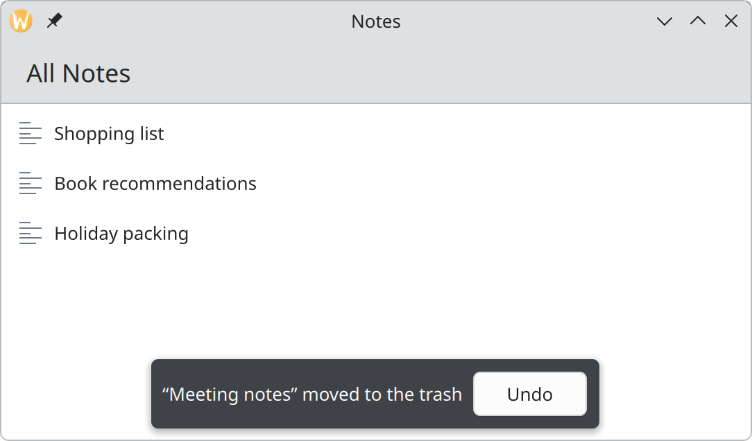
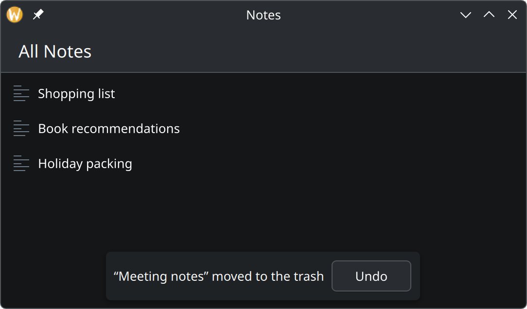
It remembers the task, removes it, and shows a small message at the bottom of the window with an Undo button. Undo puts the remembered task back where it was. After a few seconds the message goes away by itself.
Why these choices
- No “Are you sure?” dialog. Deleting one task is a small thing that is easy to do by accident. Doing it at once and offering a way back is faster for everyone and safer than a question people learn to click through. See Feedback and status.
- The red bin icon
edit-deleteis the standard one for removing the user’s own content. See Icons. - The button is always visible, not only on hover, so it also exists on touch screens. See Showing collections.
Try it
Tick a task, then click its text to untick it. Delete one and press Undo.