Components
List items
The rows of a list. Qt and Kirigami provide ready-made ones for the common cases, so rows look and behave the same in every app.
QQC2.ItemDelegateKD.SubtitleDelegateKD.CheckSubtitleDelegateKirigami.ListSectionHeaderKirigami.InlineViewHeader
A list has three parts: a ListView, a model that holds the data, and a delegate, which is the template
for one row. This page is about the delegate. For when to use a list at all, see
Showing collections.
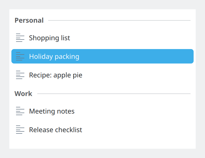
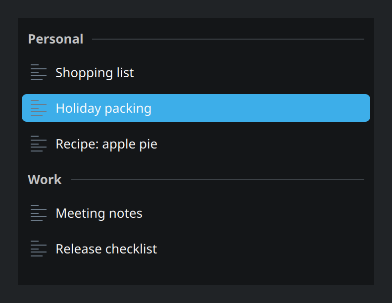
Show the QML for this example
import QtQuick
import QtQuick.Controls as QQC2
import org.kde.kirigami as Kirigami

// A plain list: one line per item, grouped under section headers.
QQC2.ScrollView {
    width: Kirigami.Units.gridUnit * 20
    height: Kirigami.Units.gridUnit * 15

    // Lists live on the View colour set, the brightest surface.
    Kirigami.Theme.colorSet: Kirigami.Theme.View
    Kirigami.Theme.inherit: false
    background: Rectangle {
        color: Kirigami.Theme.backgroundColor
    }

    ListView {
        currentIndex: 1

        model: ListModel {
            ListElement { name: "Shopping list"; folder: "Personal" }
            ListElement { name: "Holiday packing"; folder: "Personal" }
            ListElement { name: "Recipe: apple pie"; folder: "Personal" }
            ListElement { name: "Meeting notes"; folder: "Work" }
            ListElement { name: "Release checklist"; folder: "Work" }
        }

        section.property: "folder"
        section.delegate: Kirigami.ListSectionHeader {
            required property string section
            width: ListView.view.width
            text: section
        }

        delegate: QQC2.ItemDelegate {
            required property string name
            required property int index

            width: ListView.view.width
            text: name
            icon.name: "text-x-generic"
            highlighted: ListView.isCurrentItem
        }
    }
}
Which delegate
Use a ready-made delegate. They already have the right height, padding, icon size, hover and focus effects, and they work with keyboard and touch.
| A row shows… | Use | From |
|---|---|---|
| One line of text, optional icon | QQC2.ItemDelegate |
Qt Quick Controls |
| The same, with a checkbox, radio button or switch | QQC2.CheckDelegate, RadioDelegate, SwitchDelegate |
Qt Quick Controls |
| A title and a subtitle | KD.SubtitleDelegate |
Kirigami |
| Title, subtitle and a checkbox, radio button or switch | KD.CheckSubtitleDelegate, RadioSubtitleDelegate, SwitchSubtitleDelegate |
Kirigami |
Prefer the Qt ones when one line is enough. The Kirigami delegates live in their own module:
import org.kde.kirigami.delegates as KDTwo lines
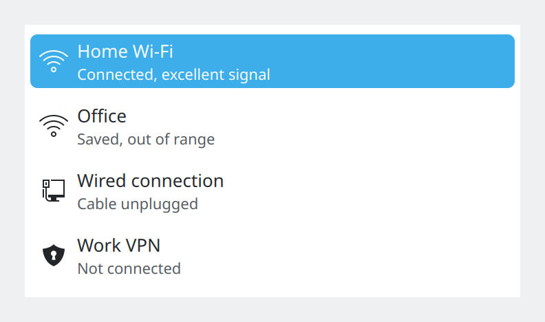
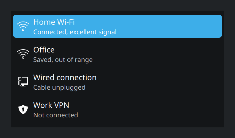
KD.SubtitleDelegate. Rows with a subtitle get a larger icon than one-line rows.Show the QML for this example
import QtQuick
import QtQuick.Controls as QQC2
import org.kde.kirigami as Kirigami
import org.kde.kirigami.delegates as KD

// Two lines per item: a title and a quieter subtitle.
QQC2.ScrollView {
    width: Kirigami.Units.gridUnit * 20
    height: Kirigami.Units.gridUnit * 11

    Kirigami.Theme.colorSet: Kirigami.Theme.View
    Kirigami.Theme.inherit: false
    background: Rectangle {
        color: Kirigami.Theme.backgroundColor
    }

    ListView {
        currentIndex: 0

        model: ListModel {
            ListElement { name: "Home Wi-Fi"; detail: "Connected, excellent signal"; glyph: "network-wireless" }
            ListElement { name: "Office"; detail: "Saved, out of range"; glyph: "network-wireless" }
            ListElement { name: "Wired connection"; detail: "Cable unplugged"; glyph: "network-wired" }
            ListElement { name: "Work VPN"; detail: "Not connected"; glyph: "network-vpn" }
        }

        delegate: KD.SubtitleDelegate {
            required property string name
            required property string detail
            required property string glyph

            width: ListView.view.width
            text: name
            subtitle: detail
            icon.name: glyph
            highlighted: ListView.isCurrentItem
        }
    }
}
Rows that can be ticked
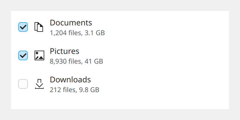
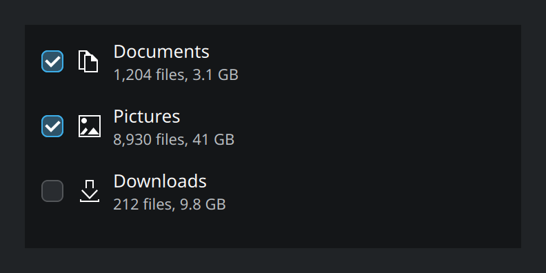
KD.CheckSubtitleDelegate. Clicking anywhere on the row toggles it.Show the QML for this example
import QtQuick
import QtQuick.Controls as QQC2
import org.kde.kirigami as Kirigami
import org.kde.kirigami.delegates as KD

// Rows that can be ticked: the whole row is the click target.
QQC2.ScrollView {
    width: Kirigami.Units.gridUnit * 20
    height: Kirigami.Units.gridUnit * 9

    Kirigami.Theme.colorSet: Kirigami.Theme.View
    Kirigami.Theme.inherit: false
    background: Rectangle {
        color: Kirigami.Theme.backgroundColor
    }

    ListView {
        currentIndex: -1

        model: ListModel {
            ListElement { glyph: "folder-documents"; name: "Documents"; detail: "1,204 files, 3.1 GB"; ticked: true }
            ListElement { glyph: "folder-pictures"; name: "Pictures"; detail: "8,930 files, 41 GB"; ticked: true }
            ListElement { glyph: "folder-download"; name: "Downloads"; detail: "212 files, 9.8 GB"; ticked: false }
        }

        delegate: KD.CheckSubtitleDelegate {
            required property string name
            required property string detail
            required property bool ticked
            required property string glyph

            width: ListView.view.width
            text: name
            subtitle: detail
            icon.name: glyph
            checked: ticked
        }
    }
}
Something else
When no ready-made delegate fits, keep QQC2.ItemDelegate and replace only its inside, the contentItem.
You keep the background, highlight and keyboard handling. Kirigami offers KD.TitleSubtitle and
KD.IconTitleSubtitle as building blocks for this.
Sizing rows correctly
A delegate must be told how wide it is. Always write it this way:
delegate: QQC2.ItemDelegate {
    required property string name

    width: ListView.view.width
    text: name
}Declare the pieces of data the row needs as required property, as above. The view fills them in from the
model, and a typo in a name becomes an error instead of an empty row.
Section headers
To group rows, tell the view which field to group by, and use Kirigami.ListSectionHeader for the heading:
ListView {
    section.property: "folder"
    section.delegate: Kirigami.ListSectionHeader {
        required property string section
        width: ListView.view.width
        text: section
    }
}
The model must already be sorted by that field; the view only draws a header where the value changes.
A header for the whole list
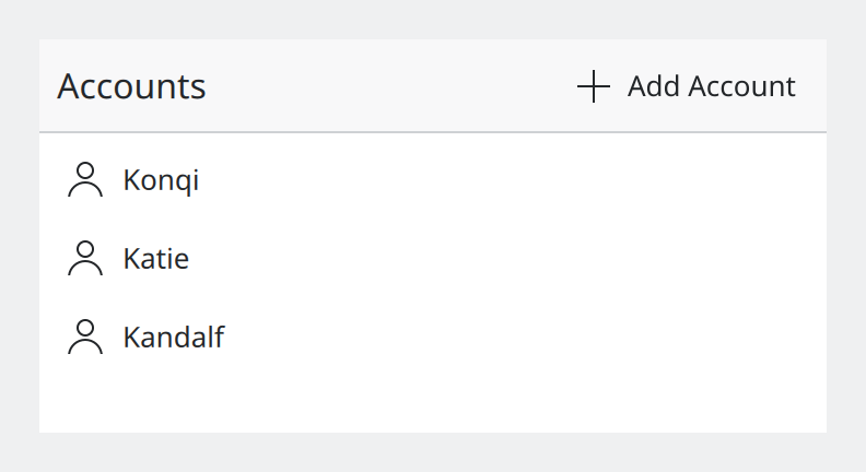
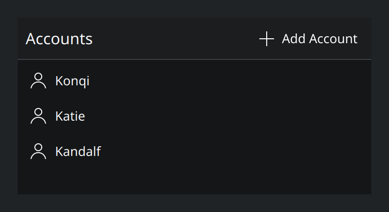
Kirigami.InlineViewHeader gives a list a title and a place for its own actions.Show the QML for this example
import QtQuick
import QtQuick.Controls as QQC2
import org.kde.kirigami as Kirigami

// Controls for the list itself sit in a header that belongs to the list.
QQC2.ScrollView {
    width: Kirigami.Units.gridUnit * 20
    height: Kirigami.Units.gridUnit * 10

    Kirigami.Theme.colorSet: Kirigami.Theme.View
    Kirigami.Theme.inherit: false
    background: Rectangle {
        color: Kirigami.Theme.backgroundColor
    }

    ListView {
        currentIndex: -1
        model: ["Konqi", "Katie", "Kandalf"]

        headerPositioning: ListView.OverlayHeader
        header: Kirigami.InlineViewHeader {
            width: ListView.view.width
            text: "Accounts"
            actions: [
                Kirigami.Action {
                    text: "Add Account"
                    icon.name: "list-add"
                }
            ]
        }

        delegate: QQC2.ItemDelegate {
            required property string modelData

            width: ListView.view.width
            text: modelData
            icon.name: "user"
        }
    }
}
Use it for the name of the list and for actions that concern the list as a whole, such as adding an item.
Icons in rows
| Row | Icon size |
|---|---|
| One line of text | iconSizes.smallMedium (22 px) |
| Title and subtitle | iconSizes.medium (32 px) |
The ready-made delegates pick these for you. See Icons.
Using list items well
- Put the list directly inside a
Kirigami.ScrollablePage; it then needs no size or anchors. See Pages. - Show an empty list as a placeholder message, not as blank space.
- Buttons on a row go at its trailing end, icon only, always visible, two at most.
- Keep row text to one line and let it elide (“…”) when it is too long. The delegates do this by default.
Properties you will use
On every delegate
| Property | Type | What it does |
|---|---|---|
text |
string | The main line. |
icon.name |
string | Icon at the start of the row. |
highlighted |
bool | Draws the row as the current one. Usually bound to ListView.isCurrentItem. |
onClicked |
handler | Runs when the row is activated. |
width |
number | Set to ListView.view.width. |
Extra on the Kirigami delegates
| Property | Type | What it does |
|---|---|---|
subtitle |
string | The second, quieter line. |
checked |
bool | State of the checkbox, radio button or switch, on the delegates that have one. |
Kirigami.InlineViewHeader
| Property | Type | What it does |
|---|---|---|
text |
string | The title. |
actions |
list of actions | Buttons at the trailing end. |
Where this comes from
- Kirigami tutorial: List views
- KDE HIG: Displaying content
- KDE HIG: Layout and navigation (Spacings and sizes)
This page restates the upstream KDE documentation in plainer words and adds pictures. When the two disagree, upstream wins.