Components
Inline messages
A coloured banner inside the page that tells the user something important and, ideally, offers a way to deal with it.
Kirigami.InlineMessage
An inline message sits in the page next to the content it is about. It does not block anything and does not disappear by itself, which makes it the right tool for things people need to notice and may want to act on.
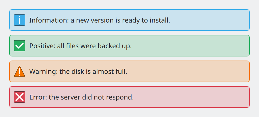
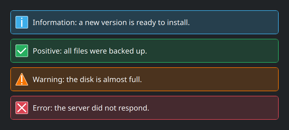
Show the QML for this example
import QtQuick
import QtQuick.Layouts
import org.kde.kirigami as Kirigami

ColumnLayout {
    width: Kirigami.Units.gridUnit * 26
    spacing: Kirigami.Units.largeSpacing

    Kirigami.InlineMessage {
        Layout.fillWidth: true
        visible: true
        type: Kirigami.MessageType.Information
        text: "Information: a new version is ready to install."
    }
    Kirigami.InlineMessage {
        Layout.fillWidth: true
        visible: true
        type: Kirigami.MessageType.Positive
        text: "Positive: all files were backed up."
    }
    Kirigami.InlineMessage {
        Layout.fillWidth: true
        visible: true
        type: Kirigami.MessageType.Warning
        text: "Warning: the disk is almost full."
    }
    Kirigami.InlineMessage {
        Layout.fillWidth: true
        visible: true
        type: Kirigami.MessageType.Error
        text: "Error: the server did not respond."
    }
}
The four types
type: Kirigami.MessageType.… |
Use it when |
|---|---|
Information |
Something is worth knowing but nothing is wrong. This is the default. |
Positive |
A long or important task finished successfully. |
Warning |
Something may go wrong, or needs attention soon. |
Error |
Something failed. |
When to use one, and when not
First ask whether a message is needed at all. The guidelines are firm that the best status message is none:
- If something succeeded, show the result. The file appears in the list, the switch is on. Add a message only for long tasks where the result is not visible.
- If something can be prevented or fixed automatically, do that instead of reporting it.
When you do need to say something inside the app, choose by importance:
| Situation | Use |
|---|---|
| Minor, can be missed: “Copied to clipboard” | A passive notification: applicationWindow().showPassiveNotification("…"). It fades by itself. |
| Should be noticed, may need action | Kirigami.InlineMessage |
| Needs a decision before anything else can happen | A dialog |
| Happened while the app was in the background | A system notification |
Writing error messages
Every error message must give the user something to do. In order of preference:
- Prevent the error, or recover silently. No message.
- Say what happened and offer a button that fixes it.
- Say what happened and explain how to proceed.
- Say only what happened. Acceptable when nothing can be done.
Never show raw technical output, and never fail without saying anything.
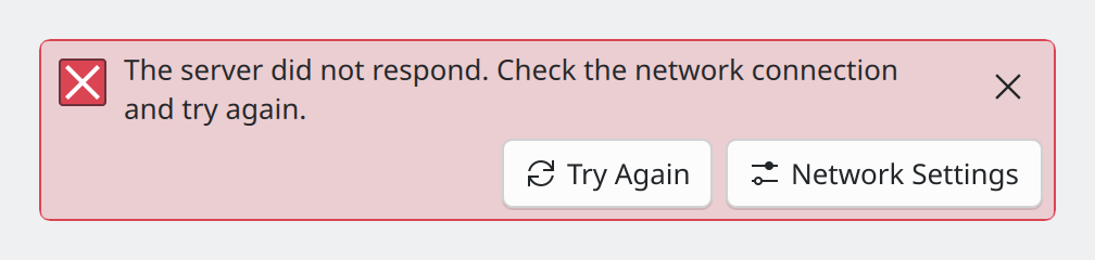
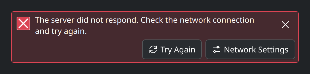
Show the QML for this example
import QtQuick
import QtQuick.Layouts
import org.kde.kirigami as Kirigami

ColumnLayout {
    width: Kirigami.Units.gridUnit * 26

    Kirigami.InlineMessage {
        Layout.fillWidth: true
        visible: true
        type: Kirigami.MessageType.Error
        text: "The server did not respond. Check the network connection and try again."
        showCloseButton: true

        actions: [
            Kirigami.Action {
                text: "Try Again"
                icon.name: "view-refresh"
            },
            Kirigami.Action {
                text: "Network Settings"
                icon.name: "configure"
            }
        ]
    }
}Say what happened in plain words, then what the user can do.
Show codes or internal messages. They mean nothing to most people and offer no next step.
In code
An inline message is hidden until you set visible: true, and it animates in and out when that changes. Bind
visible to the condition it reports:
Kirigami.InlineMessage {
    Layout.fillWidth: true
    visible: !network.online
    type: Kirigami.MessageType.Warning
    text: "You are offline. Changes will be uploaded when the connection returns."
}
Give it the full width of its container (Layout.fillWidth: true in a layout).
A message about the whole page
A message that concerns the entire page, not one part of it, goes directly under the header. Put it in the page’s
header and tell it where it is, so it draws edge to edge without rounded corners:
Kirigami.ScrollablePage {
    header: Kirigami.InlineMessage {
        position: Kirigami.InlineMessage.Position.Header
        visible: !network.online
        type: Kirigami.MessageType.Warning
        text: "You are offline."
    }
}Properties you will use
| Property | Type | What it does |
|---|---|---|
text |
string | The message. Short links written as HTML are allowed; handle them with onLinkActivated. |
type |
enum | One of the four types above. Sets colour and icon. |
visible |
bool | Shows or hides the message. Starts false. |
actions |
list of actions | Buttons shown in the message. See Actions and toolbars. |
showCloseButton |
bool | Adds a × that lets the user dismiss the message. Default false. |
position |
enum | Inline (default), Header or Footer. Use the last two when the message is a page’s header or footer. |
icon.name |
string | Replaces the icon that the type provides. Rarely needed. |
Where this comes from
This page restates the upstream KDE documentation in plainer words and adds pictures. When the two disagree, upstream wins.