Components
Actions and toolbars
An action describes something the user can do, once. Kirigami turns it into a toolbar button, a menu item or a context-menu entry as space allows.
Kirigami.ActionKirigami.ActionToolBar
In Kirigami you rarely place toolbar buttons by hand. You write an action: a small object that holds a label, an icon and what happens when it is triggered. Then you hand a list of actions to a component, and the component decides how to show them.
Kirigami.Action {
    text: "Save"
    icon.name: "document-save"
    shortcut: StandardKey.Save
    onTriggered: document.save()
}
The benefit is that one description works everywhere. The same action can appear as a button with text on a wide window, an icon in a narrow one, and a menu entry on a phone.
Where actions go
| Give a list of actions to… | They appear as… |
|---|---|
A page (actions) |
Buttons in the page header. See Pages. |
Kirigami.ActionToolBar |
Buttons in a toolbar you place yourself. |
Kirigami.GlobalDrawer |
Entries in the sidebar. |
Kirigami.Card |
Buttons along the bottom of the card. See Cards. |
Kirigami.InlineMessage |
Buttons inside the message. See Inline messages. |
Kirigami.MenuDialog |
A list of choices in a dialog. |
The action toolbar
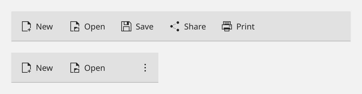
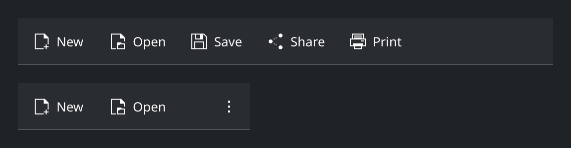
Show the QML for this example
import QtQuick
import QtQuick.Layouts
import QtQuick.Controls as QQC2
import org.kde.kirigami as Kirigami

// The same toolbar at two widths. When space runs out, actions move into
// the overflow menu at the end instead of being cut off.
ColumnLayout {
    spacing: Kirigami.Units.gridUnit

    Repeater {
        model: [Kirigami.Units.gridUnit * 30, Kirigami.Units.gridUnit * 13]

        QQC2.ToolBar {
            required property int modelData
            Layout.preferredWidth: modelData

            contentItem: Kirigami.ActionToolBar {
                actions: [
                    Kirigami.Action {
                        text: "New"
                        icon.name: "document-new"
                    },
                    Kirigami.Action {
                        text: "Open"
                        icon.name: "document-open"
                    },
                    Kirigami.Action {
                        text: "Save"
                        icon.name: "document-save"
                    },
                    Kirigami.Action {
                        text: "Share"
                        icon.name: "document-share"
                    },
                    Kirigami.Action {
                        text: "Print"
                        icon.name: "document-print"
                    }
                ]
            }
        }
    }
}
Kirigami.ActionToolBar is the component behind page headers, and you can use it on its own wherever you need a
row of actions. Its main job is handling lack of space gracefully.
Because actions can end up in the overflow menu, every action needs both a text and an icon, even one you expect to be shown as an icon only.
Steering the layout
Each action can state a preference with displayHint.


Show the QML for this example
import QtQuick
import QtQuick.Layouts
import QtQuick.Controls as QQC2
import org.kde.kirigami as Kirigami

QQC2.ToolBar {
    implicitWidth: Kirigami.Units.gridUnit * 24

    contentItem: Kirigami.ActionToolBar {
        actions: [
            Kirigami.Action {
                text: "Add Note"
                icon.name: "list-add"
                // Stays on the toolbar even when space is tight.
                displayHint: Kirigami.DisplayHint.KeepVisible
            },
            Kirigami.Action {
                text: "Search"
                icon.name: "search"
                // Well-known icon, so the label can be dropped.
                displayHint: Kirigami.DisplayHint.IconOnly
            },
            Kirigami.Action {
                text: "Sort"
                icon.name: "view-sort"

                // Child actions turn the button into a menu.
                Kirigami.Action {
                    text: "By Name"
                }
                Kirigami.Action {
                    text: "By Date"
                }
            },
            Kirigami.Action {
                text: "Settings"
                icon.name: "configure"
                // Rarely needed: lives in the overflow menu only.
                displayHint: Kirigami.DisplayHint.AlwaysHide
            }
        ]
    }
}
Kirigami.DisplayHint.… |
Effect | Use it for |
|---|---|---|
NoPreference |
The toolbar decides. This is the default. | Most actions. |
KeepVisible |
Stays on the toolbar as long as at all possible. | The one or two actions that are the point of the page. |
IconOnly |
Shown without its label. | Actions with a universally known icon: search, back, close. |
AlwaysHide |
Only ever shown in the overflow menu. | Rarely used actions: settings, about, help. |
Menus
An action with child actions becomes a button that opens a menu. Declare the children inside the parent, as the “Sort” action in the example does.
Using actions well
- Order by importance. Actions overflow from the end of the list, so put the most used first.
- Label with a verb, in title case: “Add Note”, not “Note” or “Add note”. See Typography and wording.
- Do not reuse an icon for two actions that are visible together.
- Do not hide what people need. If an action is temporarily unavailable, set
enabled: falseso it stays visible but greyed out. Usevisible: falseonly when the action makes no sense in the current context. - Give common actions their standard shortcut with
StandardKey, for exampleStandardKey.Save, so they follow the user’s shortcut settings.
Properties you will use
Kirigami.Action
| Property | Type | What it does |
|---|---|---|
text |
string | The label. Always set it, even for icon-only actions. |
icon.name |
string | Icon name from the icon theme. See Icons. |
onTriggered |
handler | What happens when the action is used. |
shortcut |
key sequence | Keyboard shortcut. |
tooltip |
string | Extra explanation shown on hover. |
enabled |
bool | false greys the action out. |
visible |
bool | false removes it everywhere. |
checkable, checked |
bool | Makes the action a toggle. |
displayHint |
enum | Layout preference, see the table above. |
separator |
bool | Turns this entry into a dividing line between groups. |
displayComponent |
component | Replaces the button with your own item, for example a search field. |
Kirigami.ActionToolBar
| Property | Type | What it does |
|---|---|---|
actions |
list of actions | The actions to show. |
alignment |
alignment | Which side the buttons gather on, for example Qt.AlignRight. |
display |
enum | Default look of each button: text beside icon, icon only, and so on. |
flat |
bool | true (default) draws buttons without a frame, as on a toolbar. |
overflowIconName |
string | Icon of the overflow button. Default is overflow-menu. |
Where this comes from
- Kirigami tutorial: Actions based components
- Kirigami tutorial: Action toolbars
- KDE HIG: Getting input
- KDE HIG: Icons
This page restates the upstream KDE documentation in plainer words and adds pictures. When the two disagree, upstream wins.