Foundations
Colour
Never write a colour value. Ask the theme for a role, and your app follows whatever colour scheme the user has chosen.
Kirigami.Theme
People using Plasma choose their own colour scheme: light, dark, high contrast, or something they made themselves. An app cannot know in advance which colours it will be shown in. So instead of colour values, Kirigami gives you roles such as “normal text” or “background of an error”, and fills in the right value at run time.
You read roles from Kirigami.Theme:
QQC2.Label {
    text: "Could not connect"
    color: Kirigami.Theme.negativeTextColor
}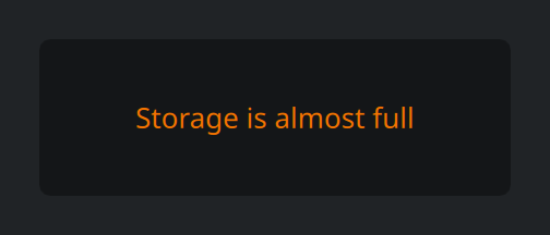
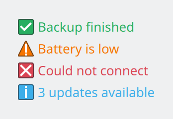
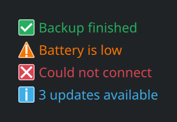
Use theme roles. The same code is readable in light and dark schemes; this is how it looks in Breeze Dark.
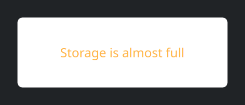
Write colour values such as "#ffffff". The same panel in Breeze Dark is a glaring white box with text that
is hard to read.
Colour roles
These are the roles you will use most. The values shown are the stock Breeze ones; your users may see others.
Text and background
| Role | Use it for | Breeze Light | Breeze Dark |
|---|---|---|---|
textColor | Normal text and symbolic icons. | #232629 | #fcfcfc |
disabledTextColor | Text of something that cannot be used right now. | #707d8a | #a1a9b1 |
backgroundColor | The surface behind content. | #ffffff | #141618 |
alternateBackgroundColor | Every second row in a list or table with striped rows. | #f7f7f7 | #1d1f22 |
linkColor | Links that open a web address. | #2980b9 | #1d99f3 |
visitedLinkColor | Links the user has already opened. | #9b59b6 | #9b59b6 |
Selection and focus
| Role | Use it for | Breeze Light | Breeze Dark |
|---|---|---|---|
highlightColor | Background of selected items and checked controls. | #3daee9 | #3daee9 |
highlightedTextColor | Text drawn on top of the highlight colour. | #ffffff | #fcfcfc |
hoverColor | Outline of the control under the pointer. | #3daee9 | #3daee9 |
focusColor | Outline of the control that has keyboard focus. | #3daee9 | #3daee9 |
Status
Each status has a text colour and a soft background to go behind it.
| Role | Use it for | Breeze Light | Breeze Dark |
|---|---|---|---|
positiveTextColor | Success, safe, finished. | #27ae60 | #27ae60 |
positiveBackgroundColor | Background behind positive content. | #ddfbe8 | #0d2c1b |
neutralTextColor | Warnings, and settings changed from their default. | #f67400 | #f67400 |
neutralBackgroundColor | Background behind a warning. | #fef1ea | #3c1f05 |
negativeTextColor | Errors and dangerous actions. | #da4453 | #da4453 |
negativeBackgroundColor | Background behind an error. | #faeced | #3c161a |
activeTextColor | Something that wants attention without being a problem. | #3daee9 | #3daee9 |
Colour sets
A window is not one flat colour. The area where content lives is brighter than the window chrome around it, buttons have their own surface, and a selected row is blue. Each of these surfaces is a colour set: the same list of roles, with different values.
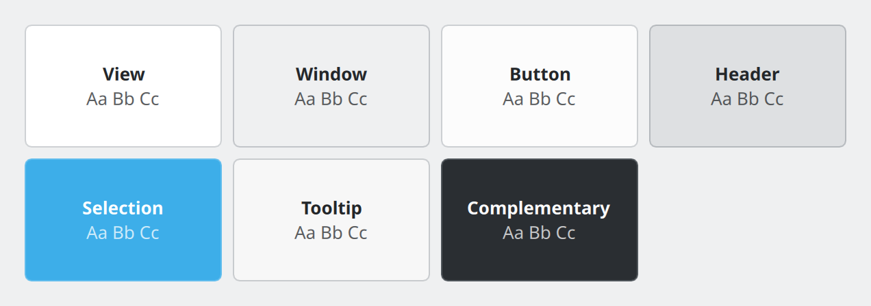
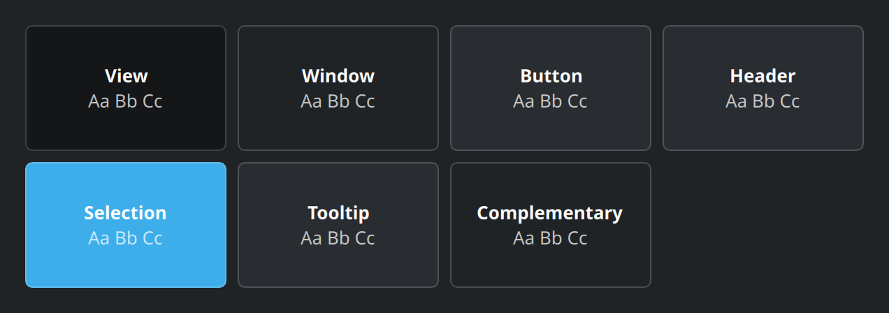
backgroundColor and textColor; only the set differs.Show the QML for this example
import QtQuick
import QtQuick.Layouts
import QtQuick.Controls as QQC2
import org.kde.kirigami as Kirigami

// One swatch per colour set. Each swatch switches the set for itself and
// everything inside it, so the label picks up the matching text colour.
GridLayout {
    columns: 4
    rowSpacing: Kirigami.Units.largeSpacing
    columnSpacing: Kirigami.Units.largeSpacing

    Repeater {
        model: [
            { name: "View", set: Kirigami.Theme.View },
            { name: "Window", set: Kirigami.Theme.Window },
            { name: "Button", set: Kirigami.Theme.Button },
            { name: "Header", set: Kirigami.Theme.Header },
            { name: "Selection", set: Kirigami.Theme.Selection },
            { name: "Tooltip", set: Kirigami.Theme.Tooltip },
            { name: "Complementary", set: Kirigami.Theme.Complementary }
        ]

        Rectangle {
            id: swatch
            required property var modelData

            Kirigami.Theme.colorSet: modelData.set
            Kirigami.Theme.inherit: false

            implicitWidth: Kirigami.Units.gridUnit * 8
            implicitHeight: Kirigami.Units.gridUnit * 5
            radius: Kirigami.Units.cornerRadius
            color: Kirigami.Theme.backgroundColor
            border.color: Kirigami.ColorUtils.linearInterpolation(
                Kirigami.Theme.backgroundColor, Kirigami.Theme.textColor, Kirigami.Theme.frameContrast)

            ColumnLayout {
                anchors.centerIn: parent
                spacing: 0

                QQC2.Label {
                    Layout.alignment: Qt.AlignHCenter
                    text: swatch.modelData.name
                    font.bold: true
                }
                QQC2.Label {
                    Layout.alignment: Qt.AlignHCenter
                    text: "Aa Bb Cc"
                    opacity: 0.75
                }
            }
        }
    }
}| Set | Where it is used |
|---|---|
View |
Where content lives: lists, text areas, the inside of cards. |
Window |
The window background around views. This is the default. |
Button |
The surface of buttons and similar controls. |
Header |
Title bars and toolbars at the top of a page or window. |
Selection |
Selected items. |
Tooltip |
Tooltips. |
Complementary |
A deliberately contrasting area, dark even in a light scheme. Used for overlays on images or video. |
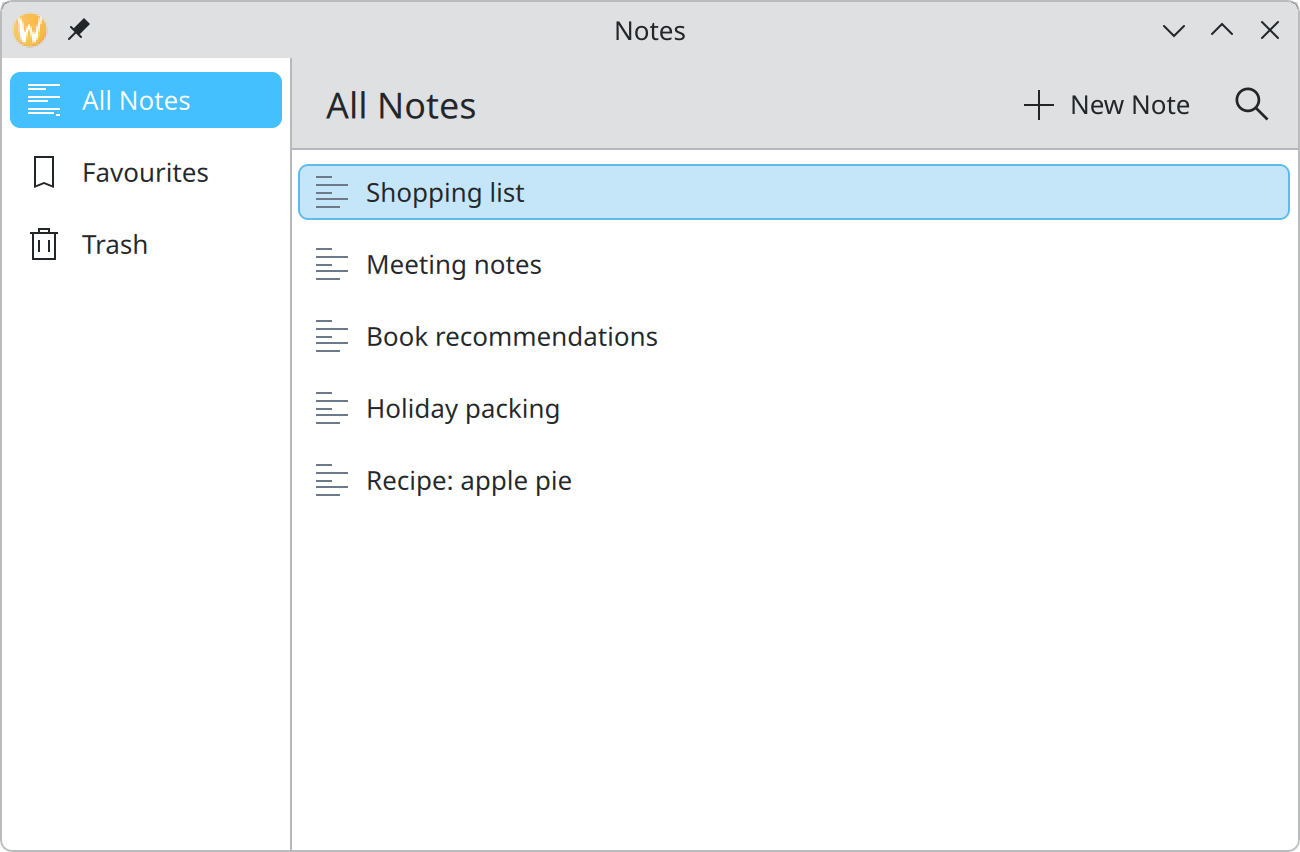
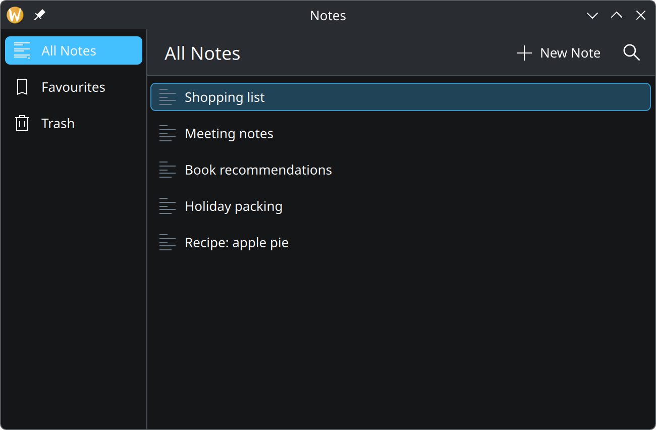
Headerset: slightly darker than the content, so the toolbar reads as chrome.Viewset: the brightest surface, for content.highlightColormarks the current destination.
Controls and pages pick their set for you. You only set one yourself when you draw your own surface:
Rectangle {
    // Use the View colours for this item and everything inside it.
    Kirigami.Theme.colorSet: Kirigami.Theme.View
    Kirigami.Theme.inherit: false

    color: Kirigami.Theme.backgroundColor
}Colour and meaning
Show the QML for this example
import QtQuick
import QtQuick.Layouts
import QtQuick.Controls as QQC2
import org.kde.kirigami as Kirigami

// Status colours always travel with an icon and words, never alone.
ColumnLayout {
    spacing: Kirigami.Units.smallSpacing

    Repeater {
        model: [
            { icon: "emblem-success", text: "Backup finished", color: Kirigami.Theme.positiveTextColor },
            { icon: "emblem-warning", text: "Battery is low", color: Kirigami.Theme.neutralTextColor },
            { icon: "emblem-error", text: "Could not connect", color: Kirigami.Theme.negativeTextColor },
            { icon: "emblem-information", text: "3 updates available", color: Kirigami.Theme.activeTextColor }
        ]

        RowLayout {
            required property var modelData
            spacing: Kirigami.Units.smallSpacing

            Kirigami.Icon {
                source: parent.modelData.icon
                implicitWidth: Kirigami.Units.iconSizes.small
                implicitHeight: Kirigami.Units.iconSizes.small
            }
            QQC2.Label {
                text: parent.modelData.text
                color: parent.modelData.color
            }
        }
    }
}- Use colour sparingly. A screen where many things are red or orange has no way left to signal a real problem.
- Never let colour be the only signal. Roughly one in twelve men cannot tell red from green reliably. Pair the colour with an icon, a shape or words, as in the picture above.
- Keep red for errors and destructive actions. Do not use it for decoration or for actions that lose nothing.
- Outline things that float. A popup or dialog over content needs a contrasting edge, because in dark schemes its background is nearly the same as what is behind it. Kirigami’s own dialogs and cards already do this.
Where this comes from
- KDE HIG: Communicating status changes (Color)
- KDE HIG: Displaying content
- Kirigami tutorial: Colors and themes
This page restates the upstream KDE documentation in plainer words and adds pictures. When the two disagree, upstream wins.