Patterns
Simple by default
The first of KDE’s two design principles. A new user should be able to do the main thing your app is for without reading, configuring or guessing.
KDE sums up its approach to design in one line: simple by default, powerful when needed. This page covers the first half. The second half is on Powerful when needed.
“Simple” here means that the common case, what most people do most of the time, is obvious and takes few steps. It does not mean leaving features out.
The first launch
An app that opens to an empty window has already lost some people. Show something to act on.
| Kind of app | What to show first |
|---|---|
| Creating things: a text editor, a drawing app | A blank document, ready to use |
| Viewing things: a video player, a PDF reader | A prompt to open a file, or recent files |
| Needing an account: chat, email | A prompt to sign in or create an account |
| A tool: a calculator, a clock | The tool itself, with no setup |
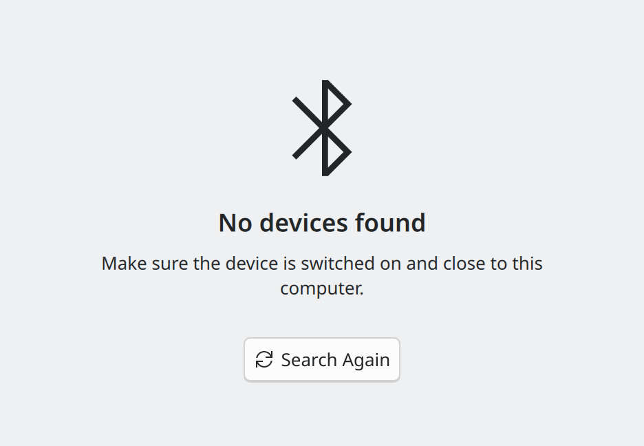
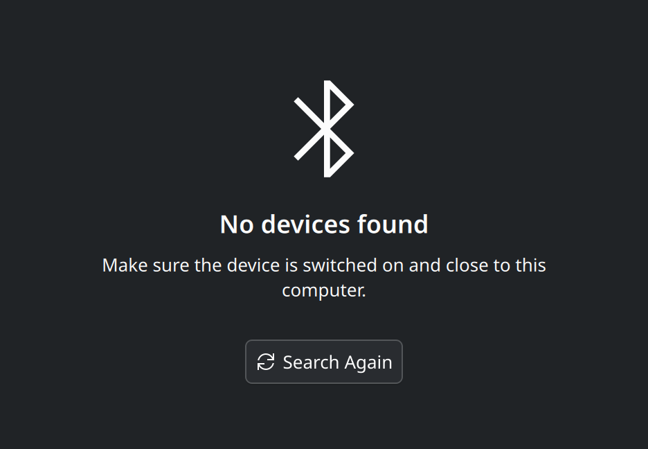
- Fill empty views with a placeholder message: an icon, a short explanation and, ideally, a button for the obvious next step.
- Explain unusual features in a sentence or two, in the placeholder or at the top of the page, not in a manual.
- Avoid setup wizards. A wizard is justified only in a complex app, and only for setup that is truly required before the app can work, or as an optional tour that can be skipped. Never use one to ask for preferences.
Shorten the common path
- Choose for the user when the choice is obvious. Preselect the device used last time. If there is only one option, skip the question.
- Use what you already know. If the clipboard holds an email address when a new message is started, fill it in.
- Edit in place. Rename an item where it stands, not in a separate dialog.
Show what matters, and only that
Keep the main actions visible and gather the rest behind one menu button.
Put every feature on the toolbar. When everything is visible, nothing stands out.
- Reduce button overload. Combine related buttons into one menu button, or move groups of controls to their own page.
- Let actions follow the content. Actions set on a page appear only while that page is shown, which keeps toolbars relevant without any effort.
- Never hide the main features behind a menu, a hover effect, a keyboard shortcut or a gesture. Whatever can only be reached that way must be something few people need.
Feel fast
- Show a progress indicator for anything that takes more than about a second.
- Keep launch time short. A tool that takes long to open is not simple to use.
Look and behave like the rest of the system
- Use the standard values: colours from the theme, distances and durations from the units, icons by name. Custom styling makes an app feel foreign and breaks with the user’s settings.
- Choose a default window size at which everything fits: no cut-off labels, no actions pushed into overflow menus.
- Quit when the window is closed. Do not linger as a system tray icon.
Be safe to explore
People try things. Make sure trying is cheap: move to the trash instead of deleting, offer undo, and keep destructive actions out of the way of ordinary ones. The details are on Feedback and status.
Remember, where it helps
| Remember | When |
|---|---|
| Window size | Always |
| Open documents, current view, scroll position | In project-based apps and document editors, where people return to the same work |
| Nothing but a list of recent files | In small tools and in viewers where each session opens something different, such as a video player |
Where this comes from
This page restates the upstream KDE documentation in plainer words and adds pictures. When the two disagree, upstream wins.