Components
Dialogs
A dialog interrupts the user to get a decision. Use one only when the app cannot continue without an answer.
Kirigami.PromptDialogKirigami.DialogKirigami.MenuDialogKirigami.OverlaySheet
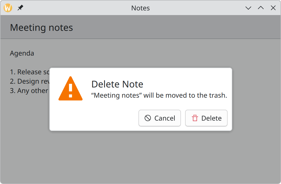
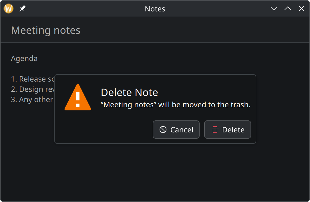
- Icon. Set by
dialogType; here a warning. - Title. Starts with a verb and names the action being confirmed.
- Subtitle. What exactly will happen, naming the thing affected.
- Buttons. A way out, and the action itself, labelled with the same verb as the title.
Kirigami.PromptDialog asking for confirmation.Show the QML for this example
import QtQuick
import QtQuick.Controls as QQC2
import org.kde.kirigami as Kirigami

Kirigami.ApplicationWindow {
    title: "Notes"
    width: Kirigami.Units.gridUnit * 30
    height: Kirigami.Units.gridUnit * 18

    pageStack.initialPage: Kirigami.Page {
        title: "Meeting notes"

        QQC2.Label {
            anchors.fill: parent
            wrapMode: Text.WordWrap
            text: "Agenda\n\n1. Release schedule\n2. Design review\n3. Any other business"
        }
    }

    Kirigami.PromptDialog {
        Component.onCompleted: open()

        title: "Delete Note"
        subtitle: "“Meeting notes” will be moved to the trash."
        dialogType: Kirigami.PromptDialog.Warning
        standardButtons: Kirigami.Dialog.Cancel

        customFooterActions: Kirigami.Action {
            text: "Delete"
            icon.name: "edit-delete"
        }
    }
}
Do you need a dialog?
A dialog stops everything until it is answered. That is appropriate only when the app needs an immediate decision, or must show the progress of a task that has to finish before work can continue.
| You want to… | Use |
|---|---|
| Show content that fills the window | Push a new page |
| Tell the user something without needing an answer | An inline message |
| Show extra read-only content that may scroll, such as details or a licence | Kirigami.OverlaySheet |
| Ask a yes-or-no question, or ask for one short value | Kirigami.PromptDialog |
| Offer a short list of actions to choose from | Kirigami.MenuDialog |
| Anything else that needs input in a popup | Kirigami.Dialog with your own content |
| Let the user choose a file or folder | FileDialog from QtQuick.Dialogs. Never build your own. |
Kirigami.OverlaySheet is for reading only. Do not put input fields in a sheet; use a dialog for input.
Writing a good dialog
Title the dialog with the action and label the button with the same verb. People can answer without reading the body.
Ask a generic question with Yes and No. The buttons mean nothing on their own, so every word must be read every time.
- The title starts with an imperative verb and repeats the control that opened the dialog: the menu item “Delete…” opens “Delete Note”. Titles use title case.
- Name the thing affected in the subtitle: “‘Meeting notes’ will be moved to the trash.”
- Always offer a way out that changes nothing: a Cancel button.
- Mark destructive buttons with the right icon, such as
edit-delete. See Icons. - Prefer undo to confirmation. If an action can be reversed, do it at once and offer “Undo” instead of asking first. Keep confirmation dialogs for what cannot be taken back.
In code
Declare the dialog once, and call open() on it when needed:
Kirigami.PromptDialog {
    id: deleteDialog

    title: "Delete Note"
    subtitle: "“Meeting notes” will be moved to the trash."
    dialogType: Kirigami.PromptDialog.Warning
    standardButtons: Kirigami.Dialog.Cancel

    customFooterActions: Kirigami.Action {
        text: "Delete"
        icon.name: "edit-delete"
        onTriggered: {
            notesModel.remove(currentNote)
            deleteDialog.close()
        }
    }
}

QQC2.Button {
    text: "Delete…"
    onClicked: deleteDialog.open()
}
Two kinds of buttons can go in the footer:
standardButtonsare ready-made, translated buttons such asKirigami.Dialog.Ok,Cancel,SaveorClose. Combine them with|. They fireonAcceptedoronRejectedand close the dialog.customFooterActionsare your own actions, for when a standard button does not say the right thing. A custom action does not close the dialog by itself.
To ask for one short value, put a text field inside a PromptDialog; it appears under the subtitle.
Properties you will use
Kirigami.Dialog (and everything based on it)
| Property | Type | What it does |
|---|---|---|
title |
string | Heading of the dialog. |
standardButtons |
flags | Ready-made footer buttons. |
customFooterActions |
list of actions | Your own footer buttons. |
showCloseButton |
bool | Shows a × in the corner. Default true. |
preferredWidth, preferredHeight |
number | Size the dialog would like to have. Use grid units. |
maximumWidth, maximumHeight |
number | Size the dialog will not exceed. It never grows past the window. |
onAccepted, onRejected |
handlers | Run when a standard button confirms or cancels. |
Extra on Kirigami.PromptDialog
| Property | Type | What it does |
|---|---|---|
subtitle |
string | The message under the title. |
dialogType |
enum | None (default), Information, Success, Warning or Error. Adds the matching icon. |
Kirigami.MenuDialog
| Property | Type | What it does |
|---|---|---|
actions |
list of actions | The choices, shown as a list. |
Where this comes from
- KDE HIG: Displaying content
- KDE HIG: Getting input
- KDE HIG: Text and labels
- Kirigami tutorial: Dialog types
This page restates the upstream KDE documentation in plainer words and adds pictures. When the two disagree, upstream wins.