Components
Form layout
FormLayout lines up labels and controls in two tidy columns, and rearranges them by itself when the window gets narrow.
Kirigami.FormLayoutKirigami.FormData
Settings pages and dialogs that ask for several values all share one look in KDE: labels on the left, aligned to
the right; controls on the right, aligned to the left; the whole block centred. Kirigami.FormLayout produces
this arrangement from a plain list of controls.
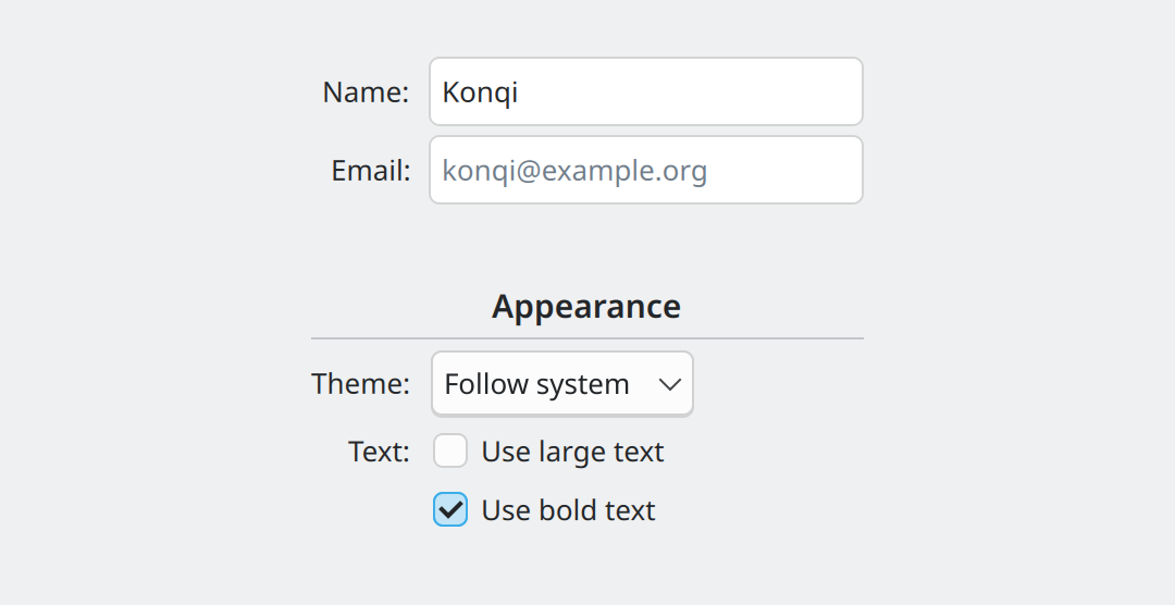
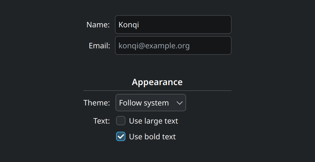
Show the QML for this example
import QtQuick
import QtQuick.Controls as QQC2
import org.kde.kirigami as Kirigami

Item {
    implicitWidth: Kirigami.Units.gridUnit * 28
    implicitHeight: form.implicitHeight + Kirigami.Units.largeSpacing * 2

    Kirigami.FormLayout {
        id: form
        anchors.fill: parent
        anchors.margins: Kirigami.Units.largeSpacing

        QQC2.TextField {
            Kirigami.FormData.label: "Name:"
            text: "Konqi"
        }
        QQC2.TextField {
            Kirigami.FormData.label: "Email:"
            placeholderText: "konqi@example.org"
        }

        Kirigami.Separator {
            Kirigami.FormData.isSection: true
            Kirigami.FormData.label: "Appearance"
        }

        QQC2.ComboBox {
            Kirigami.FormData.label: "Theme:"
            model: ["Follow system", "Light", "Dark"]
        }
        QQC2.CheckBox {
            Kirigami.FormData.label: "Text:"
            text: "Use large text"
        }
        QQC2.CheckBox {
            text: "Use bold text"
            checked: true
        }
    }
}
How it works
You put ordinary controls inside the FormLayout. On each one, you set an attached property to give it a label:
Kirigami.FormLayout {
    QQC2.TextField {
        Kirigami.FormData.label: "Name:"
    }
    QQC2.ComboBox {
        Kirigami.FormData.label: "Theme:"
        model: ["Follow system", "Light", "Dark"]
    }
}
Kirigami.FormData.label is not a property of the text field. It is a note attached to the text field that the
surrounding FormLayout reads. You never create the label yourself, and you never position anything.
Several controls under one label
A control without a label is placed in the control column, directly under the previous one. This is how the two checkboxes under “Text:” in the picture are made: only the first has a label.
Sections
To split a long form, add a Kirigami.Separator marked as a section. With a label it becomes a section heading;
without one it is simply extra space with a line.
Kirigami.Separator {
    Kirigami.FormData.isSection: true
    Kirigami.FormData.label: "Appearance"
}
Narrow windows
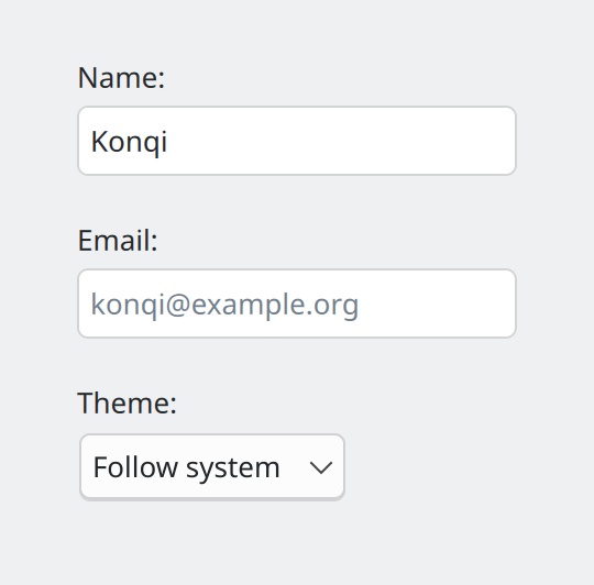
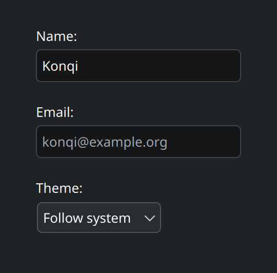
Show the QML for this example
import QtQuick
import QtQuick.Controls as QQC2
import org.kde.kirigami as Kirigami

// The same form in a narrow window: labels move above their controls.
Item {
    implicitWidth: Kirigami.Units.gridUnit * 13
    implicitHeight: form.implicitHeight + Kirigami.Units.largeSpacing * 2

    Kirigami.FormLayout {
        id: form
        anchors.fill: parent
        anchors.margins: Kirigami.Units.largeSpacing
        wideMode: false

        QQC2.TextField {
            Kirigami.FormData.label: "Name:"
            text: "Konqi"
        }
        QQC2.TextField {
            Kirigami.FormData.label: "Email:"
            placeholderText: "konqi@example.org"
        }
        QQC2.ComboBox {
            Kirigami.FormData.label: "Theme:"
            model: ["Follow system", "Light", "Dark"]
        }
    }
}
The switch happens automatically, based on the width the form is given. The property behind it is wideMode; you
can read it, or set it to force one arrangement.
Using forms well
- End labels with a colon and write them in sentence case: “Device name:”, not “Device Name”.
- Checkboxes and switches carry their own text. Put the sentence on the control (“Use large text”) and use the form label only for the group they belong to (“Text:”).
- Choose the control by the number of options:
| Options | Control |
|---|---|
| On or off, applied immediately | QQC2.Switch |
| On or off, otherwise | QQC2.CheckBox |
| Pick one of up to 3, short names | QQC2.RadioButton |
| Pick one of up to about 10 | QQC2.ComboBox |
| Pick one of more than 10 | A scrollable list |
| A rough amount, quickly | QQC2.Slider |
| An exact number | QQC2.SpinBox |
- Do not change a control’s label or icon when it is switched on. “Mute” that turns into “Unmute” leaves people unsure whether the text describes the state or the action.
- Order options logically (small to large, for example); if there is no natural order, alphabetically.
- Explain inline, briefly. A short sentence under a control is better than a tooltip, which touch users cannot
see. For longer help add a
Kirigami.ContextualHelpButtonnext to the control. - Check input as it is typed. If a value is invalid, show an inline message that says what is wrong, and disable the confirm button until it is fixed.
Properties you will use
Attached to each control: Kirigami.FormData
| Property | Type | What it does |
|---|---|---|
label |
string | The label shown beside (or above) the control. |
isSection |
bool | Marks the item as a section break; with a label, a section heading. |
buddyFor |
item | Which control gets focus when the label’s keyboard accelerator is used. Needed when the labelled item is a row holding several controls. |
labelAlignment |
alignment | Vertical position of the label next to a tall control, for example Qt.AlignTop beside a multi-line text area. |
On Kirigami.FormLayout
| Property | Type | What it does |
|---|---|---|
wideMode |
bool | true for two columns, false for labels above controls. Automatic by default. |
twinFormLayouts |
list | Other form layouts that should share this one’s column widths. |
Where this comes from
This page restates the upstream KDE documentation in plainer words and adds pictures. When the two disagree, upstream wins.