Patterns
Choosing controls
Which control to use for which kind of question, and how to explain a setting without cluttering the page.
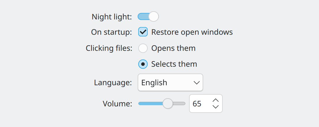
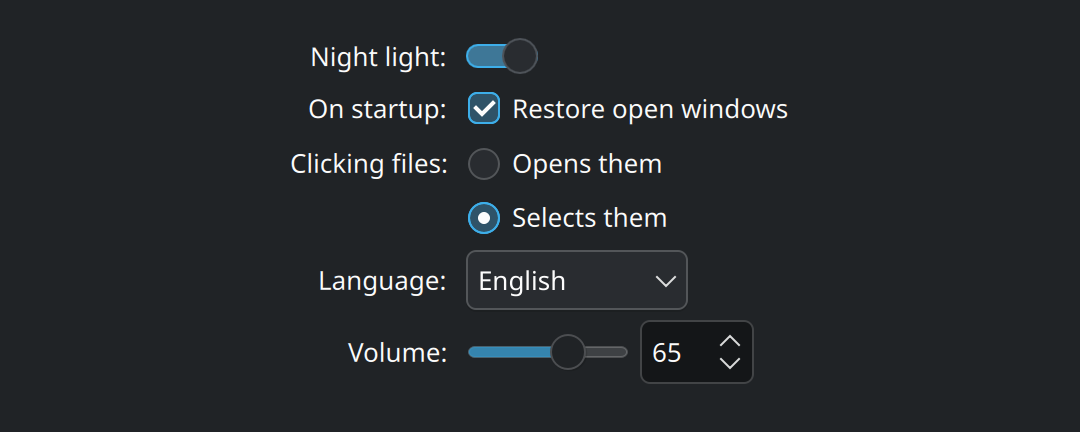
Show the QML for this example
import QtQuick
import QtQuick.Layouts
import QtQuick.Controls as QQC2
import org.kde.kirigami as Kirigami

Item {
    implicitWidth: Kirigami.Units.gridUnit * 28
    implicitHeight: form.implicitHeight

    Kirigami.FormLayout {
        id: form
        anchors.fill: parent

        QQC2.Switch {
            Kirigami.FormData.label: "Night light:"
            checked: true
        }

        QQC2.CheckBox {
            Kirigami.FormData.label: "On startup:"
            text: "Restore open windows"
            checked: true
        }

        ColumnLayout {
            Kirigami.FormData.label: "Clicking files:"
            Kirigami.FormData.buddyFor: firstRadio
            spacing: Kirigami.Units.smallSpacing

            QQC2.RadioButton {
                id: firstRadio
                text: "Opens them"
            }
            QQC2.RadioButton {
                text: "Selects them"
                checked: true
            }
        }

        QQC2.ComboBox {
            Kirigami.FormData.label: "Language:"
            model: ["English", "Deutsch", "Español", "Français", "日本語"]
        }

        RowLayout {
            Kirigami.FormData.label: "Volume:"
            Kirigami.FormData.buddyFor: volume
            spacing: Kirigami.Units.smallSpacing

            QQC2.Slider {
                id: volume
                from: 0
                to: 100
                value: 65
            }
            QQC2.SpinBox {
                from: 0
                to: 100
                value: volume.value
            }
        }
    }
}
The right control for the question
| The user is… | Use | Notes |
|---|---|---|
| Turning something on or off, effective at once | QQC2.Switch |
Flipping it is the action; there is no Apply. |
| Turning something on or off, otherwise | QQC2.CheckBox |
Also the right choice for ticking items in a list. |
| Picking one of two or three options | QQC2.RadioButton |
All options stay visible. Keep their texts short. |
| Picking one of up to about ten | QQC2.ComboBox |
|
| Picking one of more than ten | A scrollable list | A long drop-down is hard to scan and to scroll. |
| Setting a rough amount quickly | QQC2.Slider |
Volume, brightness, zoom. |
| Setting an exact number | QQC2.SpinBox |
|
| Both rough and exact | A slider followed by a spin box | As in the last row of the picture. |
| Typing text | A text field | |
| Picking a file or folder | FileDialog from QtQuick.Dialogs |
Never build your own file picker. |
Buttons
| Where | Use |
|---|---|
| On a toolbar | QQC2.ToolButton, or better, actions |
| Floating over content, one main action | QQC2.RoundButton, icon only |
| Everywhere else | QQC2.Button |
A button that opens a menu shows a small downward arrow. A button whose action needs more input before anything happens ends its label with an ellipsis: “Save As…”.
Rules that apply to all of them
☑ Mute notifications
Do
Keep the label fixed and let the control show the state.
Mute → Unmute
Don’t
Change a control’s label or icon when it is switched. Nobody can tell whether the text names the state or the action.
- Order options logically: smallest to largest, most to least common. When there is no natural order, sort alphabetically.
- Use web-style links only for web addresses. An underlined link opens something in the browser. Do not use one to move around inside your app; that is what buttons and list items are for.
- Check text as it is typed. If the input is not valid, say why in an inline message and disable the confirm button until it is.
- Apply settings at once. A changed setting should take effect immediately, without asking for a restart.
Explaining a control
Good labels need no explanation. When one is needed anyway, choose the lightest form that works:
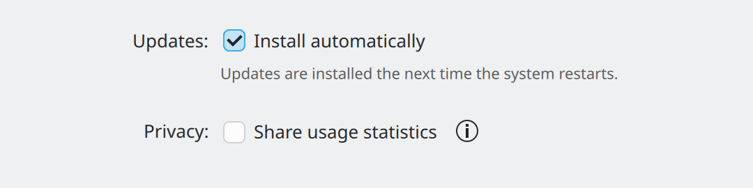
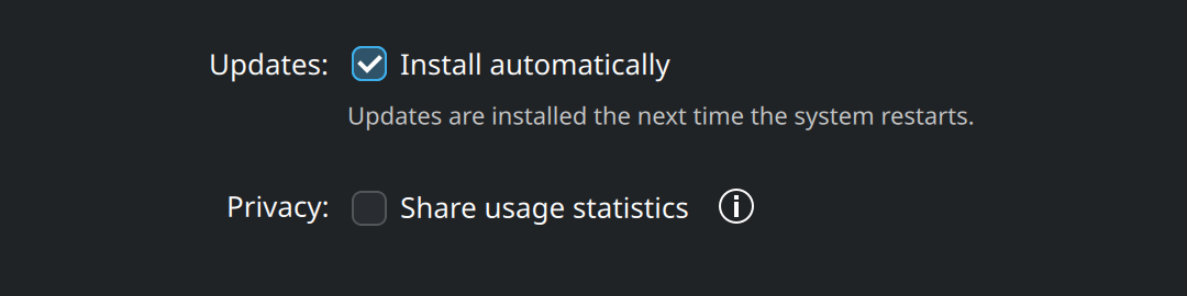
Show the QML for this example
import QtQuick
import QtQuick.Layouts
import QtQuick.Controls as QQC2
import org.kde.kirigami as Kirigami

Item {
    implicitWidth: Kirigami.Units.gridUnit * 28
    implicitHeight: form.implicitHeight

    Kirigami.FormLayout {
        id: form
        anchors.fill: parent

        // Short help: one sentence right under the control.
        QQC2.CheckBox {
            Kirigami.FormData.label: "Updates:"
            text: "Install automatically"
            checked: true
        }
        QQC2.Label {
            text: "Updates are installed the next time the system restarts."
            font: Kirigami.Theme.smallFont
            opacity: 0.75
        }

        Item {
            Kirigami.FormData.isSection: true
        }

        // Longer help: a help button that opens a popup.
        RowLayout {
            Kirigami.FormData.label: "Privacy:"
            spacing: Kirigami.Units.smallSpacing

            QQC2.CheckBox {
                text: "Share usage statistics"
            }
            Kirigami.ContextualHelpButton {
                toolTipText: "Anonymous numbers such as how often the app is opened. No file names or personal data are sent."
            }
        }
    }
}| The explanation is… | Use |
|---|---|
| One short sentence about one control | A label directly under the control |
| One or two sentences about the whole page | Text at the top of the page |
| Longer, and only some people need it | Kirigami.ContextualHelpButton beside the control |
| Much longer | A “Details” or “Show More” section, or a separate page |
RowLayout {
    Kirigami.FormData.label: "Privacy:"

    QQC2.CheckBox {
        text: "Share usage statistics"
    }
    Kirigami.ContextualHelpButton {
        toolTipText: "Anonymous numbers such as how often the app is opened."
    }
}
Where this comes from
- KDE HIG: Getting input
- KDE HIG: Displaying content
- Kirigami tutorial: Controls and interactive elements
This page restates the upstream KDE documentation in plainer words and adds pictures. When the two disagree, upstream wins.