Foundations
Spacing and units
Kirigami has a handful of named distances. Use them instead of pixel numbers and your layout stays consistent with every other KDE app.
Kirigami.Units
Spacing is what tells people which things belong together. Kirigami provides named distances in Kirigami.Units,
and the KDE guidelines say which one to use where. The values follow the user’s font and scaling settings, which
is why you should use the names and not the numbers.
The spacing units
smallSpacing4 px · between things that belong togethermediumSpacing6 px · between items in a toolbarlargeSpacing8 px · between groups, and around page contentgridUnit18 px · for sizes: widths, heights, window sizescornerRadius5 px · for rounded cornersThe bars are enlarged six times. Pixel values are those of a stock Plasma desktop with the default font.
Which unit goes where
| Between… | Use |
|---|---|
| A title and its subtitle | 0 |
| A title (with subtitle) and the content under it | Kirigami.Units.smallSpacing |
| Controls in the same logical group | Kirigami.Units.smallSpacing |
| Buttons and fields in a toolbar | Kirigami.Units.mediumSpacing |
| One group of controls and the next | Kirigami.Units.largeSpacing |
| The page edge and its content | Kirigami.Units.largeSpacing |
| The page edge and a frameless list or grid that fills the page | 0 |
The rule behind the table is simple: less space inside a group, more space between groups.
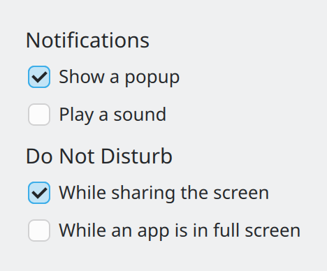
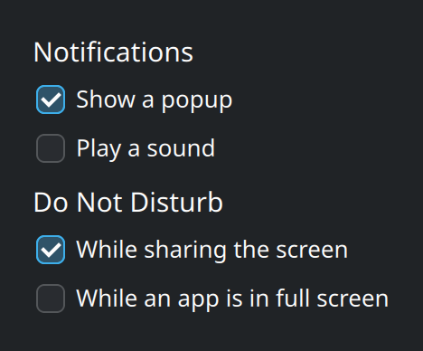
smallSpacing apart; the groups are largeSpacing apart. No lines or boxes are needed to see two groups.Show the QML for this example
import QtQuick
import QtQuick.Layouts
import QtQuick.Controls as QQC2
import org.kde.kirigami as Kirigami

// Related controls sit smallSpacing apart; groups sit largeSpacing apart.
ColumnLayout {
    spacing: Kirigami.Units.largeSpacing

    ColumnLayout {
        spacing: Kirigami.Units.smallSpacing

        Kirigami.Heading {
            text: "Notifications"
            level: 4
        }
        QQC2.CheckBox {
            text: "Show a popup"
            checked: true
        }
        QQC2.CheckBox {
            text: "Play a sound"
        }
    }

    ColumnLayout {
        spacing: Kirigami.Units.smallSpacing

        Kirigami.Heading {
            text: "Do Not Disturb"
            level: 4
        }
        QQC2.CheckBox {
            text: "While sharing the screen"
            checked: true
        }
        QQC2.CheckBox {
            text: "While an app is in full screen"
        }
    }
}
Sizes: gridUnit
For the size of things, use multiples of Kirigami.Units.gridUnit. One grid unit is about the height of a line of
text, so sizes expressed in it grow when the user picks a larger font.
Kirigami.Card {
    // About 20 lines of text wide, whatever the font size is.
    Layout.maximumWidth: Kirigami.Units.gridUnit * 20
}
Use it for fixed widths and heights, and for default and minimum window sizes. Do not use it for gaps between things; that is what the spacing units are for.
Icon sizes
Icons also come in fixed steps, under Kirigami.Units.iconSizes. They are covered on the
Icons page.
Durations
Animations use named durations too, so the whole desktop moves at one pace and respects the user’s animation speed setting. All values are in milliseconds.
| Unit | Stock value | Typical use |
|---|---|---|
Kirigami.Units.veryShortDuration |
50 | Tiny, instant-feeling changes. |
Kirigami.Units.shortDuration |
100 | Hover and press feedback. |
Kirigami.Units.longDuration |
200 | Things that move or appear: sheets, drawers, expanding sections. |
Kirigami.Units.veryLongDuration |
400 | Large movements across the window. |
Kirigami.Units.toolTipDelay |
700 | How long the pointer rests before a tooltip shows. |
Kirigami.Units.humanMoment |
2000 | How long before a person notices they are waiting. |
Behavior on opacity {
    NumberAnimation { duration: Kirigami.Units.longDuration }
}
Where this comes from
This page restates the upstream KDE documentation in plainer words and adds pictures. When the two disagree, upstream wins.