Start here
Introduction
What this guide is, how its pages are laid out, and the two imports every example uses.
KDE’s design advice is spread over several places: the Human Interface Guidelines say what a good KDE app looks like, the Kirigami tutorial shows how to build one, and the API reference lists every property. This guide joins the three. Each page explains one topic in plain words, shows what it looks like, and gives you code you can copy.
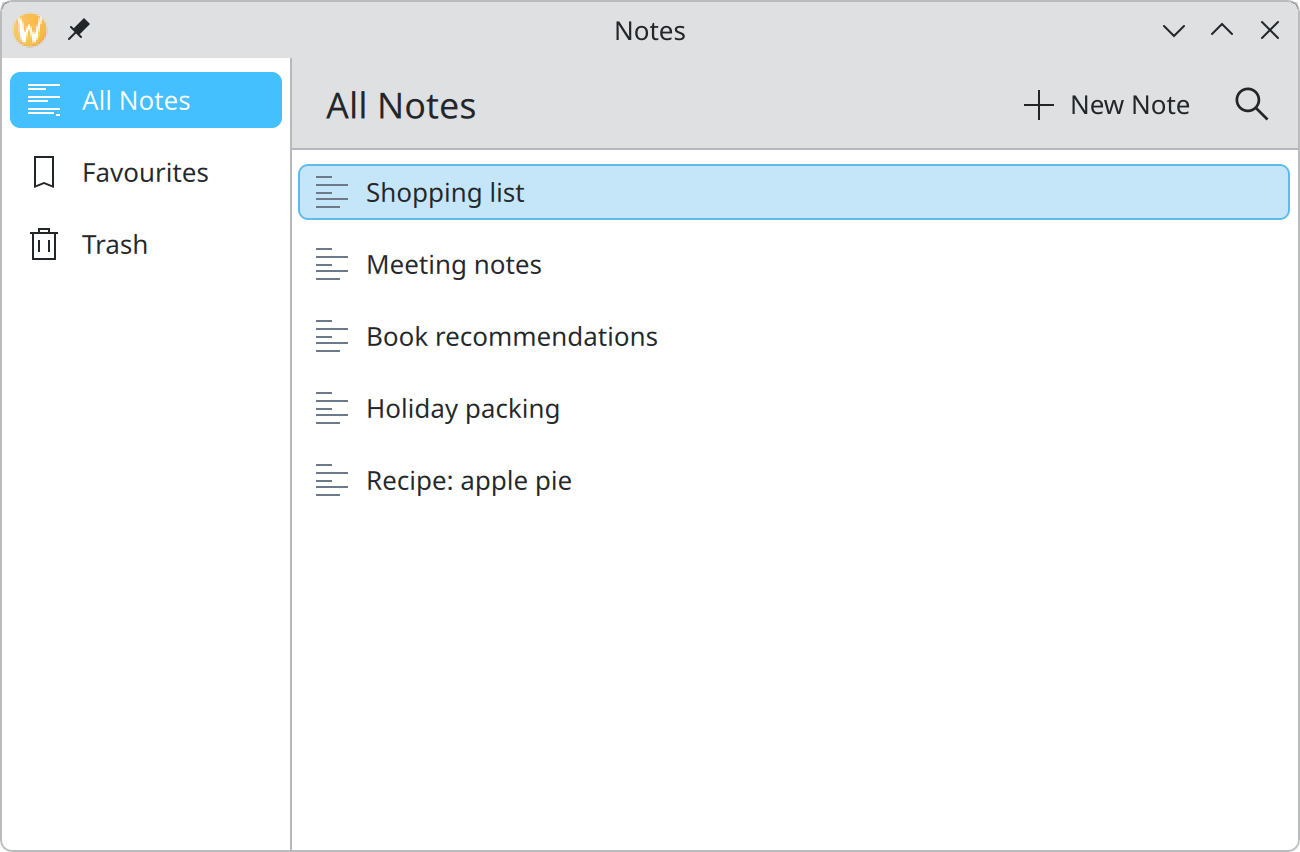
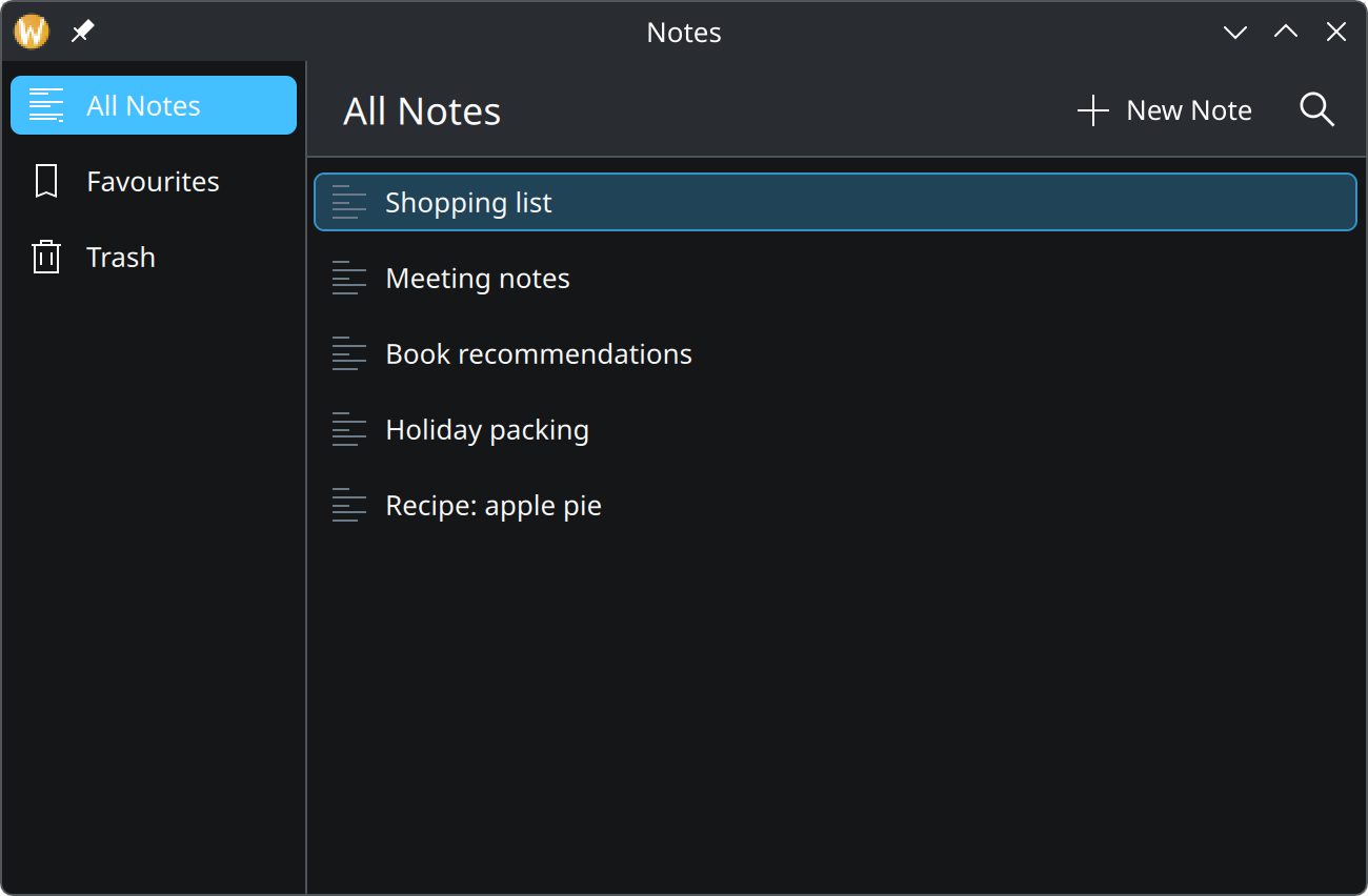
- The sidebar is a
GlobalDrawer, described in Pages. - The title belongs to the page; its size comes from the type scale.
- Buttons in the header are actions.
- Colours and spacing in the content come from the theme and the units.
Show the QML for this example
import QtQuick
import QtQuick.Controls as QQC2
import org.kde.kirigami as Kirigami

Kirigami.ApplicationWindow {
    title: "Notes"
    width: Kirigami.Units.gridUnit * 36
    height: Kirigami.Units.gridUnit * 22

    globalDrawer: Kirigami.GlobalDrawer {
        modal: false
        actions: [
            Kirigami.Action {
                text: "All Notes"
                icon.name: "view-list-text"
                checked: true
            },
            Kirigami.Action {
                text: "Favourites"
                icon.name: "bookmarks"
            },
            Kirigami.Action {
                text: "Trash"
                icon.name: "user-trash"
            }
        ]
    }

    pageStack.initialPage: Kirigami.ScrollablePage {
        title: "All Notes"

        actions: [
            Kirigami.Action {
                text: "New Note"
                icon.name: "list-add"
            },
            Kirigami.Action {
                text: "Search"
                icon.name: "search"
                displayHint: Kirigami.DisplayHint.IconOnly
            }
        ]

        ListView {
            model: ["Shopping list", "Meeting notes", "Book recommendations", "Holiday packing", "Recipe: apple pie"]

            delegate: QQC2.ItemDelegate {
                required property string modelData

                width: ListView.view.width
                text: modelData
                icon.name: "text-x-generic"
            }
        }
    }
}
The idea behind KDE design
KDE states its design principle in one line: simple by default, powerful when needed. The common task should be obvious to someone opening the app for the first time, and the depth should be there, one deliberate step away, for those who go looking. Two pages cover the halves: Simple by default and Powerful when needed.
For new apps KDE recommends Qt Quick with Kirigami, which is what this guide documents. Kirigami is convergent: one interface that reshapes itself for desktop, tablet and phone.
The sections
- Foundations: colour, spacing, type and icons. The values everything else is built from.
- Patterns: how to solve problems every app has, such as navigation, lists, settings and feedback. Start here when you are deciding what to build.
- Components: the building blocks, one per page. Go here when you know what you need and want to use it correctly.
- Tutorial: build a small to-do app step by step. The quickest way to see how the pieces fit together; start with What we will build.
How component pages are laid out
Every component page follows the same order, so you can skim:
- What it is. A sentence or two and a picture.
- When to use it, and when to pick something else.
- How to use it well. Rules, shown as do and don’t pairs where a picture helps.
- In code. A short example, then a table of the properties you will actually reach for.
Screenshots are not drawings. They are produced by running the QML shown under each picture against Kirigami and the Breeze style, once with the light and once with the dark colour scheme. Switch the theme of this site with the button in the top right corner and the screenshots switch with it.
The two imports
Almost every example starts with the same lines:
import QtQuick
import QtQuick.Controls as QQC2
import org.kde.kirigami as KirigamiQQC2is Qt Quick Controls: buttons, checkboxes, text fields, labels. KDE styles them to look like Breeze, so you use them directly.Kirigamiadds what an app needs on top: pages and navigation, cards, forms, messages, and the theme values for colour and spacing.
When this guide writes Kirigami.Card or QQC2.Button, those prefixes are the ones from these imports.
Trying an example
Examples whose QML starts with an ordinary item can be run as they are. Save the code as example.qml and run:
qml6 example.qmlTo see how the same code behaves on a phone, set one environment variable first:
QT_QUICK_CONTROLS_MOBILE=1 qml6 example.qmlWhere this comes from
This page restates the upstream KDE documentation in plainer words and adds pictures. When the two disagree, upstream wins.