Components
Navigation tab bar
A row of labelled icons for switching between the few main places of an app. On a phone it sits at the bottom, within reach of a thumb.
Kirigami.NavigationTabBar
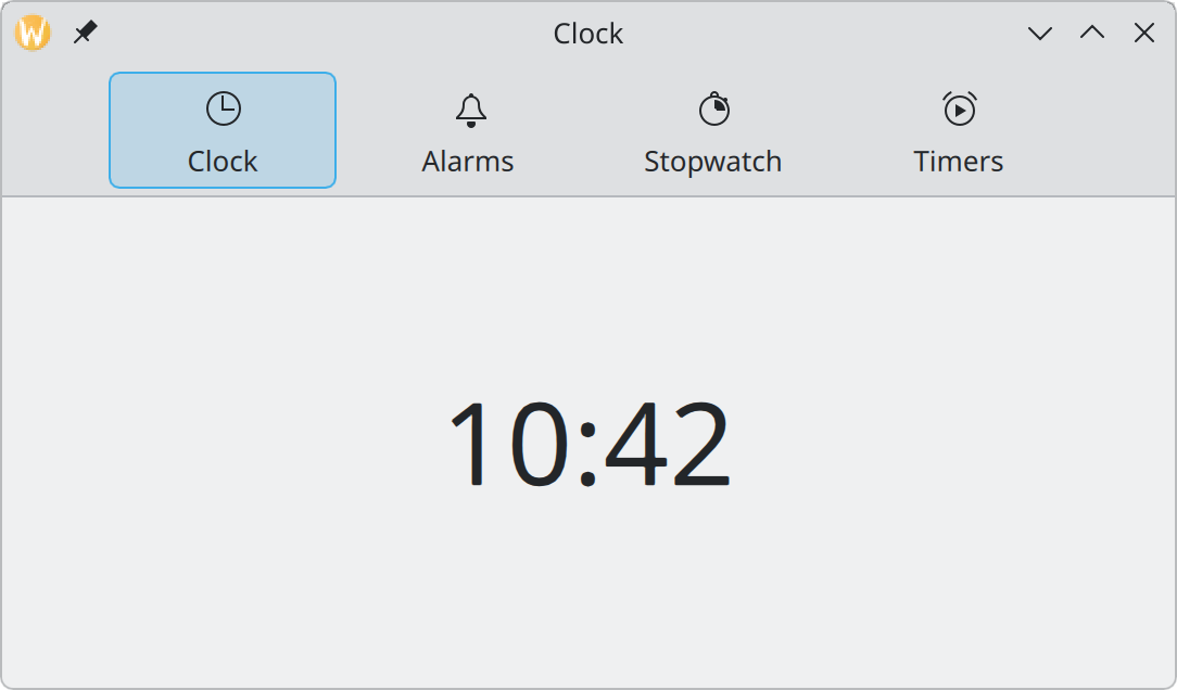
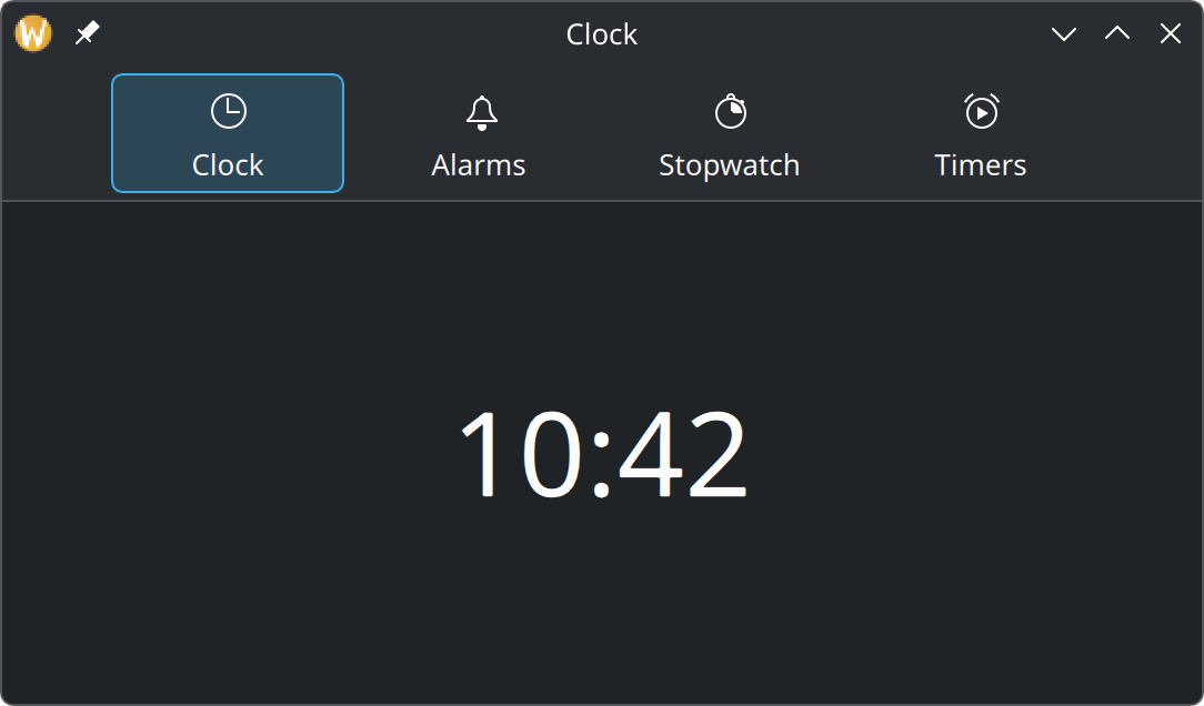
Show the QML for this example
import QtQuick
import QtQuick.Controls as QQC2
import org.kde.kirigami as Kirigami

Kirigami.ApplicationWindow {
    title: "Clock"
    width: Kirigami.Units.gridUnit * 30
    height: Kirigami.Units.gridUnit * 16

    header: Kirigami.NavigationTabBar {
        actions: [
            Kirigami.Action {
                text: "Clock"
                icon.name: "clock"
                checked: true
            },
            Kirigami.Action {
                text: "Alarms"
                icon.name: "notifications"
            },
            Kirigami.Action {
                text: "Stopwatch"
                icon.name: "chronometer"
            },
            Kirigami.Action {
                text: "Timers"
                icon.name: "player-time"
            }
        ]
    }

    pageStack.globalToolBar.style: Kirigami.ApplicationHeaderStyle.None
    pageStack.initialPage: Kirigami.Page {
        Kirigami.Heading {
            anchors.centerIn: parent
            text: "10:42"
            level: 1
            font.pointSize: 40
        }
    }
}
When to use it
Use a navigation tab bar when your app has two to five top-level places of equal standing, and people switch between them often.
| Situation | Use instead |
|---|---|
| More than five places | A sidebar: see Drawers |
| Places that are steps of one flow | The page stack: see Pages |
| Tabs the user opens and closes, like browser tabs | QQC2.TabBar: see Showing collections |
| Actions (“New”, “Share”) | A toolbar: see Actions and toolbars |
A tab bar is for going somewhere. Every tab should show a different view; none should do something.
Where it goes
| Device | Position | Set it as the window’s |
|---|---|---|
| Desktop | Above the content | header |
| Phone | Below the content | footer |
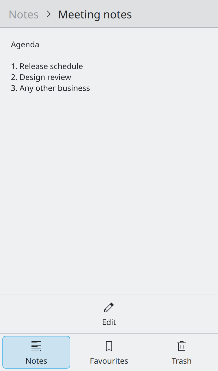
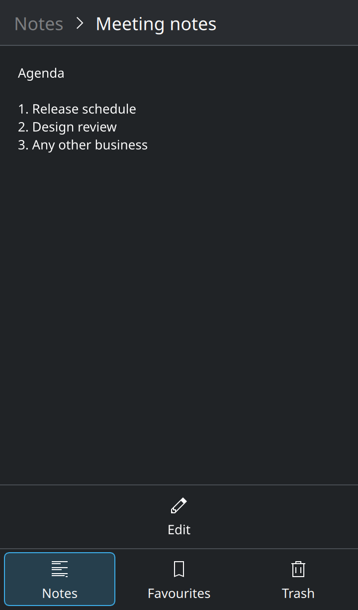
Kirigami.ApplicationWindow {
    // On a phone, assign it to `footer` instead.
    header: Kirigami.NavigationTabBar {
        actions: [
            Kirigami.Action {
                text: "Clock"
                icon.name: "clock"
                checked: true
                onTriggered: pageStack.replace(clockPage)
            },
            Kirigami.Action {
                text: "Alarms"
                icon.name: "notifications"
                onTriggered: pageStack.replace(alarmsPage)
            }
        ]
    }
}
Each tab is an action. The tab bar keeps exactly one of them checked. Switching tabs replaces the current page; it does not push a new one on top, because tabs are siblings, not steps.
Using it well
- Show the launch view as the first tab.
- One or two words per tab, in title case, with a distinct icon each.
- Keep the set fixed. Tabs that appear and disappear make people lose their bearings.
- Do not combine it with a sidebar for the same level of navigation. Pick one.
Properties you will use
| Property | Type | What it does |
|---|---|---|
actions |
list of actions | One per tab. Needs text and icon.name. |
currentIndex |
int | Index of the selected tab. |
maximumContentWidth |
number | On wide windows, keeps the tabs together in the middle instead of spreading across the full width. |
Where this comes from
This page restates the upstream KDE documentation in plainer words and adds pictures. When the two disagree, upstream wins.