Components
Chips
Small rounded labels for the tags, filters or properties attached to something.
Kirigami.Chip
A chip is a compact label with a frame. Chips come in groups: the tags on a photo, the filters applied to a list, the recipients of a message.
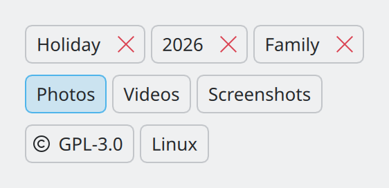
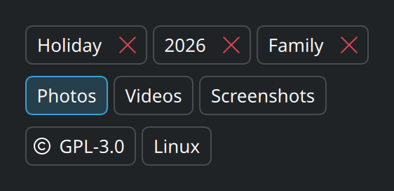
Show the QML for this example
import QtQuick
import QtQuick.Layouts
import QtQuick.Controls as QQC2
import org.kde.kirigami as Kirigami

ColumnLayout {
    spacing: Kirigami.Units.largeSpacing

    // Removable: tags the user added.
    RowLayout {
        spacing: Kirigami.Units.smallSpacing

        Repeater {
            model: ["Holiday", "2026", "Family"]
            Kirigami.Chip {
                required property string modelData
                text: modelData
            }
        }
    }

    // Toggles: filters that can be switched on and off.
    RowLayout {
        spacing: Kirigami.Units.smallSpacing

        Kirigami.Chip {
            text: "Photos"
            closable: false
            checkable: true
            checked: true
        }
        Kirigami.Chip {
            text: "Videos"
            closable: false
            checkable: true
        }
        Kirigami.Chip {
            text: "Screenshots"
            closable: false
            checkable: true
        }
    }

    // Read-only: properties that are simply shown.
    RowLayout {
        spacing: Kirigami.Units.smallSpacing

        Kirigami.Chip {
            text: "GPL-3.0"
            icon.name: "license"
            closable: false
            interactive: false
        }
        Kirigami.Chip {
            text: "Linux"
            closable: false
            interactive: false
        }
    }
}
Three kinds
| Kind | What the user can do | Set |
|---|---|---|
| Removable | Remove it with the × | Nothing; this is the default |
| Toggle | Switch it on and off | closable: false and checkable: true |
| Read-only | Only read it | closable: false and interactive: false |
When to use chips
- Tags and labels that the user adds and removes.
- Filters for a list or a search: a row of toggles above the results.
- A few properties of an item worth showing at a glance: licence, platform, category.
Do not use chips for actions. “Save” is a button, not a chip. And do not use a single toggle chip for a setting; that is a checkbox or switch. See Choosing controls.
In code
Chips are almost always generated from a list, with a Repeater:
Flow {
    spacing: Kirigami.Units.smallSpacing

    Repeater {
        model: tagsModel

        Kirigami.Chip {
            required property string name
            required property int index

            text: name
            onRemoved: tagsModel.remove(index)
        }
    }
}
Put them in a Flow, as here, so that they wrap onto another line when the window is narrow.
Using chips well
- Keep the text to a word or two.
- Space them
smallSpacingapart; they belong together. - Do not mix kinds in one group. A row where some chips toggle and others can be removed is confusing.
- If there can be many, think about how the group looks with thirty of them, and whether a list would serve better.
Properties you will use
| Property | Type | What it does |
|---|---|---|
text |
string | The label. |
icon.name |
string | Optional icon before the label. |
closable |
bool | Show the remove button. Default true. |
onRemoved |
handler | Runs when the remove button is clicked. |
checkable, checked |
bool | Make the chip a toggle, and its state. |
interactive |
bool | false makes the chip a plain label that does not react to the pointer. Default true. |
onClicked |
handler | Runs when the chip itself is clicked. |
Where this comes from
This page restates the upstream KDE documentation in plainer words and adds pictures. When the two disagree, upstream wins.