Tutorial: a to-do app
3. Adding tasks
A field above the list where a task can be typed and added with Enter or a click.
Kirigami.ActionTextFieldKirigami.Action
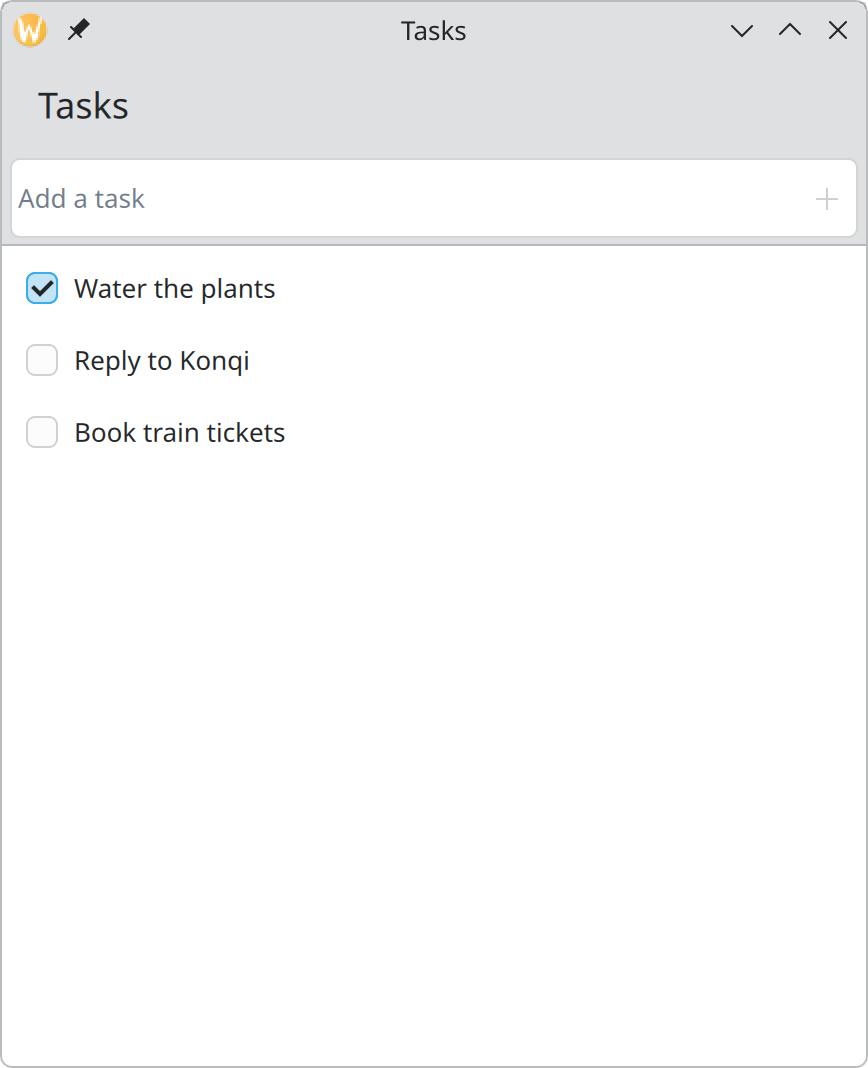
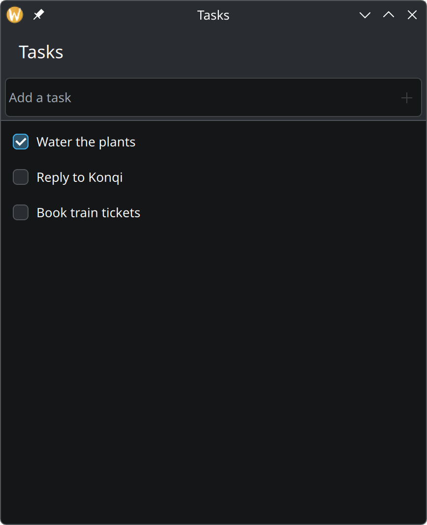
Show the complete main.qml for this step
import QtQuick
import QtQuick.Controls as QQC2
import org.kde.kirigami as Kirigami

Kirigami.ApplicationWindow {
    id: root

    title: "Tasks"
    width: Kirigami.Units.gridUnit * 24
    height: Kirigami.Units.gridUnit * 28

    ListModel {
        id: tasksModel

        ListElement { title: "Water the plants"; done: true }
        ListElement { title: "Reply to Konqi"; done: false }
        ListElement { title: "Book train tickets"; done: false }
    }

    function addTask(title: string): void {
        const trimmed = title.trim()
        if (trimmed.length > 0) {
            tasksModel.append({ title: trimmed, done: false })
        }
    }

    pageStack.initialPage: Kirigami.ScrollablePage {
        title: "Tasks"

        // Stays in place above the list while the list scrolls.
        header: QQC2.ToolBar {
            contentItem: Kirigami.ActionTextField {
                id: newTaskField

                placeholderText: "Add a task"
                onAccepted: {
                    root.addTask(text)
                    clear()
                }

                rightActions: Kirigami.Action {
                    text: "Add Task"
                    icon.name: "list-add"
                    enabled: newTaskField.text.trim().length > 0
                    onTriggered: newTaskField.accepted()
                }
            }
        }

        ListView {
            model: tasksModel
            // Rows are ticked, not selected, so none is marked as current.
            currentIndex: -1

            delegate: QQC2.CheckDelegate {
                required property string title
                required property bool done

                width: ListView.view.width
                text: title
                checked: done
            }
        }
    }
}
A function that adds a task
Add this to the window, below the model:
function addTask(title: string): void {
    const trimmed = title.trim()
    if (trimmed.length > 0) {
        tasksModel.append({ title: trimmed, done: false })
    }
}
trim() removes spaces at both ends, and the if refuses to add a task that has no text. Because of this
check, nothing else in the app has to worry about empty tasks. The list updates by itself when the model changes;
you never tell the view to refresh.
The entry field
Give the page a header, above the ListView:
header: QQC2.ToolBar {
    contentItem: Kirigami.ActionTextField {
        id: newTaskField

        placeholderText: "Add a task"
        onAccepted: {
            root.addTask(text)
            clear()
        }

        rightActions: Kirigami.Action {
            text: "Add Task"
            icon.name: "list-add"
            enabled: newTaskField.text.trim().length > 0
            onTriggered: newTaskField.accepted()
        }
    }
}headeris a slot every page has. What you put there stays in place while the content scrolls, which is what we want: the field should be reachable however long the list gets.Kirigami.ActionTextFieldis a text field that can hold small buttons inside its frame. See Text fields.onAcceptedruns when Enter is pressed. It hands the text to our function and empties the field, ready for the next task.rightActionsadds the + button for people who prefer to click, and for touch screens. It does the same thing as Enter by firing the field’s ownacceptedsignal, so there is only one code path.enabledgreys the button out while there is nothing to add.
Why these choices
- The placeholder is a short instruction in sentence case, with no ellipsis, because the field has no label in front of it. See Typography and wording.
- The button has a
textalthough only its icon shows. It is what a screen reader announces and what appears as the tooltip. See Actions and toolbars. - The button is disabled, not hidden, when it cannot be used. Controls that come and go are harder to learn.
Try it
Type a few tasks and press Enter after each. Try adding only spaces: nothing happens.