Components
Text fields
Kirigami adds three specialised text fields to the standard one, for searching, for passwords, and for fields with a built-in button.
Kirigami.SearchFieldKirigami.PasswordFieldKirigami.ActionTextFieldQQC2.TextField
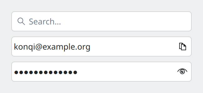
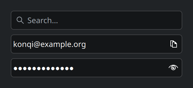
SearchField, ActionTextField and PasswordField.Show the QML for this example
import QtQuick
import QtQuick.Layouts
import QtQuick.Controls as QQC2
import org.kde.kirigami as Kirigami

ColumnLayout {
    width: Kirigami.Units.gridUnit * 16
    spacing: Kirigami.Units.largeSpacing

    Kirigami.SearchField {
        Layout.fillWidth: true
    }

    Kirigami.ActionTextField {
        Layout.fillWidth: true
        text: "konqi@example.org"

        rightActions: Kirigami.Action {
            icon.name: "edit-copy"
            text: "Copy"
        }
    }

    Kirigami.PasswordField {
        Layout.fillWidth: true
        text: "correct horse"
    }
}
Which field
| For… | Use |
|---|---|
| Ordinary text | QQC2.TextField; QQC2.TextArea for several lines |
| Searching or filtering | Kirigami.SearchField |
| A password | Kirigami.PasswordField |
| Text plus a small button that acts on it | Kirigami.ActionTextField |
Search field
Always use Kirigami.SearchField for search. It brings what people expect from search everywhere in KDE: the
magnifying-glass icon, a translated “Search…” placeholder, a clear button once there is text, and the standard
Find shortcut (Ctrl+F) to jump into it.
Kirigami.SearchField {
    onAccepted: notesModel.filter = text
}
You do not need to listen to every key press. By default the field fires accepted by itself shortly after
the user stops typing, so results update live without running a search for each letter.
- If searching is slow or expensive, set
delaySearch: trueto wait longer before firing. - If search should run only when Enter is pressed, set
autoAccept: false.
A common place for a search field is the top of a list or the header of a sidebar.
Password field
Kirigami.PasswordField hides what is typed and offers a button to reveal it, which helps people catch
typing mistakes before submitting. Do not build this from a plain text field.
Field with actions
Kirigami.ActionTextField is a text field that can hold small icon buttons inside its frame, at either end.
The search and password fields are built on it.
Kirigami.ActionTextField {
    id: addressField
    text: "konqi@example.org"

    rightActions: Kirigami.Action {
        icon.name: "edit-copy"
        text: "Copy"
        onTriggered: {
            addressField.selectAll()
            addressField.copy()
        }
    }
}
Use it for one or two actions that belong to the field’s content: copy, clear, paste, pick from a list. Give each
action a text as well as an icon; it becomes the tooltip and the name read by screen readers.
Using text fields well
- Label fields with a label in front, using a form layout. A placeholder is not a label: it vanishes as soon as typing starts.
- Placeholder text depends on whether there is a label. With a label, show an example value (“konqi@example.org”). Without one, use a short instruction (“Enter file name”). Sentence case, no trailing ellipsis.
- Validate while typing, not after submitting. Explain a problem in an inline message and keep the confirm button disabled until the input is valid.
- Size the field for its content. A postcode field should not be as wide as an address field.
Properties you will use
Kirigami.SearchField
| Property | Type | What it does |
|---|---|---|
text |
string | What has been typed. |
onAccepted |
handler | Runs when a search should happen. |
autoAccept |
bool | Fire accepted automatically after typing pauses. Default true. |
delaySearch |
bool | Wait longer before firing, for expensive searches. Default false. |
Kirigami.PasswordField
| Property | Type | What it does |
|---|---|---|
text |
string | The password. |
showPassword |
bool | Whether the text is currently readable. Default false. |
Kirigami.ActionTextField
| Property | Type | What it does |
|---|---|---|
leftActions |
list of actions | Buttons at the leading end, inside the field. |
rightActions |
list of actions | Buttons at the trailing end, inside the field. |
focusSequence |
key sequence | A shortcut that moves keyboard focus into the field. |
placeholderText |
string | Hint shown while the field is empty. |
Where this comes from
This page restates the upstream KDE documentation in plainer words and adds pictures. When the two disagree, upstream wins.