Patterns
Showing collections
Lists, grids, tables and tabs all show many things at once. Which one fits depends on what the things are.
List, grid or table?
| The items are… | Use | Built with |
|---|---|---|
| Mostly text: names, messages, settings | A list | ListView and list items |
| Mostly visual: photos, covers, apps | A grid, or cards | GridView, Kirigami.CardsLayout |
| Records with three or more fields worth comparing | A table | TableView |
If you are tempted to make a table with two columns, make a list with a title and a subtitle instead.
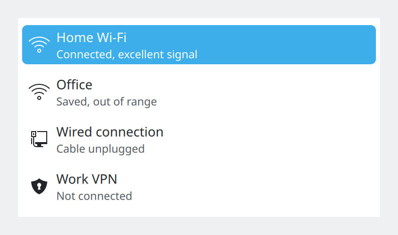
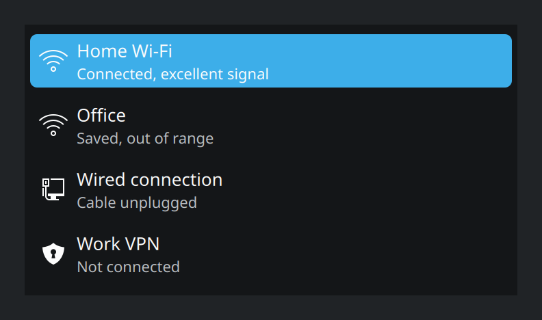
Show the QML for this example
import QtQuick
import QtQuick.Controls as QQC2
import org.kde.kirigami as Kirigami
import org.kde.kirigami.delegates as KD

// Two lines per item: a title and a quieter subtitle.
QQC2.ScrollView {
    width: Kirigami.Units.gridUnit * 20
    height: Kirigami.Units.gridUnit * 11

    Kirigami.Theme.colorSet: Kirigami.Theme.View
    Kirigami.Theme.inherit: false
    background: Rectangle {
        color: Kirigami.Theme.backgroundColor
    }

    ListView {
        currentIndex: 0

        model: ListModel {
            ListElement { name: "Home Wi-Fi"; detail: "Connected, excellent signal"; glyph: "network-wireless" }
            ListElement { name: "Office"; detail: "Saved, out of range"; glyph: "network-wireless" }
            ListElement { name: "Wired connection"; detail: "Cable unplugged"; glyph: "network-wired" }
            ListElement { name: "Work VPN"; detail: "Not connected"; glyph: "network-vpn" }
        }

        delegate: KD.SubtitleDelegate {
            required property string name
            required property string detail
            required property string glyph

            width: ListView.view.width
            text: name
            subtitle: detail
            icon.name: glyph
            highlighted: ListView.isCurrentItem
        }
    }
}
Avoid trees
Tree views, with rows that expand into indented child rows, are hard to use with touch and easy to get lost in. Prefer a list with section headers, a list that pushes a new page, or collapsible sections.
Making lists easy to scan
- Make the selected or active item stand out. The highlight colour marks the current row; bold text marks the item that is in use, such as the connected network or the playing track.
- Vary the icons, or leave them out. A column of identical icons tells nobody anything.
- Striped rows help the eye in wide lists and tables. Turn them on with
Kirigami.Theme.useAlternateBackgroundColor: trueon the view; do not paint them yourself. - Group long lists under section headers.
Adding and removing items
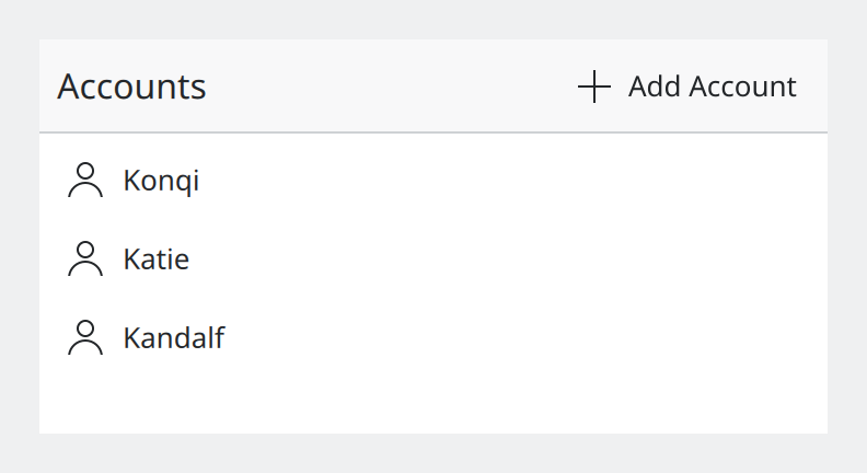
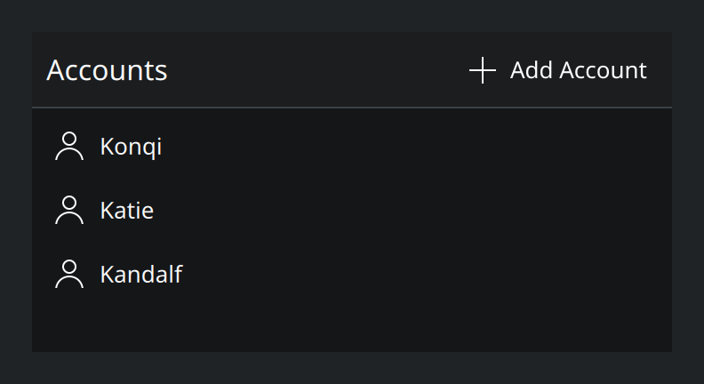
Show the QML for this example
import QtQuick
import QtQuick.Controls as QQC2
import org.kde.kirigami as Kirigami

// Controls for the list itself sit in a header that belongs to the list.
QQC2.ScrollView {
    width: Kirigami.Units.gridUnit * 20
    height: Kirigami.Units.gridUnit * 10

    Kirigami.Theme.colorSet: Kirigami.Theme.View
    Kirigami.Theme.inherit: false
    background: Rectangle {
        color: Kirigami.Theme.backgroundColor
    }

    ListView {
        currentIndex: -1
        model: ["Konqi", "Katie", "Kandalf"]

        headerPositioning: ListView.OverlayHeader
        header: Kirigami.InlineViewHeader {
            width: ListView.view.width
            text: "Accounts"
            actions: [
                Kirigami.Action {
                    text: "Add Account"
                    icon.name: "list-add"
                }
            ]
        }

        delegate: QQC2.ItemDelegate {
            required property string modelData

            width: ListView.view.width
            text: modelData
            icon.name: "user"
        }
    }
}- Controls that add to a list belong to the list. Put them in a
Kirigami.InlineViewHeaderat the top of the view, not far away in the window’s toolbar. - Controls that act on one row go on that row, at its trailing end, as icon-only buttons. Keep them always visible; a button that appears only on hover does not exist for touch users. Use at most two per row, and preferably none or one.
- Removing should be easy to undo. See Feedback and status.
Tabs
There are two kinds of tabs and they should not be confused.
| Kind | What the tabs are | Component | Placement |
|---|---|---|---|
| Navigation tabs | The fixed places of your app | Kirigami.NavigationTabBar |
Above content on desktop, below on phones |
| Document tabs | Things the user opened: web pages, files, chats | QQC2.TabBar |
Above the content, full width |
Document tabs can be closed and reordered by the user, so each needs a close button. Hide the tab bar when only one tab is open.
Tabs do not scale. As a way to split one view into sections they stop working beyond four or five tabs on a desktop, and two on a phone. If you have more, use a list that leads to pages.
Showing extra detail
| The detail is… | Show it… |
|---|---|
| Large enough to fill the window | On a new page |
| Read-only and possibly long | In an overlay sheet |
| A question or a small form | In a dialog |
Anything that floats over the content needs a visible edge, so it does not melt into the background in dark colour schemes. Kirigami’s own sheets, dialogs and cards have one.
Where this comes from
This page restates the upstream KDE documentation in plainer words and adds pictures. When the two disagree, upstream wins.