Design KDE apps that feel at home.
The KDE and Kirigami design guidance in one place, in plain language, with a real screenshot next to every rule and component.
Start readingBrowse components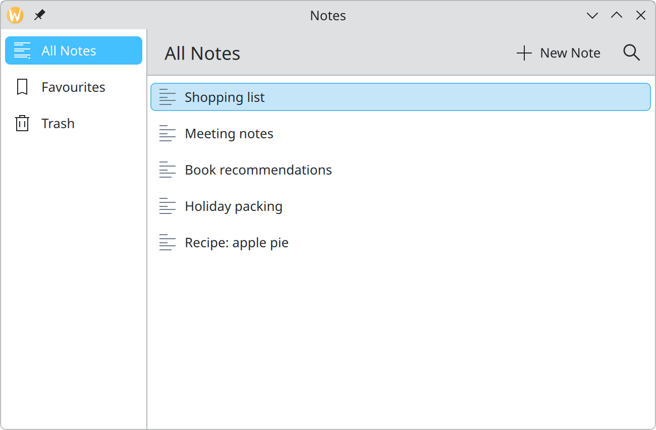
Start here
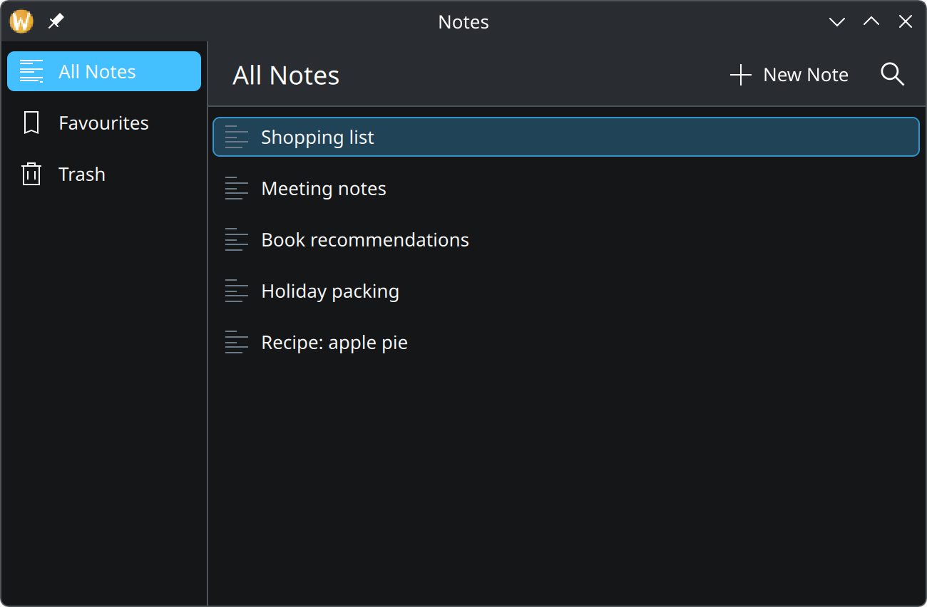
What KDE design is about and how to read this guide.
Foundations
Colour, spacing, type and icons: the rules every screen shares.
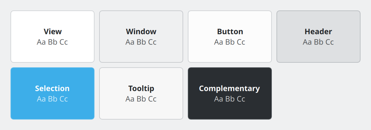
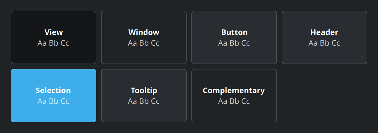
ColourNever write a colour value. Ask the theme for a role, and your app follows whatever colour scheme the user has chosen.
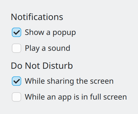
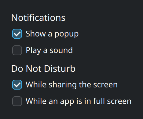
Spacing and unitsKirigami has a handful of named distances. Use them instead of pixel numbers and your layout stays consistent with every other KDE app.
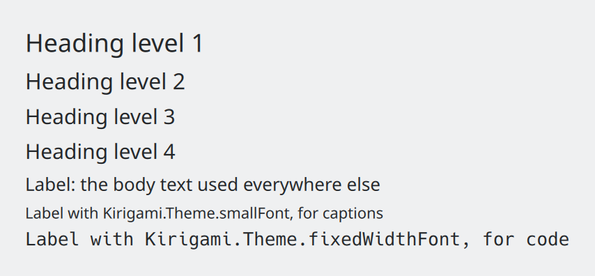
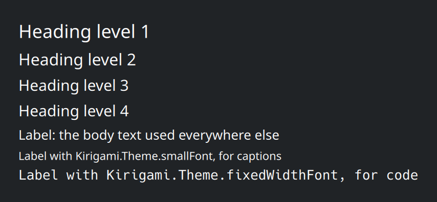
Typography and wordingTwo text components cover nearly everything, and a few wording rules make an app read like the rest of KDE.
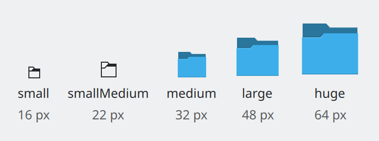
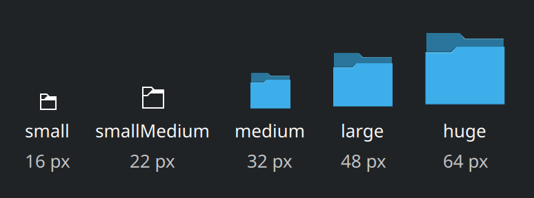
IconsAsk for icons by name and the system supplies them in the user's icon theme, at the right size and in the right colours.
Patterns
How to solve the problems every app has: getting around, showing content, asking, and telling.
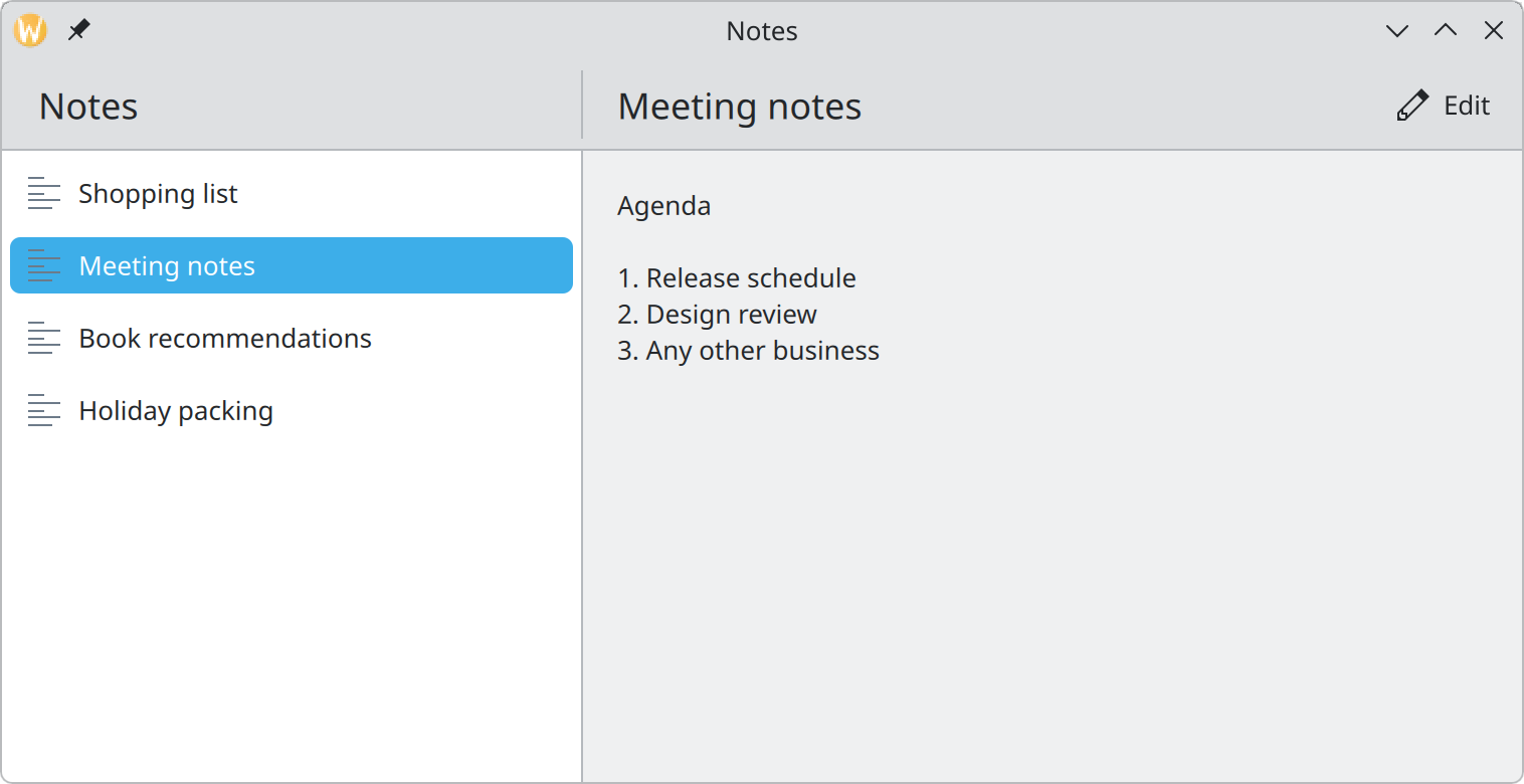
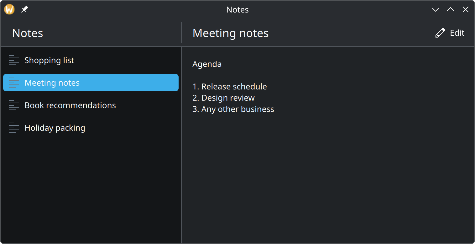
Layout and navigationHow to arrange an app's main parts, how people move between them, and how the same app reshapes itself from a desktop window to a phone.
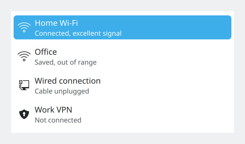
Showing collectionsLists, grids, tables and tabs all show many things at once. Which one fits depends on what the things are.
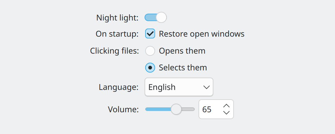
Choosing controlsWhich control to use for which kind of question, and how to explain a setting without cluttering the page.
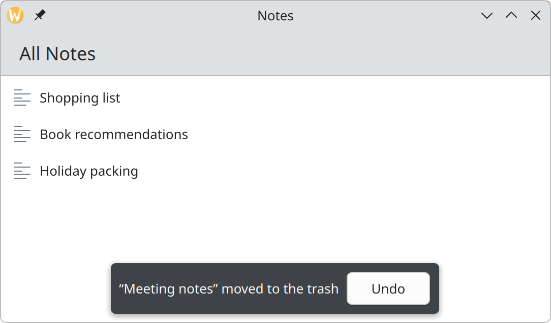
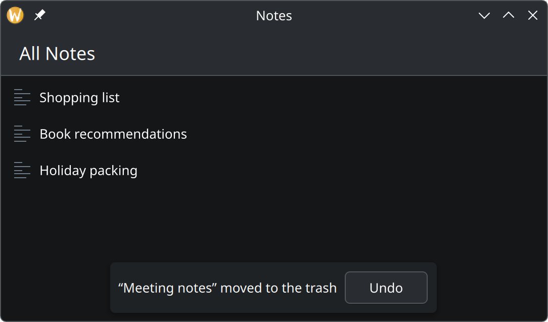
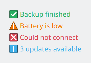
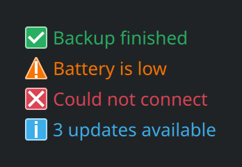
Feedback and statusHow to tell people what happened, what is happening, and what went wrong, using the quietest means that still gets the message across.
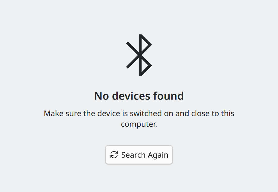
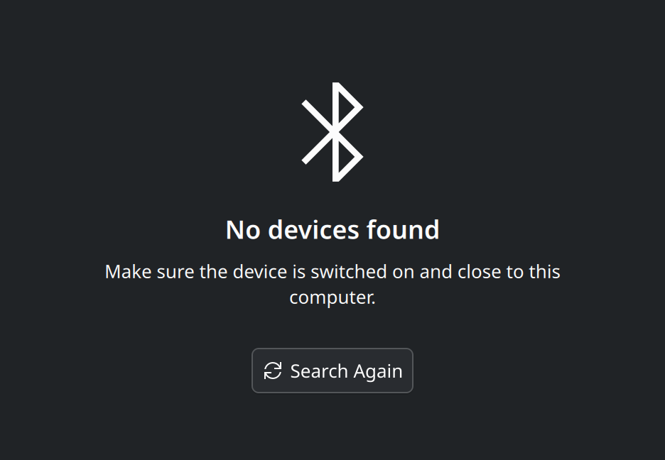
Simple by defaultThe first of KDE’s two design principles. A new user should be able to do the main thing your app is for without reading, configuring or guessing.


Powerful when neededThe second of KDE’s two design principles. Depth for people who want it, placed where it does not get in the way of people who do not.
Accessibility and inclusionA checklist for finding out whether everyone can use your app, and wording that does not shut anyone out.
Components
The building blocks Kirigami gives you, and when to use each.
PagesA page is one screen of your app. Kirigami gives it a title bar, room for actions, and navigation that adapts from desktop to phone.
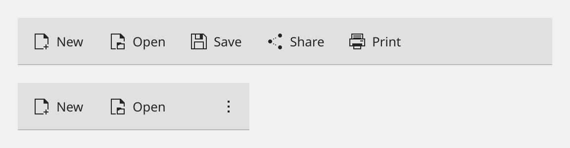
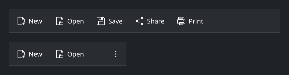
Actions and toolbarsAn action describes something the user can do, once. Kirigami turns it into a toolbar button, a menu item or a context-menu entry as space allows.
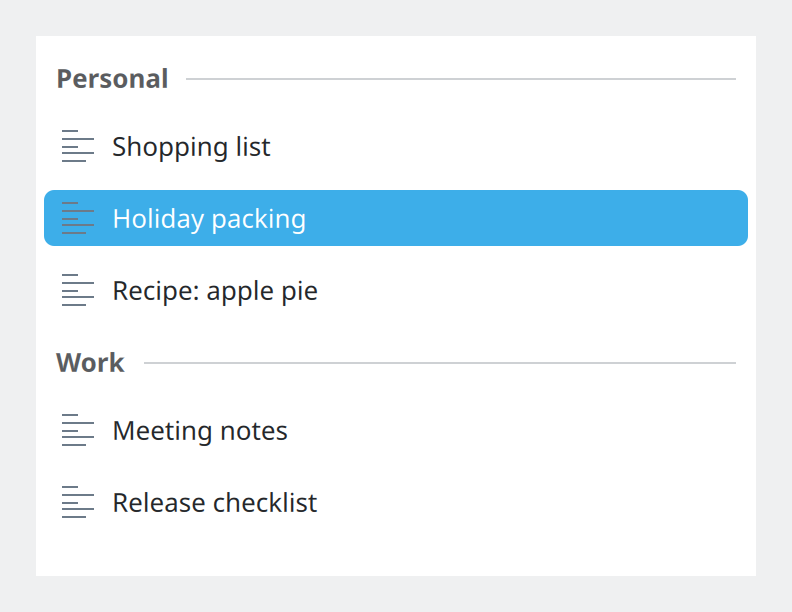
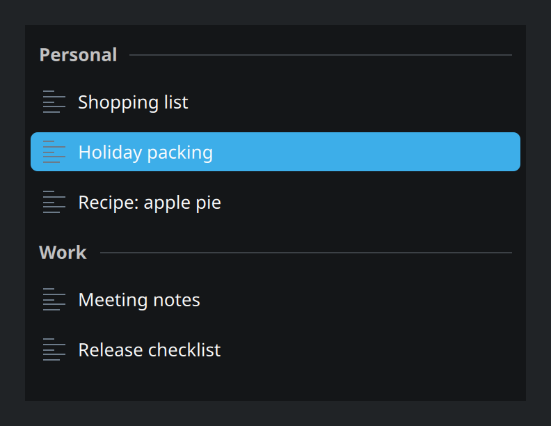
List itemsThe rows of a list. Qt and Kirigami provide ready-made ones for the common cases, so rows look and behave the same in every app.
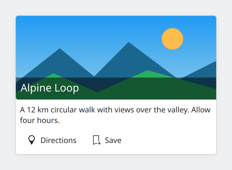
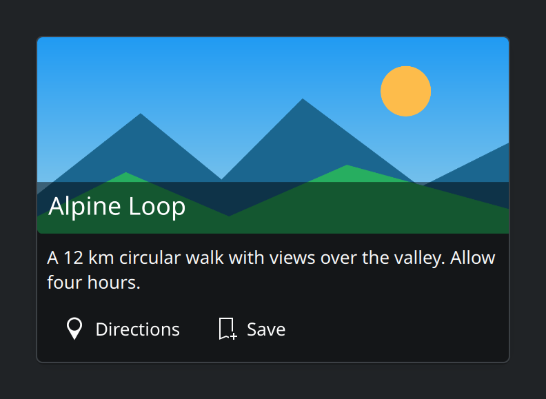
CardsA card groups a picture, some text and a few actions about one thing into a single framed block.
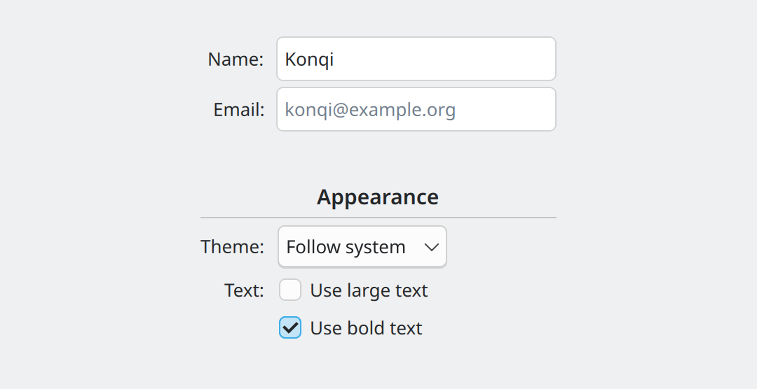
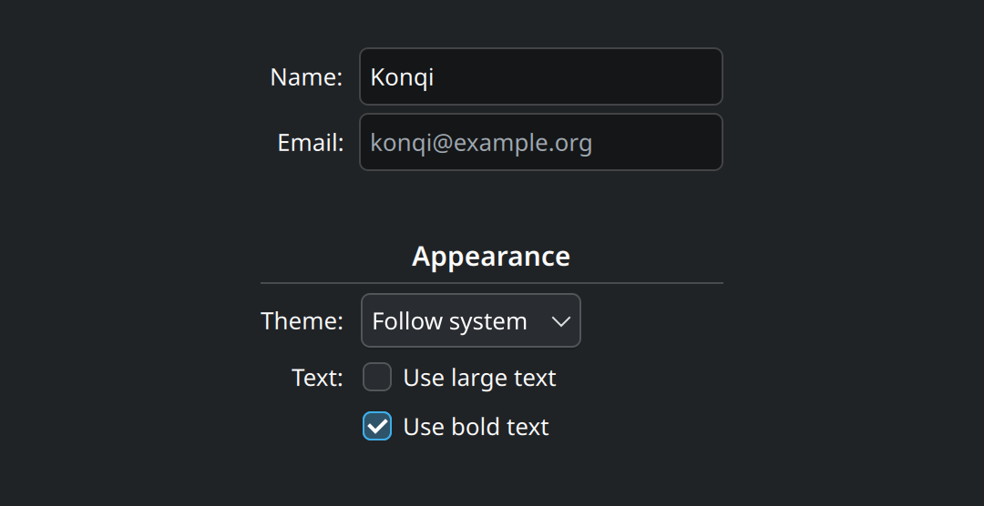
Form layoutFormLayout lines up labels and controls in two tidy columns, and rearranges them by itself when the window gets narrow.
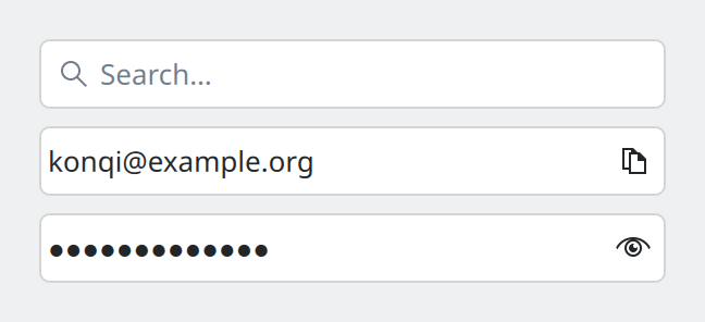
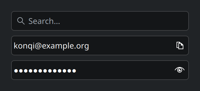
Text fieldsKirigami adds three specialised text fields to the standard one, for searching, for passwords, and for fields with a built-in button.
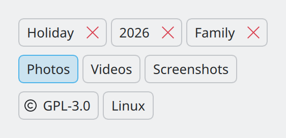
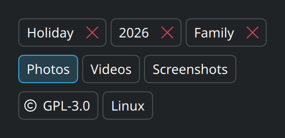
ChipsSmall rounded labels for the tags, filters or properties attached to something.
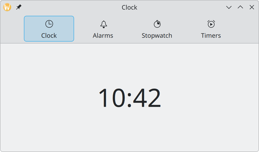
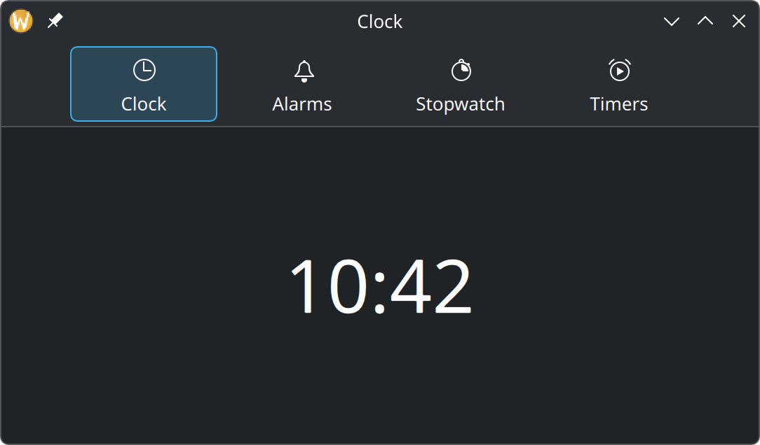
Navigation tab barA row of labelled icons for switching between the few main places of an app. On a phone it sits at the bottom, within reach of a thumb.
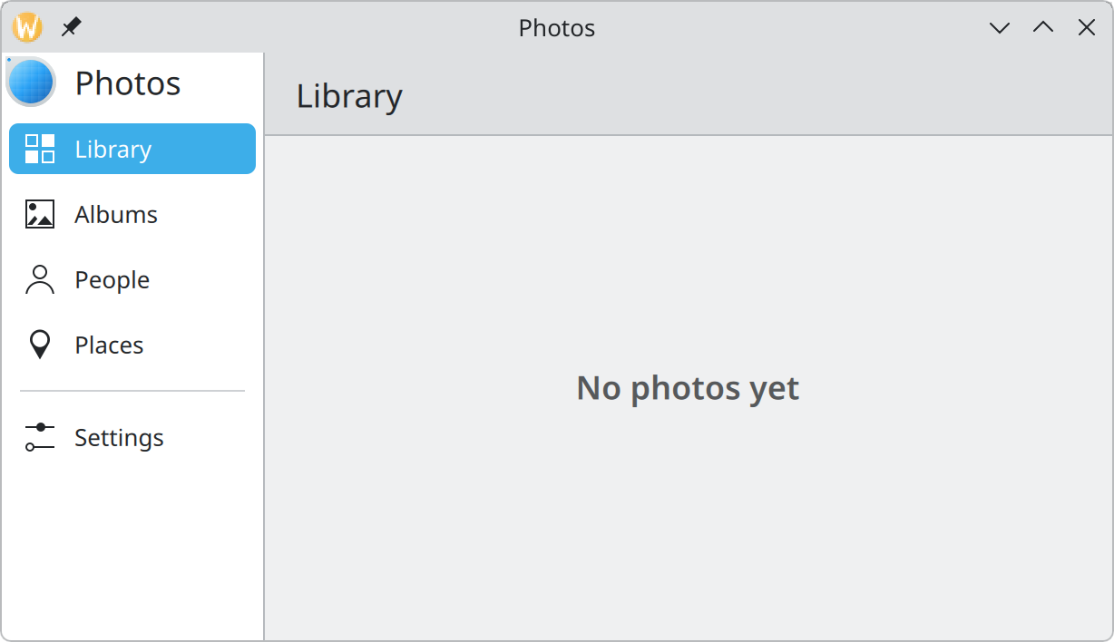
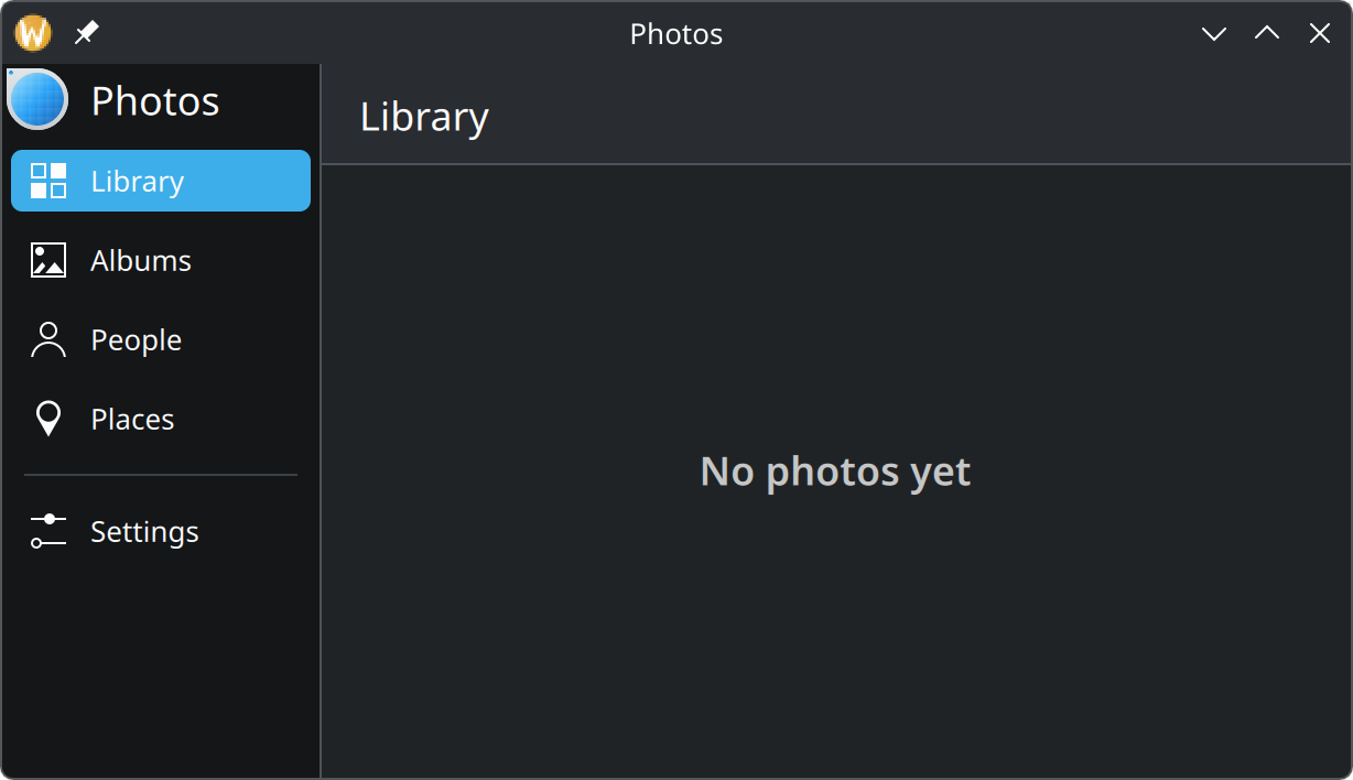
DrawersPanels attached to an edge of the window. The global drawer is the app’s sidebar; other drawers slide in when asked.
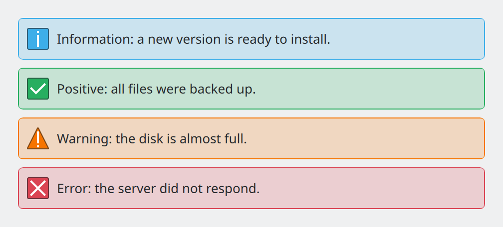
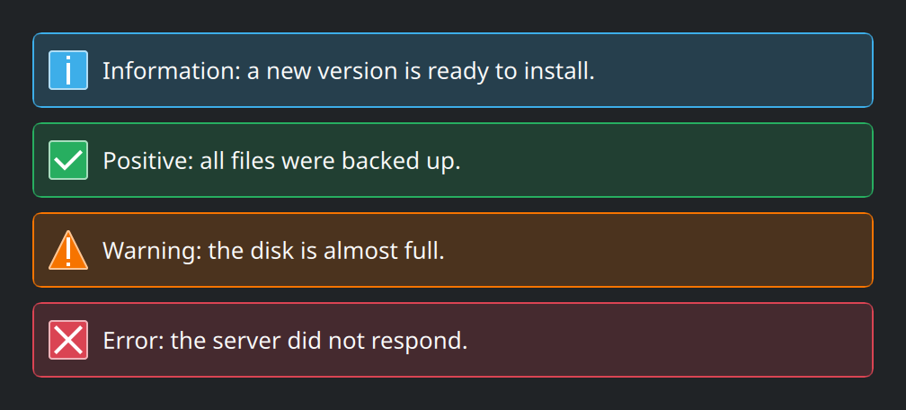
Inline messagesA coloured banner inside the page that tells the user something important and, ideally, offers a way to deal with it.
Placeholder messagesWhat to show where content would be when there is none yet, so an empty page explains itself instead of looking broken.
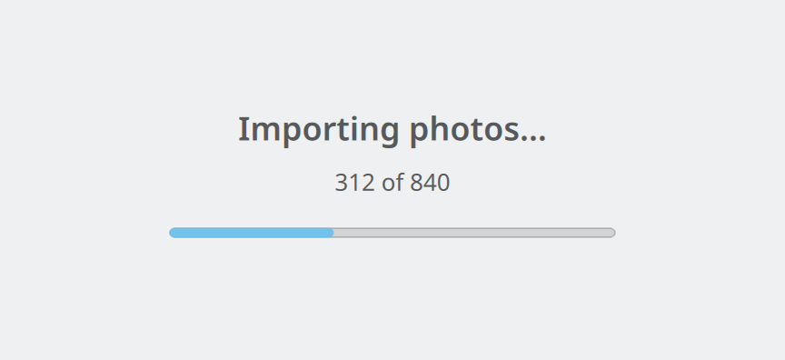
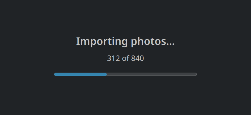
Progress and loadingThree ways to show that the app is busy, depending on whether you know how long it will take and how much of the screen is waiting.
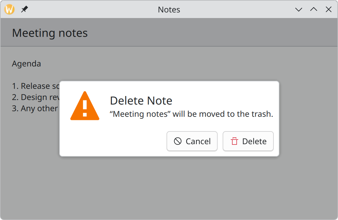
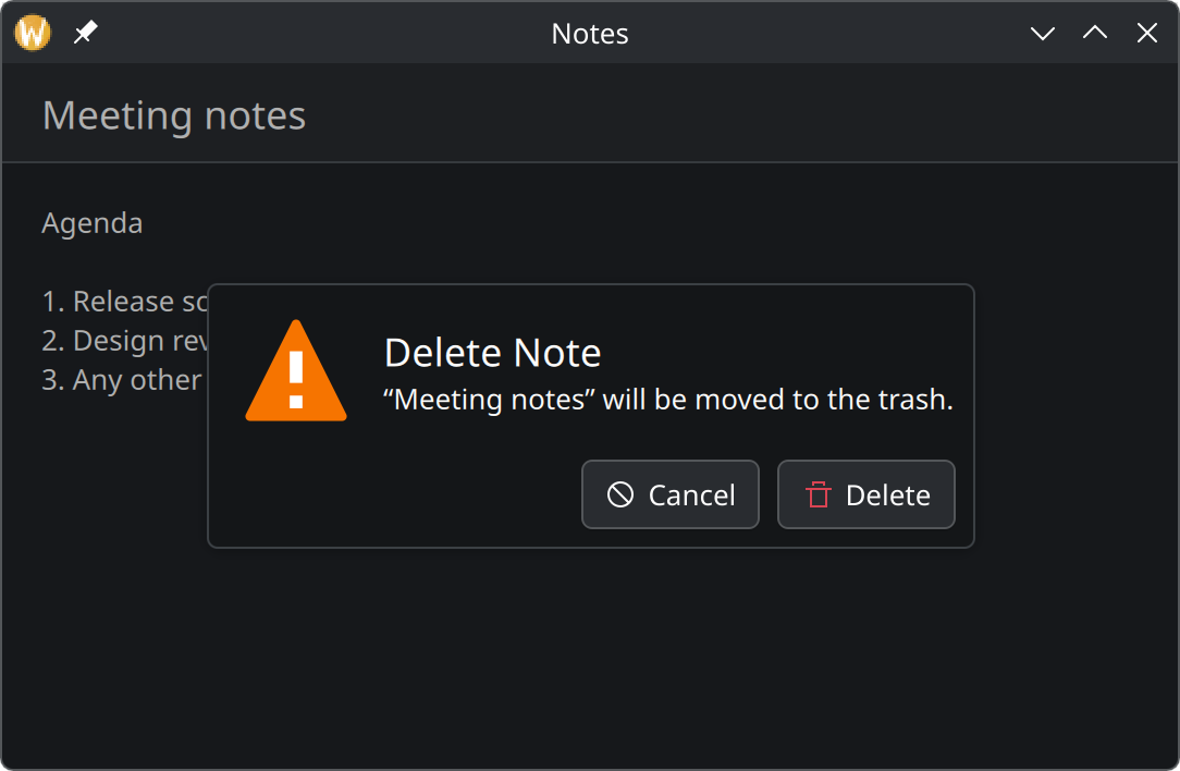
DialogsA dialog interrupts the user to get a decision. Use one only when the app cannot continue without an answer.
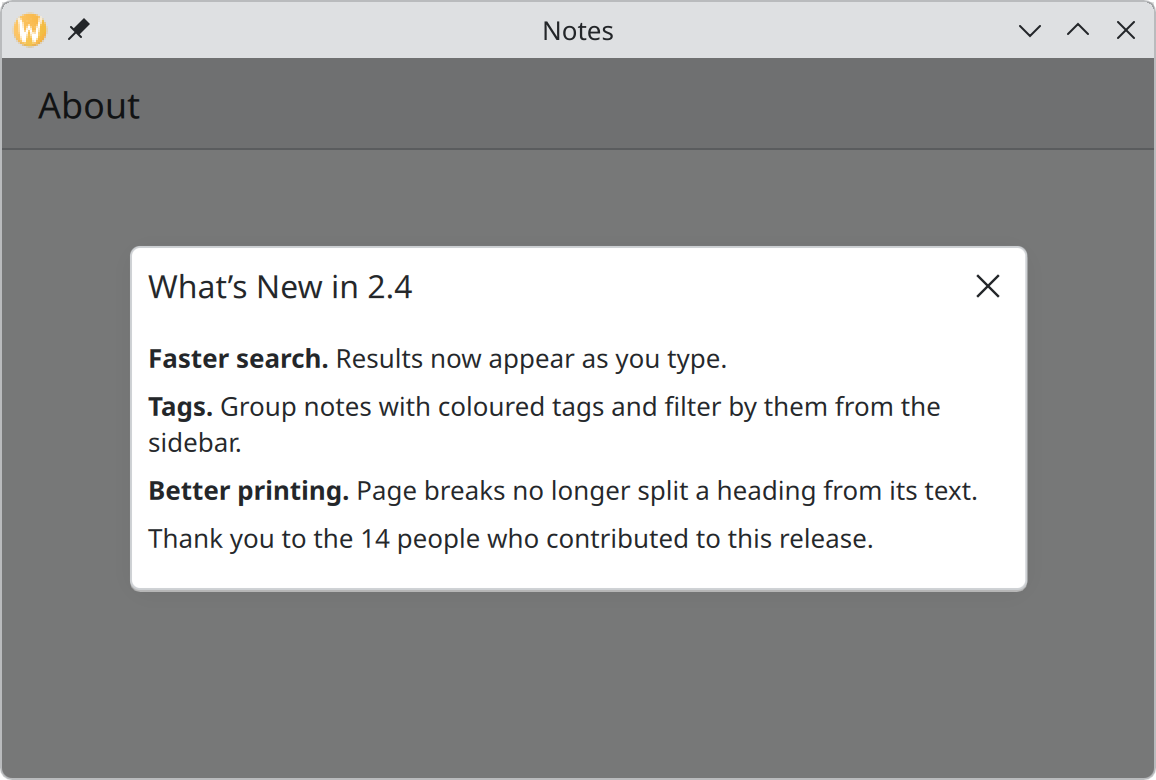
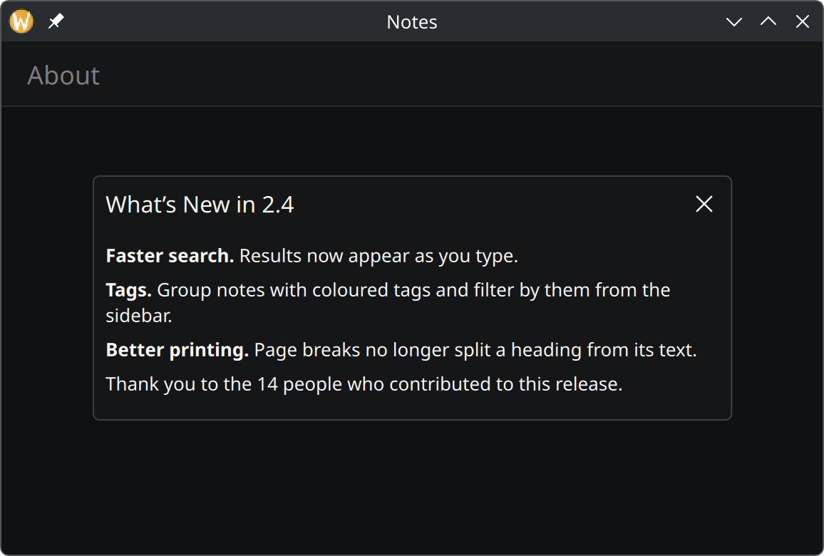
Overlay sheetsA panel that floats over the page to show extra content for reading. It scrolls if the content is long and closes with a click outside.
Tutorial: a to-do app
Build a small, complete Kirigami app in seven steps, with the code and a screenshot at each one.
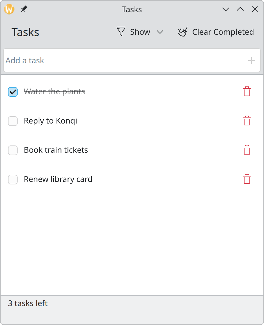
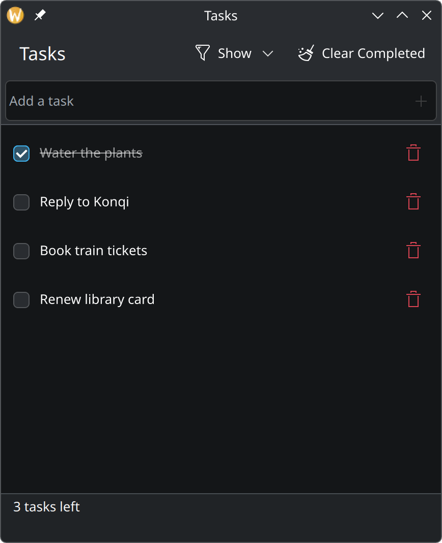
What we will buildA to-do app in about 250 lines of QML. Add tasks, tick them off, delete them with undo, filter the list, and find everything still there the next day.
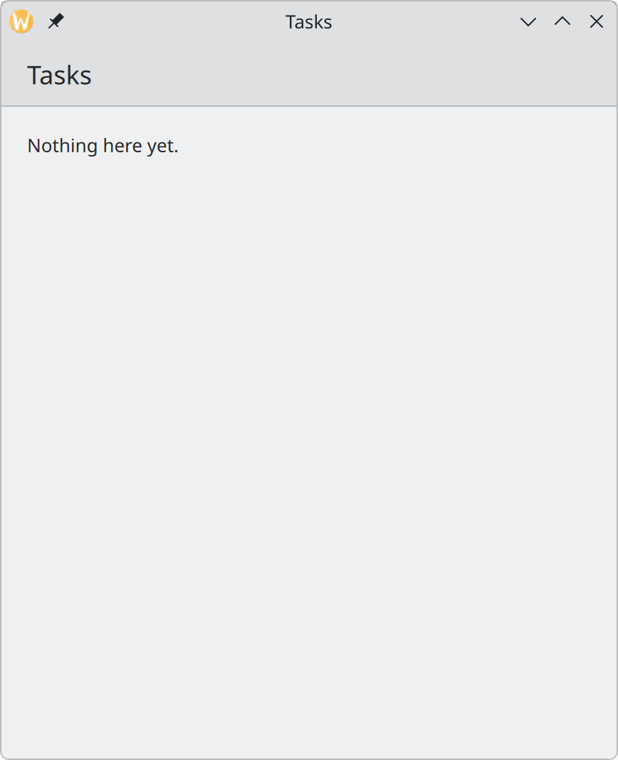
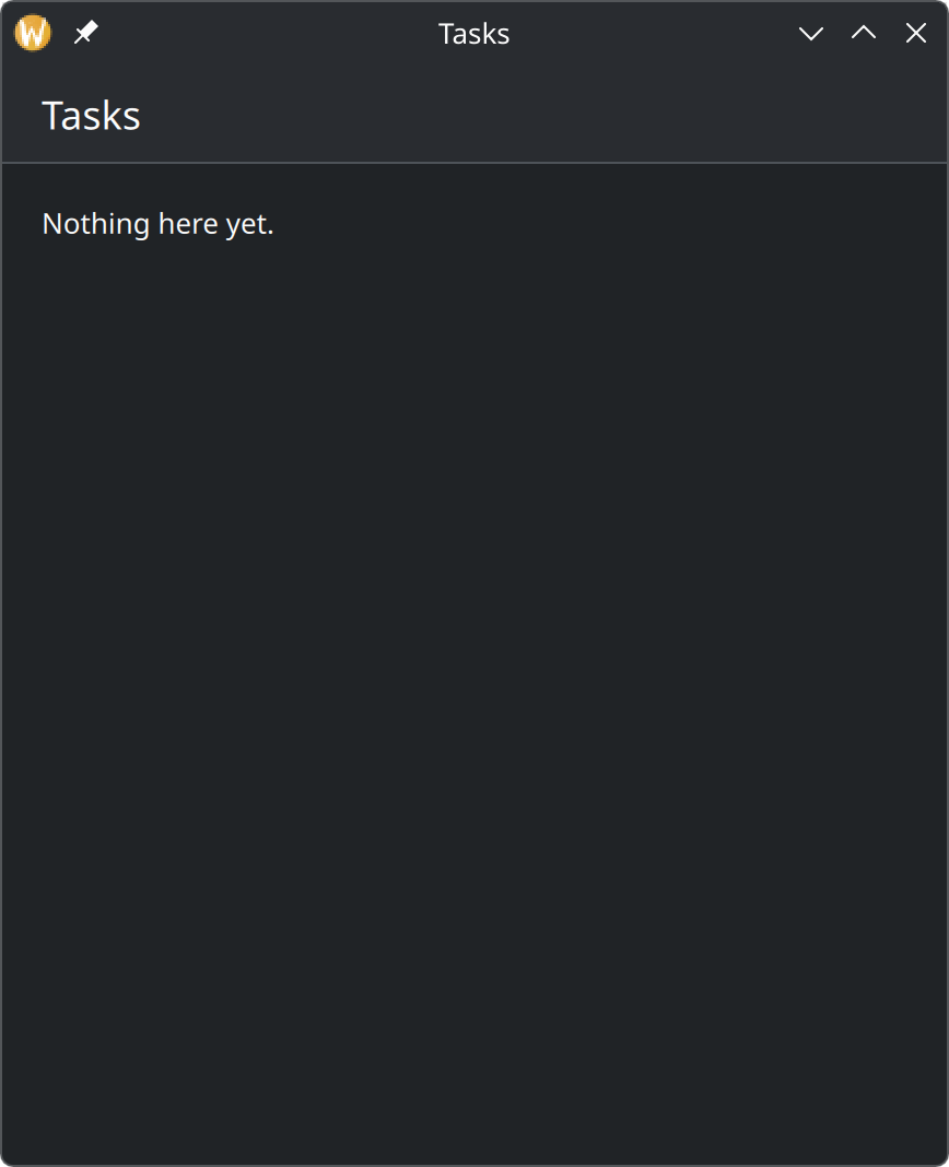
1. A window and a pageEvery Kirigami app starts the same way, with a window that shows a page. Twenty lines get you a real, resizable app window with a title bar.
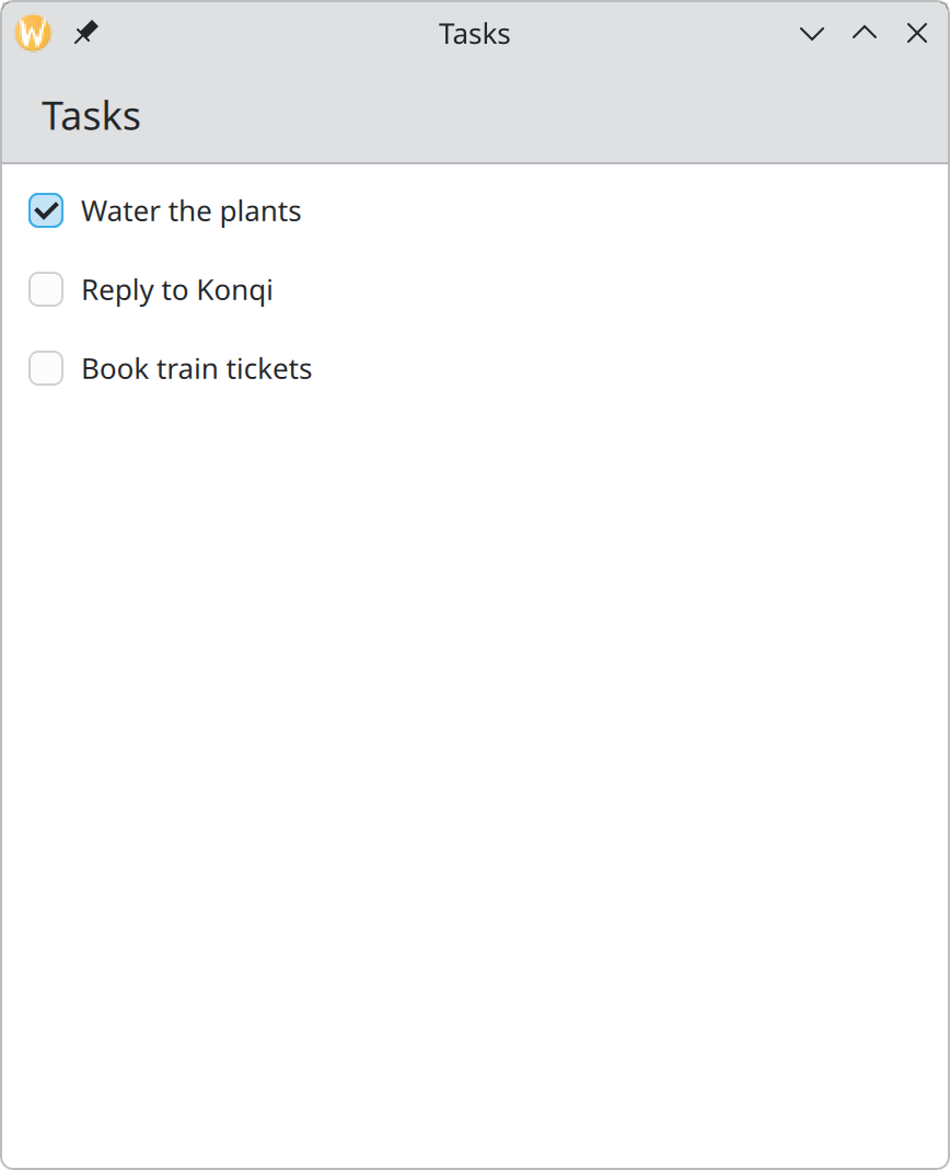
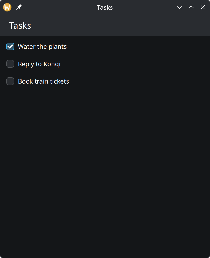
2. A list of tasksShow some tasks. This step introduces the three things every list is made of — the data, the view, and the template for one row.
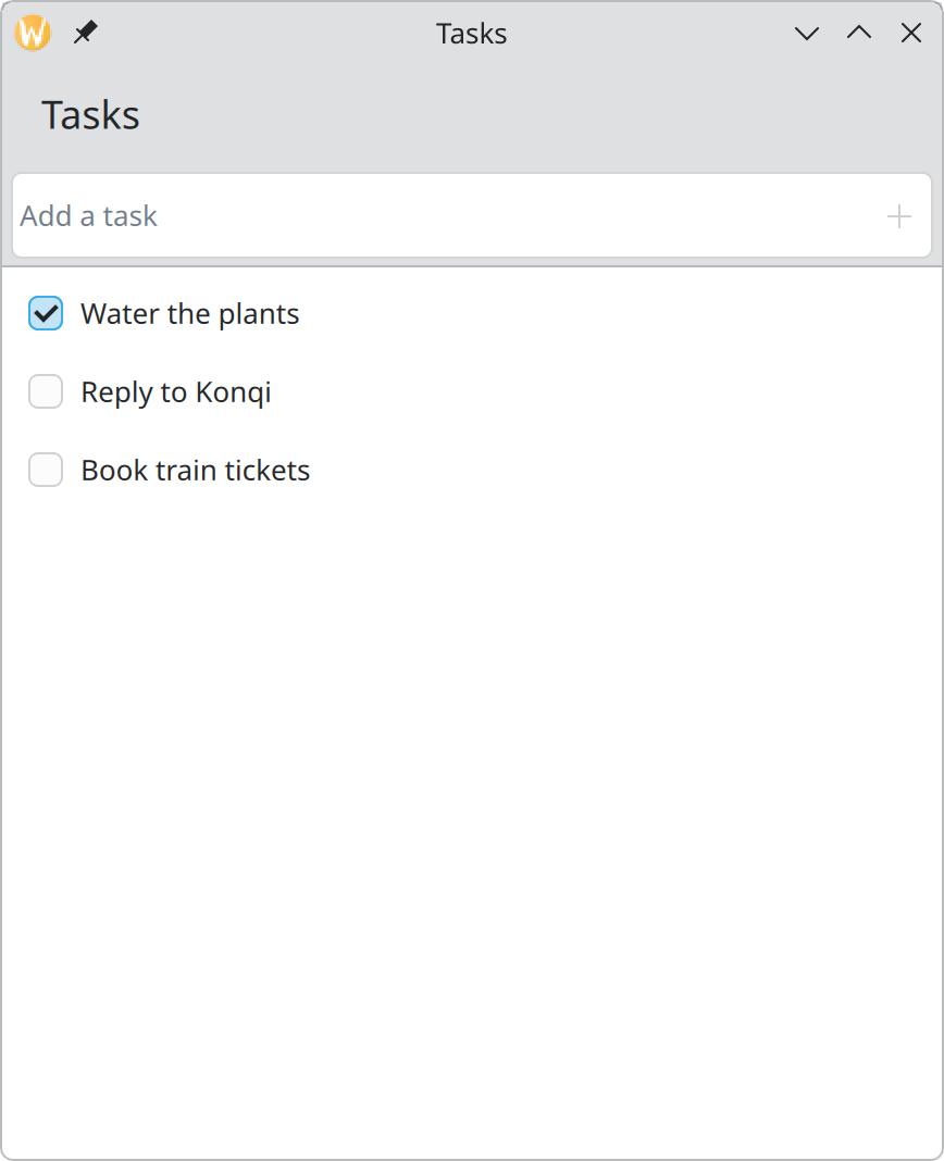
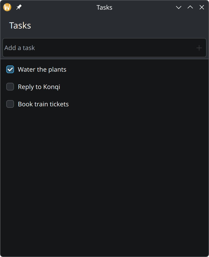
3. Adding tasksA field above the list where a task can be typed and added with Enter or a click.
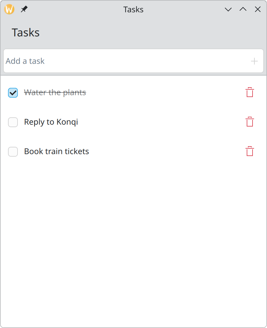
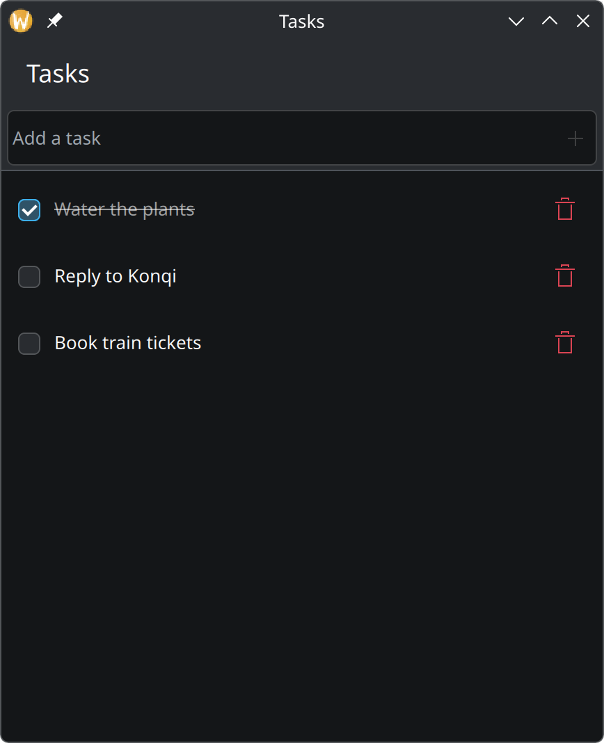
4. Ticking off and deletingMake the checkbox change the data, show finished tasks as finished, and add a delete button that can be undone.
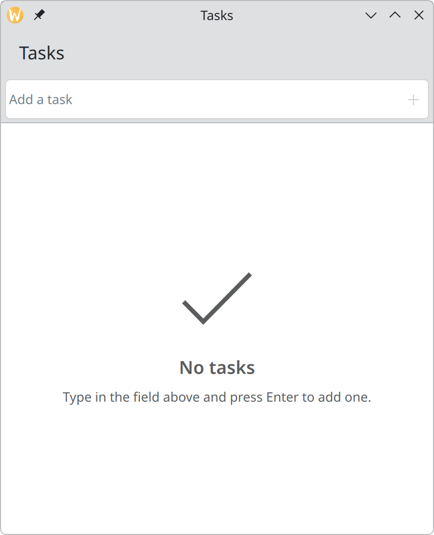
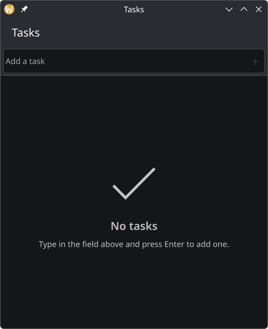
5. The empty state and a counterMake an empty list explain itself, and show how many tasks are left to do.
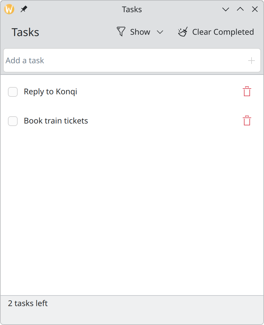
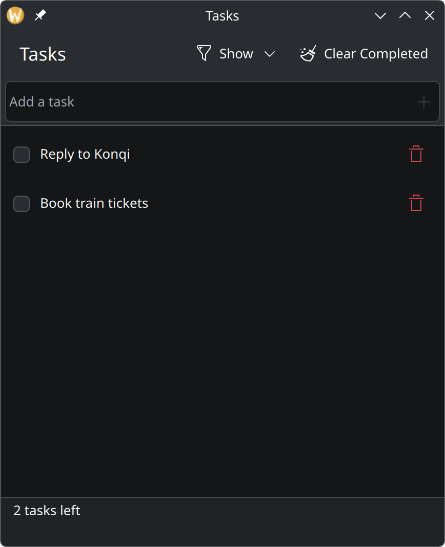
6. FilteringShow all tasks, only the open ones, or only the finished ones, and clear out everything that is finished with one click.
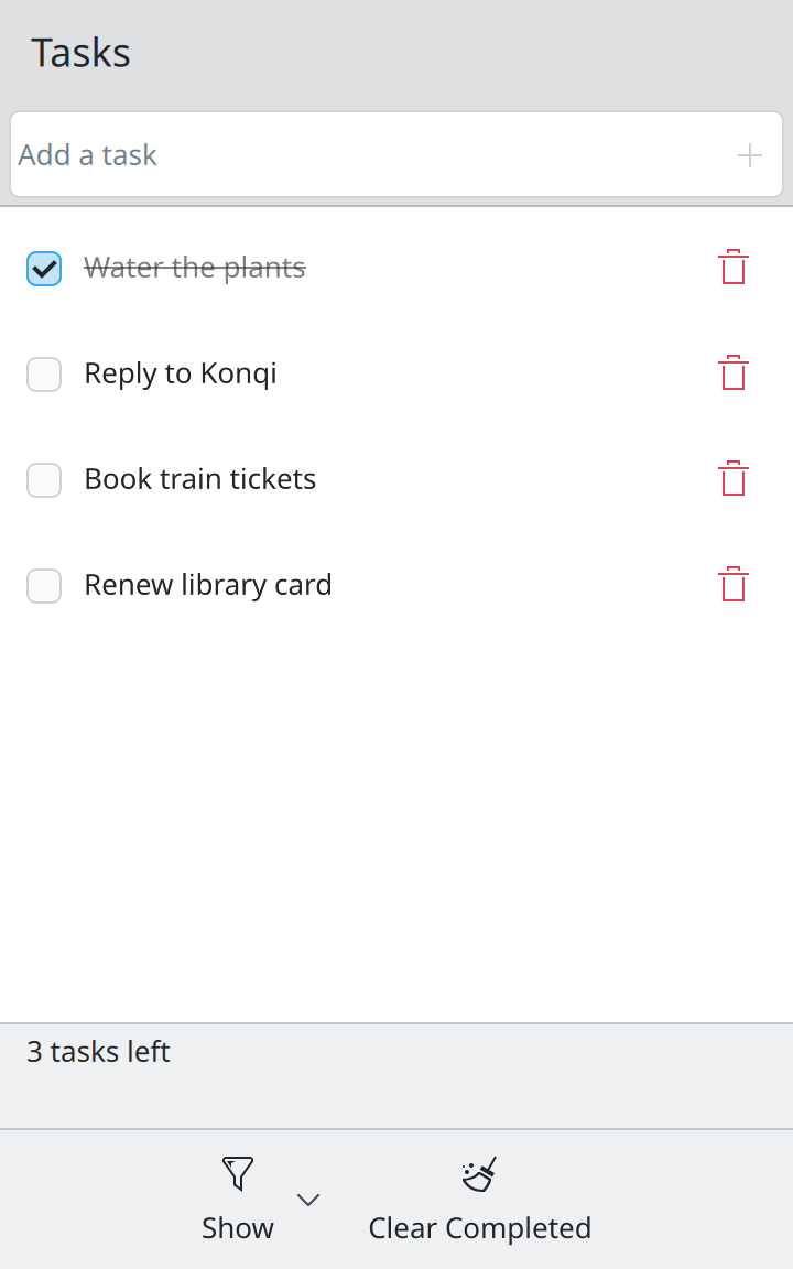
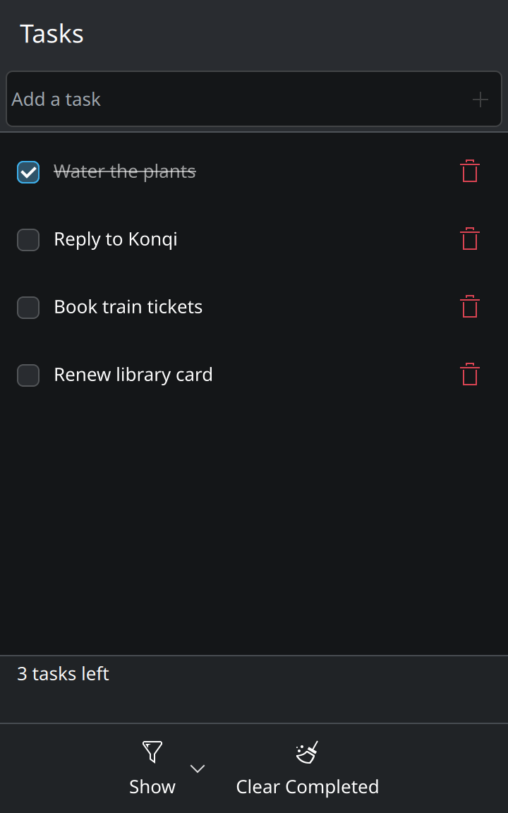
7. Remembering the listSave the tasks whenever they change and load them at start. Then look at the finished app and where to go from here.