Foundations
Icons
Ask for icons by name and the system supplies them in the user's icon theme, at the right size and in the right colours.
Kirigami.IconKirigami.Units.iconSizes
KDE apps do not ship their own toolbar icons. They ask for an icon by name, such as document-save, and the
desktop provides it from the user’s icon theme. Names follow the FreeDesktop icon naming specification, and Breeze
is the reference theme.
QQC2.Button {
    text: "Save"
    icon.name: "document-save"
}

// On its own, outside a control:
Kirigami.Icon {
    source: "folder"
    implicitWidth: Kirigami.Units.iconSizes.medium
    implicitHeight: Kirigami.Units.iconSizes.medium
}Sizes
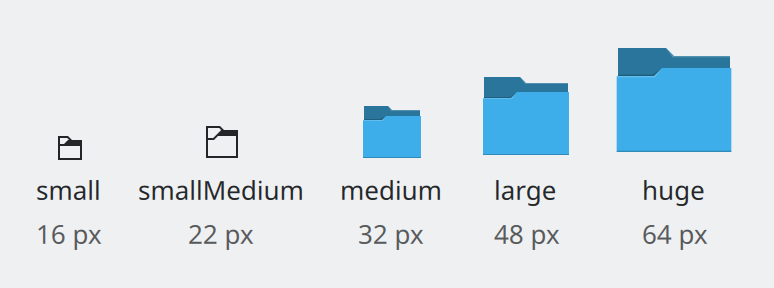
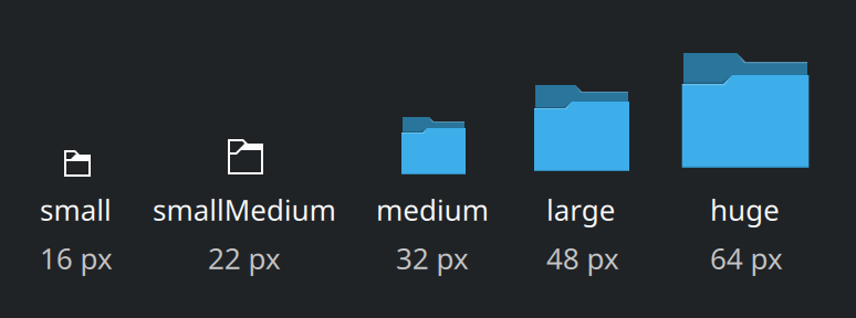
Icons come in fixed sizes. Pick the named step; do not scale icons to arbitrary sizes, because each size is drawn separately to stay sharp.
Show the QML for this example
import QtQuick
import QtQuick.Layouts
import QtQuick.Controls as QQC2
import org.kde.kirigami as Kirigami

RowLayout {
    spacing: Kirigami.Units.gridUnit

    Repeater {
        model: [
            { name: "small", size: Kirigami.Units.iconSizes.small },
            { name: "smallMedium", size: Kirigami.Units.iconSizes.smallMedium },
            { name: "medium", size: Kirigami.Units.iconSizes.medium },
            { name: "large", size: Kirigami.Units.iconSizes.large },
            { name: "huge", size: Kirigami.Units.iconSizes.huge }
        ]

        ColumnLayout {
            required property var modelData
            Layout.alignment: Qt.AlignBottom
            spacing: Kirigami.Units.smallSpacing

            Kirigami.Icon {
                Layout.alignment: Qt.AlignHCenter
                source: "folder"
                implicitWidth: parent.modelData.size
                implicitHeight: parent.modelData.size
            }
            QQC2.Label {
                Layout.alignment: Qt.AlignHCenter
                text: parent.modelData.name
            }
            QQC2.Label {
                Layout.alignment: Qt.AlignHCenter
                text: parent.modelData.size + " px"
                opacity: 0.75
            }
        }
    }
}| Size | Where it belongs |
|---|---|
iconSizes.small |
Menu items and ordinary (raised) buttons. |
iconSizes.smallMedium |
Toolbar buttons and other flat buttons; list items with one line of text. |
iconSizes.medium |
List items with a title and a subtitle. |
iconSizes.large, huge, enormous |
Large illustrations, such as an empty-state message or an app icon on an About page. |
Buttons, menu items and standard list delegates already choose the right size. You only set a size on a bare
Kirigami.Icon.
Two styles: symbolic and full colour
Show the QML for this example
import QtQuick
import QtQuick.Layouts
import QtQuick.Controls as QQC2
import org.kde.kirigami as Kirigami

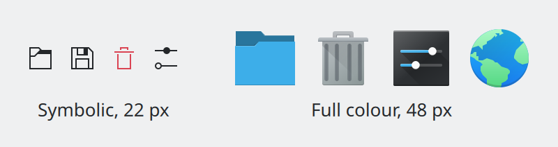
// The same icon name, asked for at two sizes. Small sizes get a monochrome
// line drawing that follows the text colour; large sizes get full colour.
GridLayout {
    columns: 2
    columnSpacing: Kirigami.Units.gridUnit * 2
    rowSpacing: Kirigami.Units.smallSpacing

    RowLayout {
        Layout.alignment: Qt.AlignHCenter | Qt.AlignVCenter
        spacing: Kirigami.Units.largeSpacing

        Repeater {
            model: ["folder-symbolic", "document-save-symbolic", "edit-delete-symbolic", "configure-symbolic"]
            Kirigami.Icon {
                required property string modelData
                source: modelData
                implicitWidth: Kirigami.Units.iconSizes.smallMedium
                implicitHeight: Kirigami.Units.iconSizes.smallMedium
            }
        }
    }
    RowLayout {
        Layout.alignment: Qt.AlignHCenter
        spacing: Kirigami.Units.largeSpacing

        Repeater {
            model: ["folder", "user-trash", "preferences-system", "applications-internet"]
            Kirigami.Icon {
                required property string modelData
                source: modelData
                implicitWidth: Kirigami.Units.iconSizes.large
                implicitHeight: Kirigami.Units.iconSizes.large
            }
        }
    }
    QQC2.Label {
        Layout.alignment: Qt.AlignHCenter
        text: "Symbolic, 22 px"
    }
    QQC2.Label {
        Layout.alignment: Qt.AlignHCenter
        text: "Full colour, 48 px"
    }
}| Size | Style |
|---|---|
small (16 px) |
Always symbolic. |
smallMedium (22 px) |
Almost always symbolic. Full colour is acceptable in a list with very few items. |
medium (32 px) and larger |
Full colour. |
The theme normally picks the right style for the size you ask for. To insist on the symbolic version, add
-symbolic to the name: folder-symbolic.
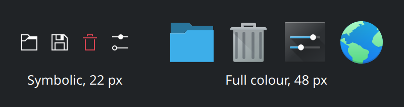
Symbolic icons take their colour from the theme’s text colour, so they stay visible in dark schemes without any work from you. This is one more reason not to bundle your own image files.
Using icons well
- Give most buttons text as well. An icon alone is acceptable only when space is very tight, when the icon is instantly recognisable (search, close, back), or when neighbouring icons explain each other.
- Icon-only buttons still need a name. Set
textanyway, hide it withdisplay: QQC2.AbstractButton.IconOnly, and add a tooltip. Screen readers read the text. - Do not repeat an icon. Two visible buttons or menu items with the same icon force people to read the labels after all. If two actions would share a generic icon, pick a more specific one for each.
- In lists, vary the icons or leave them out. A column of identical icons carries no information.
- Keep trailing buttons on list rows to a minimum. Icons only, at most two, ideally none or one.
- Overlay badges on icons must use icons whose names start with
emblem-.
Destructive actions
| Action | Icon name | Looks like |
|---|---|---|
| Delete the user’s content permanently | edit-delete |
Red rubbish bin |
| Remove an item that could be added back | edit-delete-remove |
Red × |
| Move to the trash | trash-empty |
Plain rubbish bin, not red |
Red is reserved for actions that destroy something. Do not use a red icon for anything else.
Icons that point somewhere
In languages written right to left, such as Arabic and Hebrew, the whole interface is mirrored. Directional icons
like “back” have -rtl variants for this. Photographs and other images are not mirrored.
Where this comes from
This page restates the upstream KDE documentation in plainer words and adds pictures. When the two disagree, upstream wins.