Foundations
Typography and wording
Two text components cover nearly everything, and a few wording rules make an app read like the rest of KDE.
Kirigami.HeadingQQC2.Label
The type scale
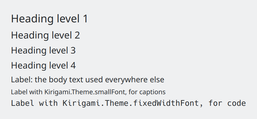
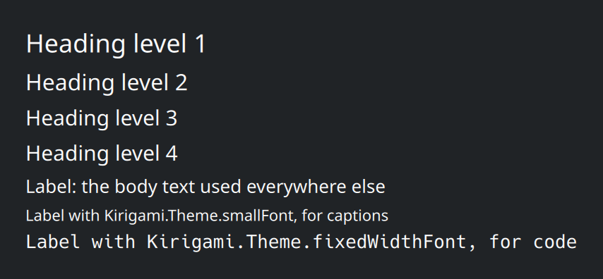
Show the QML for this example
import QtQuick
import QtQuick.Layouts
import QtQuick.Controls as QQC2
import org.kde.kirigami as Kirigami

ColumnLayout {
    spacing: Kirigami.Units.smallSpacing

    Kirigami.Heading {
        text: "Heading level 1"
        level: 1
    }
    Kirigami.Heading {
        text: "Heading level 2"
        level: 2
    }
    Kirigami.Heading {
        text: "Heading level 3"
        level: 3
    }
    Kirigami.Heading {
        text: "Heading level 4"
        level: 4
    }
    QQC2.Label {
        text: "Label: the body text used everywhere else"
    }
    QQC2.Label {
        text: "Label with Kirigami.Theme.smallFont, for captions"
        font: Kirigami.Theme.smallFont
    }
    QQC2.Label {
        text: "Label with Kirigami.Theme.fixedWidthFont, for code"
        font: Kirigami.Theme.fixedWidthFont
    }
}
There are only two components to remember:
QQC2.Labelfor all normal text.Kirigami.Headingfor titles. Itslevelsets the size: 1 is the largest.
| Component | Size, relative to normal text | Use it for |
|---|---|---|
Kirigami.Heading { level: 1 } |
135% | The main title of a page or a large empty-state message. This is the default level. |
Kirigami.Heading { level: 2 } |
120% | Titles of major sections. |
Kirigami.Heading { level: 3 } |
115% | Sub-sections. |
Kirigami.Heading { level: 4 } |
110% | Titles of small groups, such as a group of checkboxes. |
QQC2.Label |
100% | Everything else. |
QQC2.Label { font: Kirigami.Theme.smallFont } |
The user’s “small” font | Captions and secondary details. Never for anything people must read. |
QQC2.Label { font: Kirigami.Theme.fixedWidthFont } |
The user’s fixed-width font | Code, file paths, terminal output. |
Avoid setting font.pointSize or font.pixelSize yourself. If a heading level does not give the emphasis you want,
Kirigami.Heading has a type property: Kirigami.Heading.Type.Primary makes it more prominent and
Kirigami.Heading.Type.Secondary less so, without leaving the scale.
Titles with subtitles
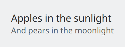
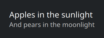
Show the QML for this example
import QtQuick
import QtQuick.Layouts
import QtQuick.Controls as QQC2
import org.kde.kirigami as Kirigami

// A title and its subtitle belong together: no spacing between them.
ColumnLayout {
    spacing: 0

    Kirigami.Heading {
        text: "Apples in the sunlight"
        level: 2
    }
    QQC2.Label {
        text: "And pears in the moonlight"
        opacity: 0.75
    }
}
Capital letters
KDE uses two styles, and which one applies depends on what the text is.
| Style | Looks like | Use it for |
|---|---|---|
| Title Case | Configure Keyboard Shortcuts | Buttons, menu items, tab names, window and page titles, headings. |
| Sentence case | Use large text | Anything that ends in a full stop or a colon; labels of checkboxes and radio buttons; items in a combo box; labels in front of a control; subtitles; tooltips; placeholder text; status messages. |
If unsure: text that names a thing or an action gets title case; text that reads like a sentence or describes a setting gets sentence case.
Wording
- Keep controls short. Anything longer than “Configure Keyboard Shortcuts” is too long for a button or menu item.
- Keep paragraphs narrow. Text of more than one sentence should wrap at about 85 characters (around 450 px).
- Leave room for translation. Other languages can need half as much space again, or more. Let labels wrap or grow instead of fixing their width.
- Spell things out. Write “Operating system”, “Memory” and “Link” instead of OS, RAM and URL. Write units as whole words (“200 milliseconds”) unless space is very tight.
- Use
…only when more input is needed. “Save As…” opens a dialog that asks for a name, so it gets an ellipsis; “Save” does not. Use the real ellipsis character…, not three full stops. - Use real symbols.
×for dimensions (1920 × 1080),–for ranges,→instead of->. - Use the serial comma in lists of three or more: “files, folders, and links”.
Titles of windows and dialogs
Keep window titles short and distinctive, without the company name or version number. A dialog’s title starts with a verb and repeats the action that opened it: the button “Save…” opens a dialog titled “Save File”.
Placeholder text in fields
If a text field has a label in front of it, the placeholder can show an example value. If it has no label, use a short instruction such as “Search” or “Enter file name”. Placeholders use sentence case and do not end with an ellipsis.
Where this comes from
This page restates the upstream KDE documentation in plainer words and adds pictures. When the two disagree, upstream wins.