Components
Drawers
Panels attached to an edge of the window. The global drawer is the app’s sidebar; other drawers slide in when asked.
Kirigami.GlobalDrawerKirigami.ContextDrawerKirigami.OverlayDrawer
| Drawer | Edge | Holds |
|---|---|---|
Kirigami.GlobalDrawer |
Leading (left in English) | Things that apply to the whole app: its main places, or its main menu |
Kirigami.ContextDrawer |
Trailing | Actions for the page currently shown |
Kirigami.OverlayDrawer |
Any | Whatever you put in it |
Global drawer
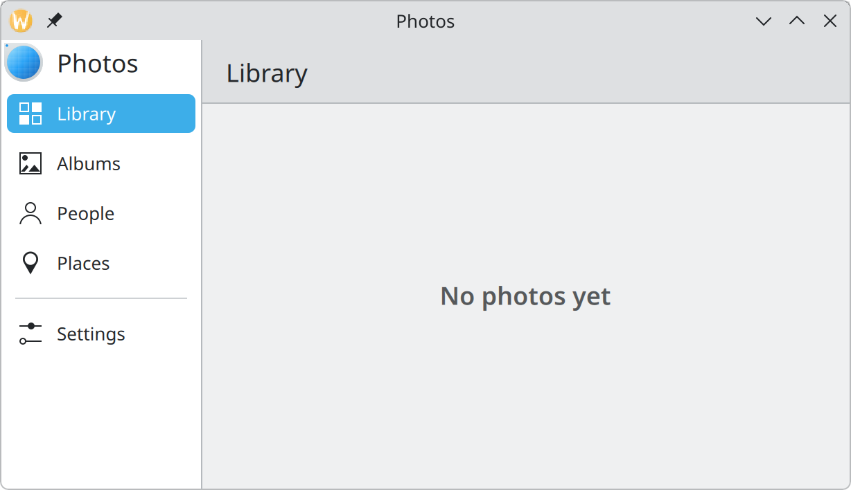
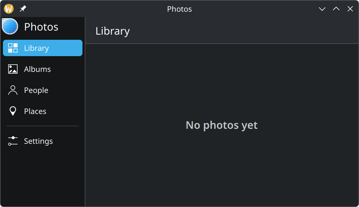
- Title and icon. Optional; from
titleandtitleIcon. - Actions. One entry each. The checked one is highlighted.
- Separator. An action with
separator: truedivides groups.
Show the QML for this example
import QtQuick
import QtQuick.Controls as QQC2
import org.kde.kirigami as Kirigami

Kirigami.ApplicationWindow {
    title: "Photos"
    width: Kirigami.Units.gridUnit * 34
    height: Kirigami.Units.gridUnit * 18

    globalDrawer: Kirigami.GlobalDrawer {
        modal: false
        title: "Photos"
        titleIcon: "applications-graphics"

        actions: [
            Kirigami.Action {
                text: "Library"
                icon.name: "view-list-icons"
                checked: true
            },
            Kirigami.Action {
                text: "Albums"
                icon.name: "folder-pictures"
            },
            Kirigami.Action {
                text: "People"
                icon.name: "user"
            },
            Kirigami.Action {
                text: "Places"
                icon.name: "mark-location"
            },
            Kirigami.Action {
                separator: true
            },
            Kirigami.Action {
                text: "Settings"
                icon.name: "configure"
            }
        ]
    }

    pageStack.initialPage: Kirigami.Page {
        title: "Library"

        Kirigami.PlaceholderMessage {
            anchors.centerIn: parent
            width: parent.width - Kirigami.Units.gridUnit * 4
            text: "No photos yet"
        }
    }
}
Set it on the window’s globalDrawer property and give it actions:
Kirigami.ApplicationWindow {
    globalDrawer: Kirigami.GlobalDrawer {
        modal: false
        actions: [
            Kirigami.Action {
                text: "Library"
                icon.name: "view-list-icons"
                onTriggered: pageStack.replace(libraryPage)
            }
        ]
    }
}
An action with child actions becomes an entry that opens a second level inside the drawer.
Sidebar or menu?
The same component serves two purposes, chosen with two properties:
| You want… | Set | Result |
|---|---|---|
| A sidebar that is always visible on desktop | modal: false |
A fixed column beside the content, as pictured |
| A panel opened from a ☰ button | nothing (the default) | Slides in over the content and dims it; closes on a click outside |
| An ordinary menu on desktop | isMenu: true |
The ☰ button opens a normal popup menu. The title and header are not shown in this mode |
Use the sidebar when the drawer is how people move around the app and there are more than five places; with fewer, a navigation tab bar is lighter. Use the menu form when the drawer only holds a handful of app-wide commands; a full panel for three entries is too much on a desktop.
On a phone the drawer always slides in from the edge, by button or by swipe, whichever you chose.
A header that stays
Anything set as the drawer’s header stays in place when the user goes into a second level. It replaces the
title. A search field is a common choice.
Context drawer
A Kirigami.ContextDrawer shows the actions of the current page. You rarely interact with it directly: set it
on the window’s contextDrawer property, and it picks up each page’s actions.
Kirigami.ApplicationWindow {
    contextDrawer: Kirigami.ContextDrawer {}
}
On a desktop with enough room the page’s actions are simply shown in its header and the drawer stays out of the way. When there is no room, and on phones, they are reached through a menu button at the trailing edge, or by swiping in from that edge.
Overlay drawer
Show the QML for this example
import QtQuick
import QtQuick.Layouts
import QtQuick.Controls as QQC2
import org.kde.kirigami as Kirigami

Kirigami.ApplicationWindow {
    title: "Music"
    width: Kirigami.Units.gridUnit * 30
    height: Kirigami.Units.gridUnit * 18

    pageStack.initialPage: Kirigami.Page {
        title: "Now Playing"

        Kirigami.Heading {
            anchors.centerIn: parent
            text: "Apples in the Sunlight"
        }
    }

    Kirigami.OverlayDrawer {
        edge: Qt.BottomEdge
        modal: true
        drawerOpen: true
        handleVisible: false

        contentItem: ColumnLayout {
            spacing: 0

            QQC2.ItemDelegate {
                Layout.fillWidth: true
                text: "Add to Playlist"
                icon.name: "list-add"
            }
            QQC2.ItemDelegate {
                Layout.fillWidth: true
                text: "Share"
                icon.name: "document-share"
            }
            QQC2.ItemDelegate {
                Layout.fillWidth: true
                text: "Show Album"
                icon.name: "media-album-cover"
            }
        }
    }
}
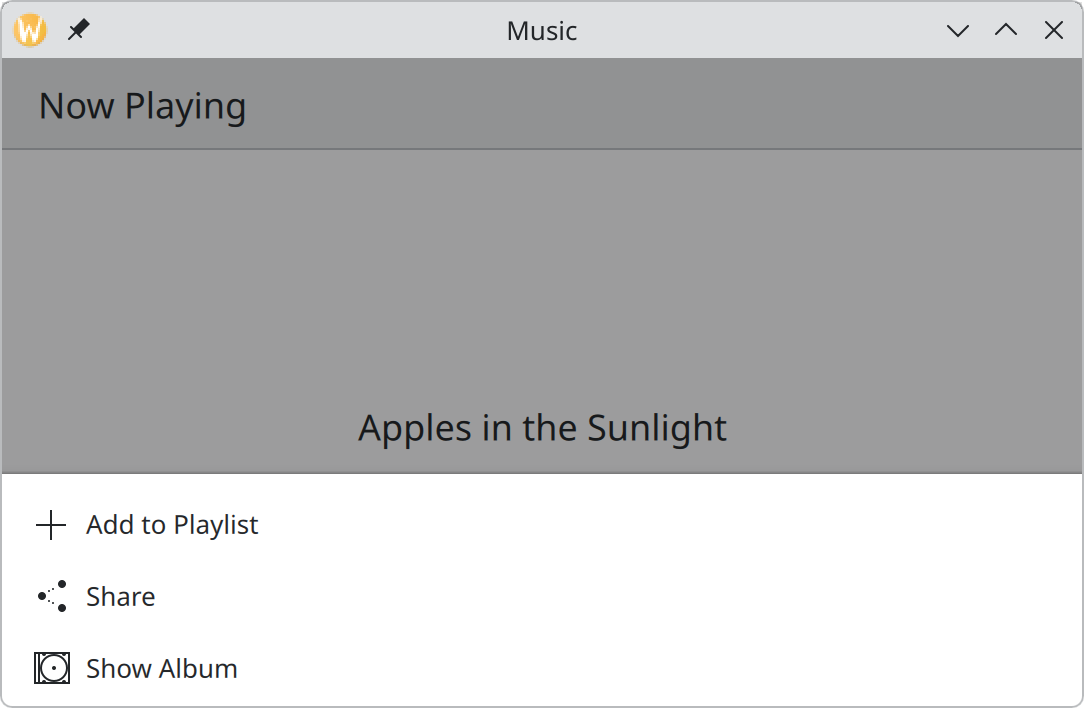
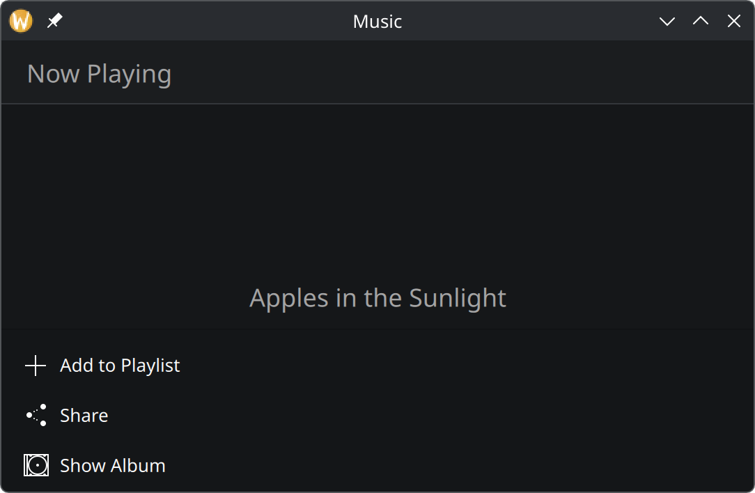
Kirigami.OverlayDrawer is the general form: a panel on any edge with your own content. It has two
behaviours.
Modal (modal: true) |
Inline (modal: false) |
|
|---|---|---|
| Starts | Hidden | Shown |
| Rest of the app | Dimmed, not usable | Stays usable |
| Click outside | Closes it | Does nothing |
| Good for | A short list of options for one item, for example after a long press | A tool panel that stays beside the content |
For read-only content that may scroll, use an overlay sheet instead; for a question, a dialog.
Using drawers well
- Put the launch view first in a navigation drawer.
- Give every entry an icon and a short title-case label, and do not repeat icons.
- App-wide things in the global drawer, page things in page actions. Do not put “Delete Note” in the sidebar.
- Do not put Quit or Minimize in a drawer. The window has those.
- Do not hide the app’s main feature in a drawer that is closed by default.
Properties you will use
Kirigami.GlobalDrawer
| Property | Type | What it does |
|---|---|---|
actions |
list of actions | The entries. |
modal |
bool | false keeps the drawer visible beside the content on desktop. |
isMenu |
bool | Show as an ordinary popup menu on desktop. Default false. |
title, titleIcon |
string | Heading and icon at the top. |
header, footer |
item | Your own item pinned to the top or bottom, such as a search field. |
collapsible, collapsed |
bool | Let a sidebar shrink to a strip of icons. |
Kirigami.OverlayDrawer
| Property | Type | What it does |
|---|---|---|
edge |
enum | Qt.LeftEdge, Qt.RightEdge, Qt.TopEdge or Qt.BottomEdge. |
modal |
bool | Modal or inline, see the table above. |
drawerOpen |
bool | Whether the drawer is open. Set it, or call open() and close(). |
contentItem |
item | What the drawer shows. |
handleVisible |
bool | Show a small tab at the edge for opening and closing. |
Where this comes from
This page restates the upstream KDE documentation in plainer words and adds pictures. When the two disagree, upstream wins.