Components
Cards
A card groups a picture, some text and a few actions about one thing into a single framed block.
Kirigami.CardKirigami.AbstractCardKirigami.CardsLayoutKirigami.CardsListView
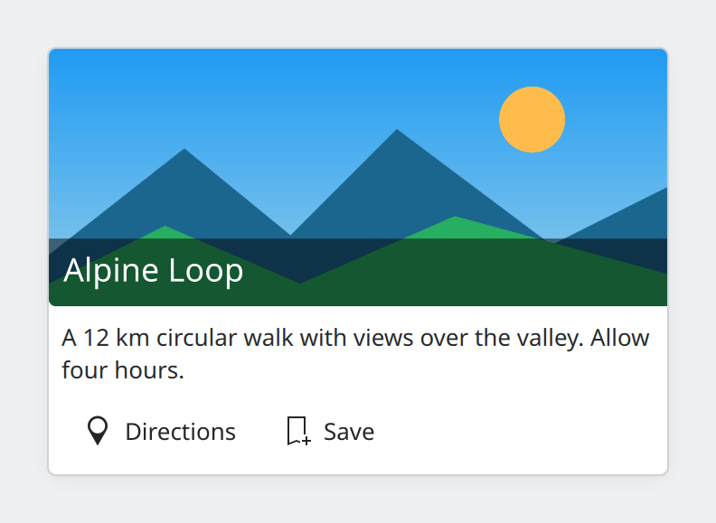
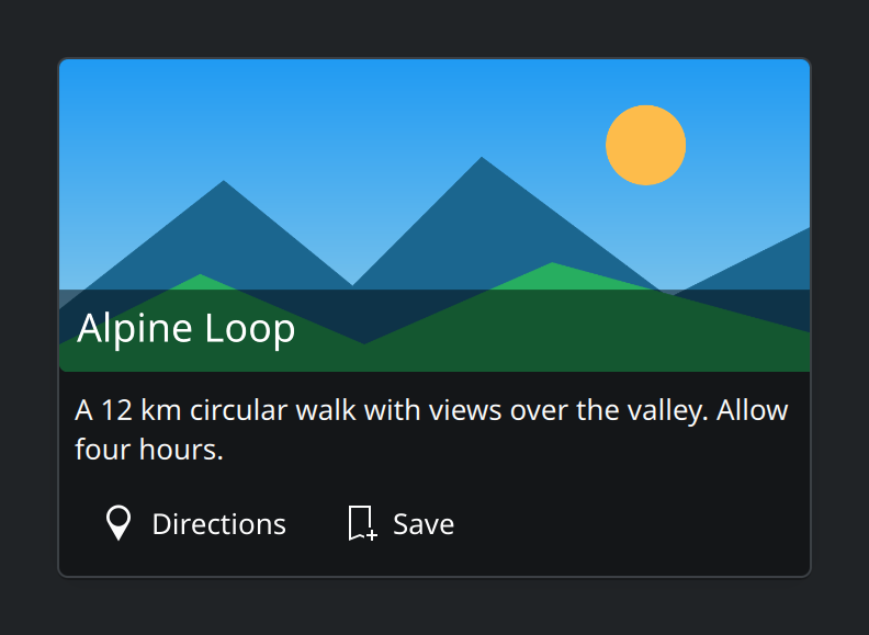
- Banner. An optional image across the top.
- Title. Drawn over the banner, on a darkened strip so it stays readable on any picture.
- Content. Any item; usually a short text.
- Actions. Up to a few buttons that act on this one thing.
Kirigami.Card and its four parts.Show the QML for this example
import QtQuick
import QtQuick.Controls as QQC2
import org.kde.kirigami as Kirigami

Item {
    implicitWidth: Kirigami.Units.gridUnit * 20
    implicitHeight: card.implicitHeight + Kirigami.Units.largeSpacing * 2

    Kirigami.Card {
        id: card
        anchors.fill: parent
        anchors.margins: Kirigami.Units.largeSpacing

        banner {
            source: Qt.resolvedUrl("../assets/landscape.png")
            title: "Alpine Loop"
            titleAlignment: Qt.AlignLeft | Qt.AlignBottom
        }

        contentItem: QQC2.Label {
            wrapMode: Text.WordWrap
            text: "A 12 km circular walk with views over the valley. Allow four hours."
        }

        actions: [
            Kirigami.Action {
                text: "Directions"
                icon.name: "map-symbolic"
            },
            Kirigami.Action {
                text: "Save"
                icon.name: "bookmark-new"
            }
        ]
    }
}
When to use cards
Use cards for a collection of separate things that each have their own picture or their own actions: albums, places, add-ons, devices, news items.
Do not use cards for:
- Plain lists of text. Rows in a
ListVieware denser and easier to scan. The guidelines put it this way: lists suit text, grids and cards suit visual content. - Settings. Use a form layout.
- Wrapping a whole page. A card is one item among several, not a frame around everything.
Card or AbstractCard?
| Type | Use it when |
|---|---|
Kirigami.Card |
You want the standard arrangement: banner, title, content, actions. |
Kirigami.AbstractCard |
You only want the framed surface and will lay out the inside yourself. |
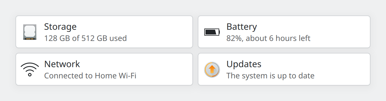
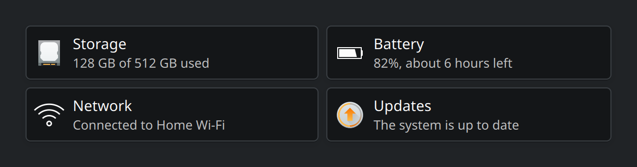
AbstractCard in a CardsLayout. Each has a custom row as its content.Show the QML for this example
import QtQuick
import QtQuick.Layouts
import QtQuick.Controls as QQC2
import org.kde.kirigami as Kirigami

Item {
    implicitWidth: Kirigami.Units.gridUnit * 34
    implicitHeight: layout.implicitHeight + Kirigami.Units.largeSpacing * 2

    Kirigami.CardsLayout {
        id: layout
        anchors.fill: parent
        anchors.margins: Kirigami.Units.largeSpacing

        Repeater {
            model: [
                { title: "Storage", text: "128 GB of 512 GB used", icon: "drive-harddisk" },
                { title: "Battery", text: "82%, about 6 hours left", icon: "battery-080" },
                { title: "Network", text: "Connected to Home Wi-Fi", icon: "network-wireless" },
                { title: "Updates", text: "The system is up to date", icon: "system-software-update" }
            ]

            Kirigami.AbstractCard {
                required property var modelData

                contentItem: RowLayout {
                    spacing: Kirigami.Units.largeSpacing

                    Kirigami.Icon {
                        source: modelData.icon
                        implicitWidth: Kirigami.Units.iconSizes.medium
                        implicitHeight: Kirigami.Units.iconSizes.medium
                    }
                    ColumnLayout {
                        Layout.fillWidth: true
                        spacing: 0

                        Kirigami.Heading {
                            Layout.fillWidth: true
                            text: modelData.title
                            level: 4
                            elide: Text.ElideRight
                        }
                        QQC2.Label {
                            Layout.fillWidth: true
                            text: modelData.text
                            opacity: 0.75
                            elide: Text.ElideRight
                        }
                    }
                }
            }
        }
    }
}
Arranging several cards
| Type | What it does |
|---|---|
Kirigami.CardsLayout |
A grid for a known, small number of cards. It picks the number of columns from the available width and gives every card in a row the same size. |
Kirigami.CardsListView |
A scrolling list of cards generated from a model. Use it when the number of cards is large or unknown; it only creates the cards that are on screen. |
Put a CardsLayout inside a Kirigami.ScrollablePage so the cards can scroll when the window is small. A
CardsListView scrolls by itself and should be the direct child of the scrollable page.
Using cards well
- One subject per card. If the title needs an “and”, it is two cards.
- Keep text short. Two or three lines. Longer text belongs on the page the card leads to.
- Few actions. Two or three, most important first. Like a toolbar, a card moves actions that do not fit into an overflow menu, so give each one a text and an icon. See Actions and toolbars.
- Make it obvious if the whole card is clickable. Set
showClickFeedback: trueso the card reacts to hover and press. - Use the same kind of banner on every card in a group, or on none. A mix of cards with and without pictures looks broken.
Properties you will use
Kirigami.Card
| Property | Type | What it does |
|---|---|---|
banner.source |
url | The image across the top. |
banner.title |
string | Title drawn over the banner. |
banner.titleIcon |
string | Icon name shown beside the title. |
banner.titleAlignment |
alignment | Where on the banner the title sits, for example Qt.AlignLeft | Qt.AlignBottom. |
banner.titleLevel |
int | Heading level of the title. See Typography. |
contentItem |
item | The body of the card. |
actions |
list of actions | Buttons along the bottom. |
Kirigami.AbstractCard (also available on Card)
| Property | Type | What it does |
|---|---|---|
header, footer |
item | Items above and below the content. |
contentItem |
item | The body of the card. |
showClickFeedback |
bool | Makes the card react to hover and press. Default false. |
onClicked |
handler | Runs when the card is clicked. |
Kirigami.CardsLayout
| Property | Type | What it does |
|---|---|---|
maximumColumns |
int | Most columns to use. Default 2. |
minimumColumnWidth |
number | Below this width a column is dropped. Default 12 grid units. |
maximumColumnWidth |
number | Cards do not grow wider than this. Default 20 grid units. |
Where this comes from
This page restates the upstream KDE documentation in plainer words and adds pictures. When the two disagree, upstream wins.