Components
Placeholder messages
What to show where content would be when there is none yet, so an empty page explains itself instead of looking broken.
Kirigami.PlaceholderMessage
A list with nothing in it is a blank rectangle. The user cannot tell whether the app is still loading, whether
something failed, or whether there simply is nothing. Kirigami.PlaceholderMessage fills that space with an
explanation, centred where the content would be.
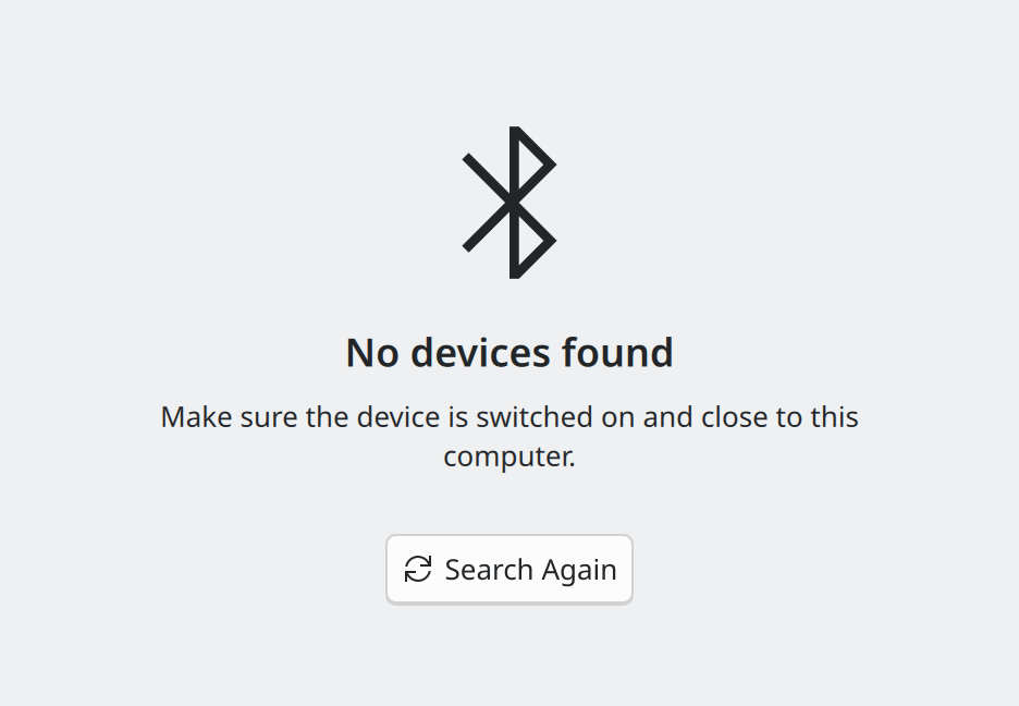
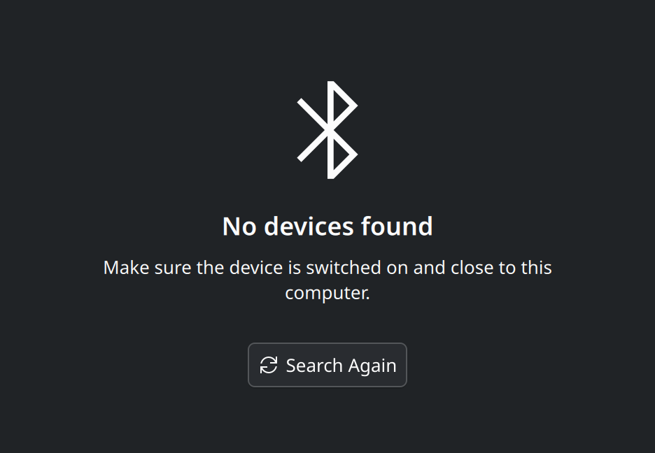
- Icon. Optional. A large symbolic icon that hints at the subject.
- Text. The one line that says what the situation is.
- Explanation. Optional. Why, or what to do.
- Helpful action. Optional. One button that gets the user out of the empty state.
Show the QML for this example
import QtQuick
import org.kde.kirigami as Kirigami

Item {
    implicitWidth: Kirigami.Units.gridUnit * 24
    implicitHeight: Kirigami.Units.gridUnit * 16

    Kirigami.PlaceholderMessage {
        anchors.centerIn: parent
        width: parent.width - Kirigami.Units.gridUnit * 4

        icon.name: "network-bluetooth"
        text: "No devices found"
        explanation: "Make sure the device is switched on and close to this computer."

        helpfulAction: Kirigami.Action {
            icon.name: "view-refresh"
            text: "Search Again"
        }
    }
}
When to use it
- A list, grid or page has no items yet: “No notes yet”.
- A search or filter matches nothing: “No results for ‘kirigmai’”.
- Content cannot be shown right now: offline, no device connected, no permission.
- A view is waiting for the user to pick something: “Select a note to read it”.
For loading, use Kirigami.LoadingPlaceholder instead, which shows a progress indicator in the same position.
How much to say
Often one line is enough.


text is set. Fine when the reason and the remedy are both obvious.Show the QML for this example
import QtQuick
import org.kde.kirigami as Kirigami

Item {
    implicitWidth: Kirigami.Units.gridUnit * 24
    implicitHeight: Kirigami.Units.gridUnit * 7

    Kirigami.PlaceholderMessage {
        anchors.centerIn: parent
        width: parent.width - Kirigami.Units.gridUnit * 4

        text: "No notes yet"
    }
}
Add the other parts only when they help:
- an explanation when the reason is not obvious or the user can do something about it;
- a helpful action when one button solves the problem (“Add Note”, “Search Again”, “Open Network Settings”);
- an icon when the page has no other visual hint of what belongs there.
Be chatty or vague. It says neither what was looked for nor why nothing came up.
In code
Centre the message in the view it stands in for, limit its width so long text wraps, and show it only while the view is empty:
ListView {
    id: notesView
    model: notesModel

    Kirigami.PlaceholderMessage {
        anchors.centerIn: parent
        width: parent.width - Kirigami.Units.gridUnit * 4
        visible: notesView.count === 0

        icon.name: "view-list-text"
        text: "No notes yet"

        helpfulAction: Kirigami.Action {
            icon.name: "list-add"
            text: "Add Note"
            onTriggered: notesModel.addNote()
        }
    }
}
The message is placed inside the list view, so it sits exactly where the items would be.
Properties you will use
| Property | Type | What it does |
|---|---|---|
text |
string | The main line. |
explanation |
string | Smaller text under the main line. |
icon.name |
string | Icon shown above the text. |
helpfulAction |
action | Shown as a button under the text. See Actions and toolbars. |
type |
enum | Kirigami.PlaceholderMessage.Type.Actionable makes the text more prominent, for when the user is expected to act; Informational makes it quieter. Chosen automatically: actionable when there is an enabled helpful action. |
Where this comes from
This page restates the upstream KDE documentation in plainer words and adds pictures. When the two disagree, upstream wins.