Components
Progress and loading
Three ways to show that the app is busy, depending on whether you know how long it will take and how much of the screen is waiting.
QQC2.ProgressBarQQC2.BusyIndicatorKirigami.LoadingPlaceholder
Anything that takes longer than about a second needs a sign that work is going on. Without one, people assume the app has frozen and click again.
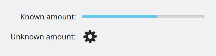
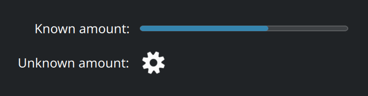
QQC2.ProgressBar and QQC2.BusyIndicator.Show the QML for this example
import QtQuick
import QtQuick.Layouts
import QtQuick.Controls as QQC2
import org.kde.kirigami as Kirigami

GridLayout {
    columns: 2
    columnSpacing: Kirigami.Units.largeSpacing
    rowSpacing: Kirigami.Units.largeSpacing

    QQC2.Label {
        text: "Known amount:"
        Layout.alignment: Qt.AlignRight
    }
    QQC2.ProgressBar {
        Layout.preferredWidth: Kirigami.Units.gridUnit * 12
        from: 0
        to: 100
        value: 62
    }

    QQC2.Label {
        text: "Unknown amount:"
        Layout.alignment: Qt.AlignRight
    }
    QQC2.BusyIndicator {
        running: true
        implicitWidth: Kirigami.Units.iconSizes.medium
        implicitHeight: Kirigami.Units.iconSizes.medium
    }
}
Which one
| Situation | Use |
|---|---|
| You know how far along the task is | QQC2.ProgressBar |
| You cannot know, or it is very short | QQC2.BusyIndicator |
| A whole view or page has nothing to show yet | Kirigami.LoadingPlaceholder |
Prefer a real measure whenever one exists. A bar that fills tells people how long to wait and proves the app is not stuck; a spinner only says “not yet”.
Loading placeholder
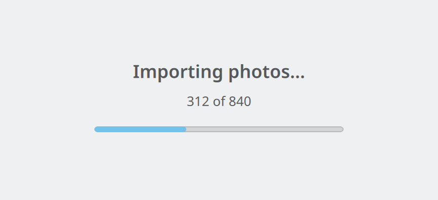
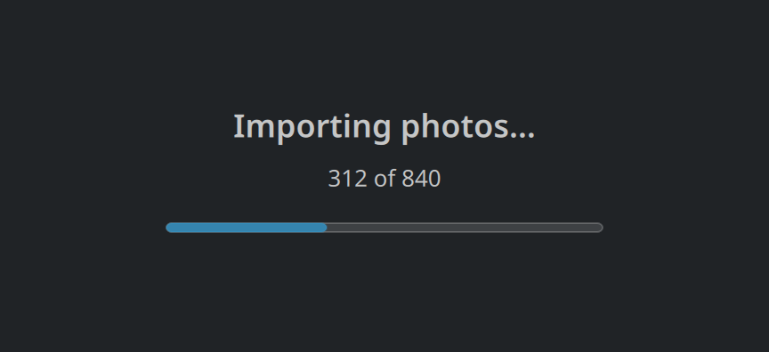
Show the QML for this example
import QtQuick
import org.kde.kirigami as Kirigami

Item {
    implicitWidth: Kirigami.Units.gridUnit * 22
    implicitHeight: Kirigami.Units.gridUnit * 9

    Kirigami.LoadingPlaceholder {
        anchors.centerIn: parent
        text: "Importing photos…"
        explanation: "312 of 840"
        determinate: true
        progressBar.value: 37
    }
}
Kirigami.LoadingPlaceholder goes in the middle of a view that is still loading, in the same spot where a
placeholder message would go if the view turned out to be empty. It has a
main text, an optional explanation, and an indicator.
Kirigami.LoadingPlaceholder {
    anchors.centerIn: parent
    visible: importer.running

    text: "Importing photos…"
    explanation: importer.done + " of " + importer.total

    determinate: true
    progressBar.value: importer.done / importer.total * 100
}
Without determinate: true it shows an indicator with no fill level, for when the amount is unknown. The
built-in bar runs from 0 to 100.
Using them well
- Say what is happening, with a verb ending in “…”: “Importing photos…”, “Connecting…”.
- Give numbers when you have them: “312 of 840”, “2 minutes left”. Technical detail is fine here.
- Put the indicator where the result will appear, not in a far corner.
- Do not block the whole window for work that only concerns one part of it.
- Switch from spinner to bar as soon as the total becomes known. A progress bar can start with
indeterminate: trueand change. - When loading finishes with nothing to show, replace the loading placeholder with a placeholder message that says so.
Properties you will use
QQC2.ProgressBar
| Property | Type | What it does |
|---|---|---|
from, to |
number | The values that mean empty and full. |
value |
number | Current progress between the two. |
indeterminate |
bool | true shows activity without a fill level. |
QQC2.BusyIndicator
| Property | Type | What it does |
|---|---|---|
running |
bool | Whether it spins. Bind it to your “busy” condition. |
Kirigami.LoadingPlaceholder
| Property | Type | What it does |
|---|---|---|
text |
string | The main line. |
explanation |
string | Smaller text under it. |
determinate |
bool | true when progress is known. Default false. |
progressBar.value |
number | Progress from 0 to 100, used when determinate is true. |
Where this comes from
This page restates the upstream KDE documentation in plainer words and adds pictures. When the two disagree, upstream wins.