Patterns
Layout and navigation
How to arrange an app's main parts, how people move between them, and how the same app reshapes itself from a desktop window to a phone.
Where things go
People look at the top-leading corner of a window first (top left in English). Put the most important thing there. On a phone, the easiest place to reach is the bottom, so that is where controls go.
The guidelines give each part of an app a home, and a different one when space is short:
| Part | Wide window | Narrow window or phone |
|---|---|---|
| Toolbar | Above the content | Below the content |
| Sidebar | At the leading edge | The first page of the stack, or opened on demand |
| Preview or tool panel | At the trailing edge | Opened on demand |
| Navigation tab bar | Above the content | Below the content |
| Menu bar | Above the toolbar | A menu button on the toolbar |
| Status bar | Below the content | Left out |
If a view needs its own controls, such as a zoom slider for a grid, put them in a second toolbar directly under the main one.
Choosing how people get around
Pick by the shape of your app, not by taste.
| Your app has… | Use | See |
|---|---|---|
| One flow that goes deeper step by step | The page stack: pageStack.push() |
Pages |
| Up to five top-level places | Kirigami.NavigationTabBar |
Navigation tab bar |
| More than five top-level places | A Kirigami.GlobalDrawer sidebar |
Drawers |
Whichever you choose, the view people see at launch should be the first item.
One app, two shapes
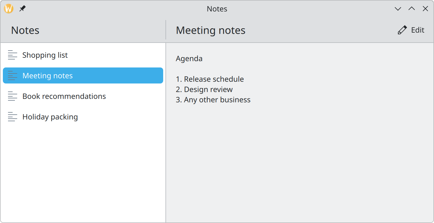
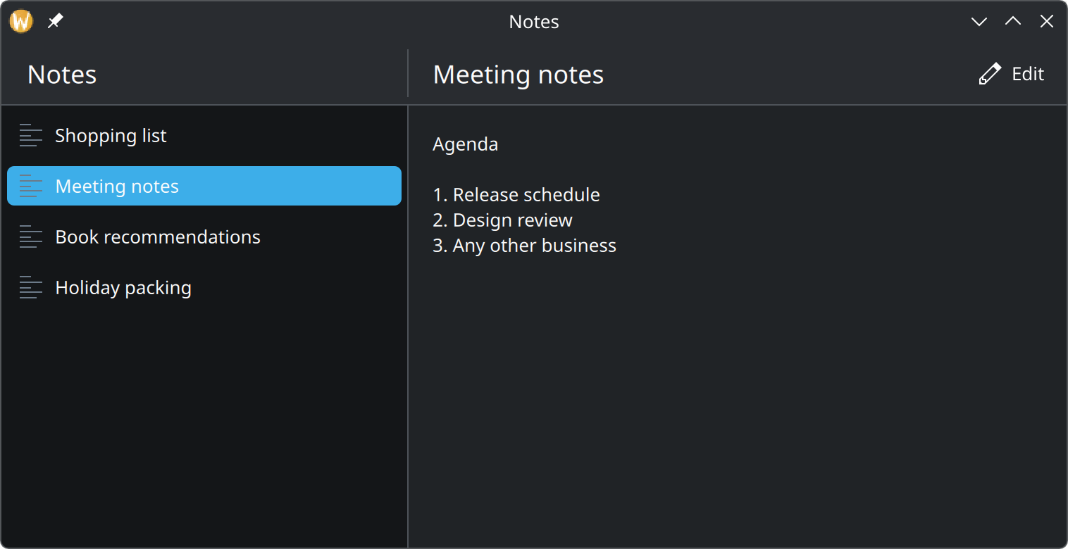
- The first page: a list.
- The page pushed from it. Its title and actions get their own header.
Show the QML for this example
import QtQuick
import QtQuick.Controls as QQC2
import org.kde.kirigami as Kirigami

// A wide window shows the list and the page pushed from it side by side.
Kirigami.ApplicationWindow {
    id: root
    title: "Notes"
    width: Kirigami.Units.gridUnit * 42
    height: Kirigami.Units.gridUnit * 20

    pageStack.defaultColumnWidth: Kirigami.Units.gridUnit * 16

    pageStack.initialPage: Kirigami.ScrollablePage {
        title: "Notes"

        ListView {
            currentIndex: 1
            model: ["Shopping list", "Meeting notes", "Book recommendations", "Holiday packing"]

            delegate: QQC2.ItemDelegate {
                required property string modelData
                width: ListView.view.width
                text: modelData
                icon.name: "text-x-generic"
                highlighted: ListView.isCurrentItem
            }
        }
    }

    Component {
        id: notePage
        Kirigami.Page {
            title: "Meeting notes"

            actions: Kirigami.Action {
                text: "Edit"
                icon.name: "document-edit"
            }

            QQC2.Label {
                anchors.fill: parent
                wrapMode: Text.WordWrap
                text: "Agenda\n\n1. Release schedule\n2. Design review\n3. Any other business"
            }
        }
    }

    Component.onCompleted: pageStack.push(notePage)
}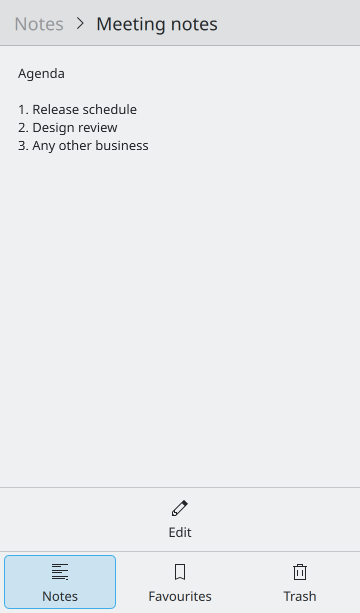
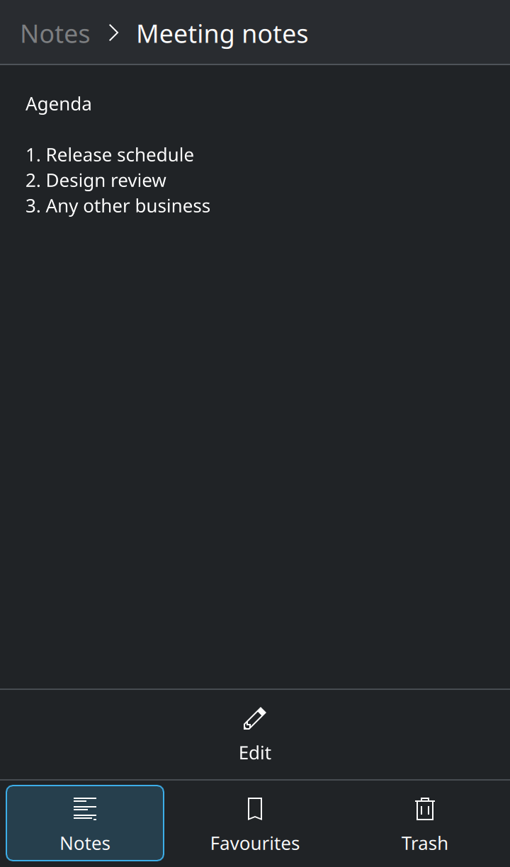
- Only the newest page is visible. The breadcrumb leads back to the list.
- The page’s actions moved to the bottom, in reach of a thumb.
- The navigation tab bar sits at the bottom edge.
Show the QML for this example
import QtQuick
import QtQuick.Controls as QQC2
import org.kde.kirigami as Kirigami

// The same two pages on a phone: only the newest page is visible, with a
// back button, and the tab bar sits at the bottom within reach of thumbs.
Kirigami.ApplicationWindow {
    id: root
    width: Kirigami.Units.gridUnit * 20
    height: Kirigami.Units.gridUnit * 34

    footer: Kirigami.NavigationTabBar {
        actions: [
            Kirigami.Action {
                text: "Notes"
                icon.name: "view-list-text"
                checked: true
            },
            Kirigami.Action {
                text: "Favourites"
                icon.name: "bookmarks"
            },
            Kirigami.Action {
                text: "Trash"
                icon.name: "user-trash"
            }
        ]
    }

    pageStack.initialPage: Kirigami.ScrollablePage {
        title: "Notes"

        ListView {
            model: ["Shopping list", "Meeting notes", "Book recommendations", "Holiday packing"]

            delegate: QQC2.ItemDelegate {
                required property string modelData
                width: ListView.view.width
                text: modelData
            }
        }
    }

    Component {
        id: notePage
        Kirigami.Page {
            title: "Meeting notes"

            actions: Kirigami.Action {
                text: "Edit"
                icon.name: "document-edit"
            }

            QQC2.Label {
                anchors.fill: parent
                wrapMode: Text.WordWrap
                text: "Agenda\n\n1. Release schedule\n2. Design review\n3. Any other business"
            }
        }
    }

    Component.onCompleted: pageStack.push(notePage)
}
Kirigami does much of this for you, but only if you let it:
- Build from pages, actions and drawers, not from fixed-position items. They are the parts that know how to move.
- Do not shrink a desktop layout onto a phone. A phone needs fewer things on screen at once and bigger touch
targets. Check
Kirigami.Settings.isMobilewhen you need to make a different choice, andKirigami.Settings.tabletModefor touch-first use on larger screens. - Try it. Start your app with
QT_QUICK_CONTROLS_MOBILE=1to see the phone arrangement on your desktop, and drag the window narrow to see the columns collapse.
Menus
A menu button (☰) is fine while the menu has about 15 items or fewer. Beyond that, a real menu bar is easier to search by eye. Do not put Quit or Minimize in a menu button; the window already has those.
Keyboard, touchpad and touch
- Every action should be reachable from the keyboard. Give standard actions their standard shortcut and let people reassign shortcuts where you can.
- Shortcuts use a modifier plus a letter or number, never a function key alone; laptop keyboards often hide those behind another key. Leave the Meta key alone; it belongs to the desktop.
- Shortcuts, context menus and gestures are accelerators. They make experts faster, but nothing important may be reachable only that way. The main route is always something visible.
- On touchpads and touchscreens, use two-finger gestures only. Three and four fingers are reserved for the system. Scrolling with a touchpad should move content smoothly, pixel by pixel.
Right-to-left languages
In Arabic, Hebrew and other right-to-left languages the whole layout is mirrored: sidebars move to the right, back
arrows point the other way. That is why this guide says “leading” and “trailing” instead of left and right. Kirigami
components and Qt Quick layouts mirror by themselves; images are not mirrored. Test with LANGUAGE=ar_AR.
Where this comes from
This page restates the upstream KDE documentation in plainer words and adds pictures. When the two disagree, upstream wins.