Components
Pages
A page is one screen of your app. Kirigami gives it a title bar, room for actions, and navigation that adapts from desktop to phone.
Kirigami.ApplicationWindowKirigami.PageKirigami.ScrollablePageKirigami.GlobalDrawer
A Kirigami app is a window that shows pages. You describe what is on each page and which actions it offers; Kirigami draws the header, places the actions, and handles moving between pages.
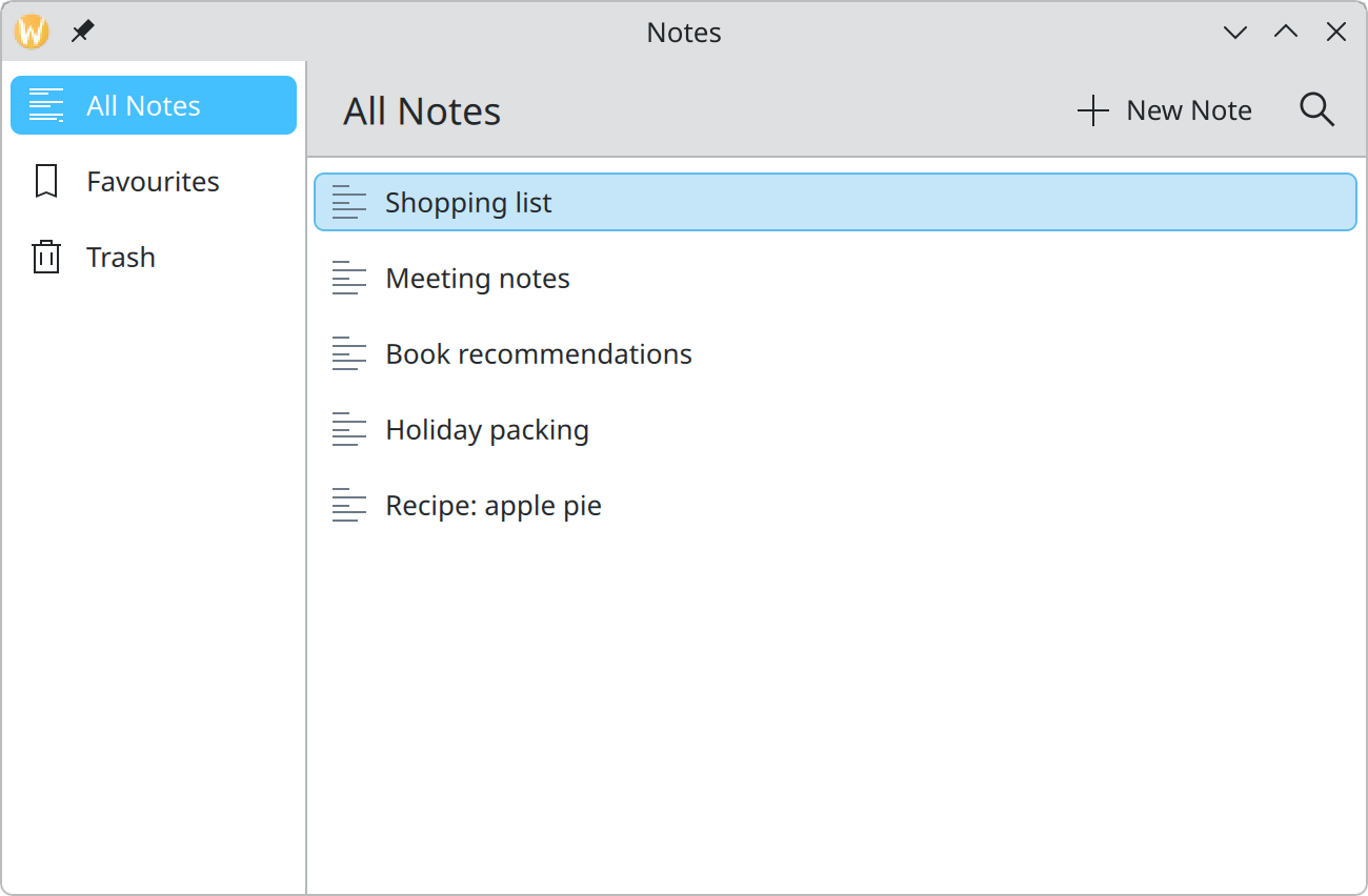
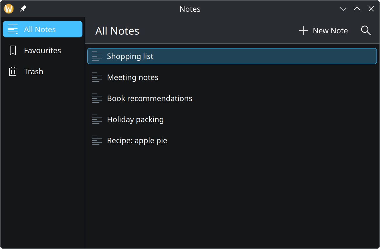
- Global drawer. The app-wide sidebar, for moving between top-level places.
- Title. Comes from the page’s
title. - Actions. Come from the page’s
actions. See Actions and toolbars. - Content. Whatever you put inside the page.
Show the QML for this example
import QtQuick
import QtQuick.Controls as QQC2
import org.kde.kirigami as Kirigami

Kirigami.ApplicationWindow {
    title: "Notes"
    width: Kirigami.Units.gridUnit * 36
    height: Kirigami.Units.gridUnit * 22

    globalDrawer: Kirigami.GlobalDrawer {
        modal: false
        actions: [
            Kirigami.Action {
                text: "All Notes"
                icon.name: "view-list-text"
                checked: true
            },
            Kirigami.Action {
                text: "Favourites"
                icon.name: "bookmarks"
            },
            Kirigami.Action {
                text: "Trash"
                icon.name: "user-trash"
            }
        ]
    }

    pageStack.initialPage: Kirigami.ScrollablePage {
        title: "All Notes"

        actions: [
            Kirigami.Action {
                text: "New Note"
                icon.name: "list-add"
            },
            Kirigami.Action {
                text: "Search"
                icon.name: "search"
                displayHint: Kirigami.DisplayHint.IconOnly
            }
        ]

        ListView {
            model: ["Shopping list", "Meeting notes", "Book recommendations", "Holiday packing", "Recipe: apple pie"]

            delegate: QQC2.ItemDelegate {
                required property string modelData

                width: ListView.view.width
                text: modelData
                icon.name: "text-x-generic"
            }
        }
    }
}
The pieces
| Type | What it is |
|---|---|
Kirigami.ApplicationWindow |
The window. It owns the page stack and the drawers. An app has one. |
Kirigami.Page |
A page whose content fits on screen without scrolling. |
Kirigami.ScrollablePage |
A page whose content can be longer than the screen. Use this for lists and long forms. |
Kirigami.GlobalDrawer |
The sidebar with app-wide destinations or actions. |
pageStack |
The window’s stack of open pages. You push a page to go deeper and pop to go back. |
Page or ScrollablePage?
- Use
ScrollablePagewhen the content is a list, a grid, or anything that may not fit: long text, a form, a set of cards. It adds scrolling, a scrollbar, and keeps the focused field visible when an on-screen keyboard opens. - Use
Pagewhen the content should always fill exactly the available space: a map, an image viewer, a canvas, an empty-state message.
Padding
A Page puts one Kirigami.Units.gridUnit of padding around its content. That is right for forms, text and
cards. A list or grid that fills the whole page should touch the edges; ScrollablePage removes the padding for
you when its child is a list view. If you fill a plain Page with something edge to edge, set padding: 0.
Moving between pages
Kirigami.ApplicationWindow {
    pageStack.initialPage: notesPage

    Component {
        id: notePage
        Kirigami.Page {
            title: "Shopping list"
        }
    }

    // Somewhere in notesPage, when a note is clicked:
    //     applicationWindow().pageStack.push(notePage)
}
On a wide window, pushed pages appear side by side as columns. On a narrow window or a phone, only the newest page
is shown and a back button appears in the header. You get both behaviours from the same push call.
Choosing navigation
The full picture is on Layout and navigation. In short:
How people move around your app depends on how many top-level places it has.
| Your app has… | Use |
|---|---|
| One flow that goes deeper step by step | The page stack alone: pageStack.push() |
| Up to five top-level places | Kirigami.NavigationTabBar |
| More than five top-level places | A Kirigami.GlobalDrawer sidebar |
Whatever you choose, show the view people see at launch as the first item.
For a sidebar that is always visible on desktop, set modal: false on the drawer, as the example does. On a
phone the same drawer slides in from the edge on demand.
Desktop and phone
The same app should work on both, but not by shrinking. The guidelines place things differently depending on the width available:
| Element | Wide window | Narrow window or phone |
|---|---|---|
| Toolbar | Above the content | Below the content, within reach of thumbs |
| Sidebar | At the leading edge | First page of the stack, or opened on demand |
| Preview or tool panel | At the trailing edge | Opened on demand |
| Navigation tab bar | Above the content | Below the content |
| Menu bar | Above the toolbar | A menu button on the toolbar |
| Status bar | Below the content | Left out |
Kirigami’s pages, action toolbars and drawers already move this way. To make your own decisions in code, check
Kirigami.Settings.isMobile for phones and Kirigami.Settings.tabletMode for touch-first use. To try the phone
layout on your desktop, start the app with QT_QUICK_CONTROLS_MOBILE=1.
Properties you will use
On a page
| Property | Type | What it does |
|---|---|---|
title |
string | Text shown in the header. |
actions |
list of actions | Buttons shown in the header. |
padding |
number | Space around the content. Set 0 for edge-to-edge content. |
header, footer |
item | Your own item pinned above or below the content, for example a search field or an inline message. |
globalToolBarStyle |
enum | How the header looks for this page; Kirigami.ApplicationHeaderStyle.None hides it. |
Extra on ScrollablePage
| Property | Type | What it does |
|---|---|---|
supportsRefreshing |
bool | Allows pull-down-to-refresh on touch screens. |
refreshing |
bool | Becomes true when the user pulls down. Set it back to false when loading is done. |
Where this comes from
- KDE HIG: Layout and navigation
- Kirigami tutorial: Explaining pages
- Kirigami tutorial: Page rows and page stacks
- Kirigami tutorial: Scrollable pages and list views
This page restates the upstream KDE documentation in plainer words and adds pictures. When the two disagree, upstream wins.